Statistics Coursework – Comparing Newspapers
Statistics Coursework - Comparing Newspapers
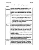
The Plan
Introduction
I have been told to produce a statistical investigation on the subject of newspapers. The investigation needs to draw a comparison in some way between at least two newspapers. I will have to form my own hypotheses and then collect primary data.
Original Hypothesis
I am going to investigate and evaluate the following hypothesis:
"Based on the sports sections of three different types of newspaper: The Sun (tabloid), The Daily Mirror, and The Times (broadsheet), The Sun will be the easiest newspaper to read or the 'most readable' on average. "
(This is what I have predicted)
Data Collection
As I have mentioned, the data used for this coursework has to be primary data collected by myself. To test my hypothesis, I am going to, for each newspaper, collect data based on the readability of sentences of all the articles of four different sports which are: Football, Cricket, Rugby and Horse Racing. I have chosen these four sports because, having had a look through each paper, These are the four sports that have articles in all of the papers I am testing.
I will produce a table of my results (using a sampled population of 100, if possible, because this is a large enough sample to represent the data but small enough to be manageable). I will then develop the investigation further from there.
Testing Readability
For my method of testing readability, I am going to use the "Readability Statistics" function on Microsoft. In "Spelling and Grammar" on the "Tools" menu, there is an option which will show you the readability statistics of a document. Enabling this option shows you different statistics including: the number of words, characters, paragraphs and sentences, the average number of words per sentence, sentences per paragraph and characters per word. I am going to use the "Flesch-Kincaid Reading Ease" as the statistic for testing the readability of the sentences.
Here is a little information about how the Flesch-Kincaid Reading Ease statistic.
Flesch Reading Ease
This computes readability based on the average number of syllables per word and the average number of words per sentence. Scores range from 0 (zero) to 100. Standard writing averages approximately 60 to 70. The higher the score, the greater the number of people who can readily understand the document (i.e. the more 'readable' the text is).
Short, choppy, text with little variation in length will score as "easy to read" with this measure, but it is not a good style. Check the average sentences per paragraph and average words per sentence to detect this.
Info from http://www.writepage.com/writing/gramchek.htm
I have chosen this method of testing readability because I thought it would be quicker if I used Microsoft Word to do it than if I physically counted up words per sentence and syllables per word etc. and also, because I think that The Flesch Reading Ease is a more standard way of testing readability and is a more commonly used method. However, I realize that there are other methods of testing readability, and that the Flesch Reading Ease method can be a bit general in some cases because of individual reading levels and standards.
Pre-test and Practical Problems
I am going to do a pre-test because this will enable me to know what type of sampling to use, how much data I need to use and whether my hypothesis is worth pursuing. If my hypothesis will not enable me to produce a detailed enough investigation e.g. because there is not enough range in the data or the comparison is so simple that it doesn't need an investigation, then I will go back, amend it and repeat the pre-test process. Otherwise, I will then be able to investigate and draw conclusions about my hypotheses. I will be able to see whether the data is sufficient or there is enough range in the sampled data set when I draw histograms of my data sets. If the data is good enough to continue the investigation and draw comparisons then I will do so. I will record any practical problems I come across as I go along, and discuss them at the end.
Data Analysis
For each of the three newspapers, I am going to use stratified sampling to collect data from my sports articles because I want each of the four sports I am focusing on to be fairly represented in the data, and stratified sampling will make sure this happens. I will measure the total area of all of the football articles, cricket articles, rugby articles and horse-racing articles, add the four totals together and then work out the proportion of the area each sport covers to the total area of all four sports as a percentage. The percentages I obtain for each sport will tell me the number of sentences I need to take from that sport to contribute to the final population. I may need to round the percentages up or down accordingly. However, the total sentences needed from each type of sport should add up to 100, even though the numbers for each group will differ for each newspaper.
When I know the number of sentences required from each 'group' for all three types of newspaper, I am then going to use systematic sampling to select the individual sentences because it eliminates bias as every sentence in each group an equal chance of being selected. I will use the random number on my scientific calculator to generate a single random number between 1 and 10. The corresponding sentence in each group will then be the first sentence in the sample. I will then generate another random number between 1 and 10 with my calculator which will be ...
This is a preview of the whole essay
When I know the number of sentences required from each 'group' for all three types of newspaper, I am then going to use systematic sampling to select the individual sentences because it eliminates bias as every sentence in each group an equal chance of being selected. I will use the random number on my scientific calculator to generate a single random number between 1 and 10. The corresponding sentence in each group will then be the first sentence in the sample. I will then generate another random number between 1 and 10 with my calculator which will be the selection gap for the sentences in the group. For example, if my calculator generates the number 5 and then the number 2, I will start at the 5th sentence in the group and then select a sentence every two sentences for my sample.
Once I have collected all of my sentences, I will type them up in Microsoft Word and obtain a Flesch Reading Ease score for each individual sentence (separately for each of the three newspapers). With these scores, I will produce a histogram using Autograph and analyse the data. The histogram should tell me whether I need to amend my hypothesis or not because I will be able to see whether there is enough range in the data and whether I have too little or too much data. I will be able to look at the distribution of the data, which will enable me to know what average to use in my comparison. I will then analyse the data by comparing the averages and a type of range for all three newspapers and state whether my original hypothesis was correct or incorrect.
Conclusion
I will then conclude my investigation, linking my results to my original hypothesis and explaining any problems encountered during the investigation.
The Investigation
The Pre-test
I decided to do a pre-test first to ensure that I had sufficient data to continue my investigation. My pre-test consisted of the following:
Data Collection
Having planned my investigation, my next line of action was to go and buy the three newspapers - The Daily Mirror, The Sun and The Times. I then began the data collection process, beginning with my stratified sampling. I did this so that I would know how many sentences to collect from each 'group' of sports articles.
The Stratified Sampling
The following tables show the results of my stratified sampling:
The Mirror
Sport ('group')
Total area of articles
(cm²)
Percentage (to the nearest whole number)
Number of sentences required
Football
391
(1391÷1840*) x 100 = 76%
76
Cricket
53
(153÷1840*) x 100 = 8%
8
Rugby
209.25
(209.25÷1840*) x 100 = 11%
1
Horse-Racing
86
(86÷1840)* x 100 = 5%
5
Total
839.25
00%
00
*When I added up the total areas of all the sports articles, it came to 1839.35, which I rounded to the nearest 10 (1840) to make the numbers easier to work with.
The Sun
Sport ('group')
Total area of articles
(cm²)
Percentage (to the nearest whole number)
Number of sentences required
Football
766.5
(1766.5÷2600**) x 100 = 68%
68
Cricket
276.75
(276.75÷2600**) x 100 = 11%
1
Rugby
358.25
(358.25÷2600**) x 100 = 14%
4
Horse-Racing
96
(196÷2600**) x 100 = 7%
7
Total
2597.5
00%
00
** When I added up the total areas of all the sports articles, it came to 2597.5, which I rounded to the nearest 10 (2600) to make the numbers easier to work with.
The Times
Sport ('group')
Total area of articles
(cm²)
Percentage (to the nearest whole number)
Number of sentences required
Football
5297.5
(5297.5÷7760***) x 100 = 68%
68
Cricket
803.25
(803.25÷7760***) x 100 = 10%
0
Rugby
074.75
(1074.75÷7760***) x 100 = 14%
4
Horse-Racing
588
(588÷7760***) x 100 = 8%
8
Total
7763.5**
00%
00
*** When I added up the total areas of all the sports articles, it came to 7763.5, which I rounded to the nearest 10 (7760) to make the numbers easier to work with.
The Systematic Sampling
Now that I knew how many sentences I needed from each type of sports article, my next objective was to collect the actual sentences so that I could obtain Flesch Reading Ease scores for them. This was to be done by systematic sampling and, to an extent, random sampling. The method I used is a fair way and eliminates much of the bias that can sometimes be encountered in a stratified sample. I used my calculator to generate a random number between 1 and 10 (because these are safe and sensible numbers to use as I am almost guaranteed that there will be at least 10 sentences of each type of sports article) which would be my starting sentence in each type of sports article. This number was 7. I then chose another random number, again between 1 and 10 (again because this is a sensible range) which would be the gap between each selected sentence. The second number generated by my calculator was 2. Therefore, I had to collect every other sentence.
I highlighted the sentences (by hand) which were systematically selected until I had the right number of sentences for each type of sports article (which, as I had planned, came to a total of 100 sentences for each newspaper). Then, for each newspaper, I typed up the selected sentences in Microsoft Word so that I could test their readability with my Flesch Reading Ease method. After I had typed up all of my sentences for each newspaper, I would go through the sentences individually highlighting them and obtaining a Flesch Reading Ease score for all of them, which I recorded on a spreadsheet in Microsoft Excel.
I then entered my sampled data set of 100 sentences into Autograph so that I could use Autograph to draw a histogram of my data for each newspaper. After drawing a histogram for the data of each of the three newspapers, I then decided to fit a normal curve to the data sets so that I could make more concrete decisions as to what to do next in my investigation and how to make a comparison e.g. what average and measure of spread to use.
The diagrams
The next three pages are the statistical diagrams I created using Autograph:
Analysis of the statistical diagrams
The Mirror
It was immediately quite clear to see from the histogram that the distribution was not symmetrical and that it showed very slight negative skew. This was confirmed by fitting a normal curve to the data set and further confirmed by drawing a box and whisker diagram. The box and whisker diagram showed that the median was not quite in the middle of the interquartile range, which it would have been if the data was symmetrical. I concluded from this that the mean would not be a good representation of the data set because it had been affected by extreme values or outliers, which 'pull' the mean towards themselves. Instead, the median and the interquartile range would be better representations for drawing a comparison because the outliers don't affect them.
Just to make sure that the distribution was not normal, even though it wasn't symmetrical, and to back up my analysis, I decided to work out the standard deviation of the data set to see whether the data fitted the criteria for normal distribution i.e. 68% of all the values being between ±1 standard deviation, 95% being between ± 2 standard deviations and 99.7% between ± 3 standard deviations. I did this on a spreadsheet in Microsoft Excel, and it is attached to this coursework on a separate page.
Working out standard deviation
To work out the spread of my data so that I could see whether it could be deemed a normal distribution, I had to work out the standard deviation of the sample, and I used the following equation to do so:
Where x = the value, =the mean and n = the total number of values.
Having worked out the standard deviation from the data, I then had to work out a standardised score for each value to find out what percentage of values lay between ±1 standard deviations, ±2 standard deviations and ±3 standard deviations.
Working out standardised scores
I worked out the standardised scores of my individual values to compare them to a normal distribution and see whether they were similar enough to be called a normal distribution. This is the formula I used to work out my standardised scores:
These were my results:
±1 S.D.*
68/100 (68%)
±2 S.D.*
98/100 (98%)
±3 S.D.*
00/100 (100%)
*S.D = Standard Deviation
This confirmed that the distribution of my data for The Daily Mirror was not normal and that it was only just slightly skewed because, for the distribution to be normal:
* Approximately 68% of my data values needed to lie between ±1 standard deviations - this was true for my data set
* Approximately 95% of my data values needed to be between ±2 standard deviations - this was not true for my data set, which was just slightly over limit (98%)
* Approximately 99.7% of my data needed to lie between ±3 standard deviations - this was approximately true for my data set (100%)
Now that I knew that my distribution was slightly skewed, I knew that, to make a fair and valid comparison, I would need to use the median and the interquartile range because they are not affected by the outliers which affected the mean. I now had to repeat the process for the other two papers.
The Sun
At first glance, the histogram produced by the data set looked almost symmetrical, but not quite. The data set was ever so slightly positively skewed as a result of one or two outliers. Again I fitted a normal curve to the data set, and then drew a box and whisker diagram to confirm my analysis of the distribution. The mean was not quite in the centre of the interquartile range (on the box and whisker diagram), which meant that there was skew (positive skew in this case). This told me that the mean would, again, not be the best representation of the data set as it had been affected by the outliers, causing the skew that I could see. It would be best to use the median and interquartile range for comparison. However, even though the distribution was not symmetrical, it could still have been a normal distribution so I had to check this by working out the standard deviation for the data set, and the standardised scores for each individual value to see whether it fitted the criteria for a normal distribution:
Having worked out the standard deviation from the data, I then had to work out a standardised score for each value to find out what percentage of values lay between ±1 standard deviations, ±2 standard deviations and ±3 standard deviations.
These were my results:
±1 S.D.
71/100 (71%)
±2 S.D.
94/100 (94%)
±3 S.D.
00/100 (100%)
This showed that my distribution was not normal because:
* Approximately 71% of my data values lay between the standardised scores of ±1, which is just too many
* Approximately 94% of my data values lay between the standardised scores of ±2, which is just too few
* All of my data values lay between the standardised scores of ±3 standard deviations
Again, this was confirmation that it would be best to use the median and interquartile range for comparison, rather than the mean because the mean was affected by outliers, causing skew in the data. Two out of three newspapers completed, now for the final newspaper, The Times.
The Times
The histogram produced by the data set for The Times looked very close to being symmetrical but, once more, it was not quite symmetrical. The box and whisker confirms this, showing positive skew. As I did before with The Sun and The Mirror, I worked out the standard deviation for the data set and then worked out the standardised scores of the individual values, to check whether the distribution of the data was normal. The standard deviation for the data set is shown on a separate page. These were the results of my test for normal distribution:
±1 S.D.
69/100 (69%)
±2 S.D.
94/100 (94%)
±3 S.D.
00/100 (100%)
This was confirmation of my data set being slightly short of being called a normal distribution, meaning that I would need to use the median and interquartile range for my comparison with the other two newspapers because of the outliers which had affected the mean.
* Approximately 69% of my data values lay between standardised scores of ±1, which is a little too many.
* Approximately 94% of my data values lay between standardised scores of ±2 standard deviations, which is only just too few.
* All (100%) of my data values lay between standardised scores of ±3, which as about right.
This concluded my pre-test. The diagrams had shown me that it was possible to conduct an investigation out of this hypothesis and that I would be able to draw comparisons between the data from all three newspapers.
Now that I knew that I needed to use the median and interquartile range of the data sets of all three newspapers to compare their readability and conclude whether my hypothesis was correct, all I had to do now was work out the necessary averages and draw the comparisons.
Analysis - Comparing the readability of The Daily Mirror, The Sun and The Times
Firstly, I had to go through my sampled data sets for each newspaper and work out the position of the median and get a value and then the position of the upper quartile and the lower quartile for the interquartile range. I could have just read the numbers from my box and whisker diagram but the axes of the graph made it difficult for me to do so.
To find the median
To find the median I used the following formula:
The position of the median is at , where n is the number of values in the data set.
To find the interquartile range
The interquartile range is the difference between the upper quartile (the value which is of the way through the data) and the lower quartile (the value which is of the way through the data).
The position of the lower quartile is found by the formula, where n refers to the number of values in the data set.
The position of the upper quartile is found by the formula, where n refers to the number of values in the data set.
The interquartile range is found by: upper quartile - lower quartile
These were my results:
Newspaper
Median Sentence Score
Upper Quartile
Lower Quartile
Interquartile Range
The Mirror
61.9
74.275
46.725
74.275 - 46.725 = 27.55
The Sun
58.4
71.75
46.125
71.75 - 46.125
= 25.625
The Times
45.9
61.5
32.875
61.5 - 32.875
= 28.625
Looking at the above table I could see the following:
* The Mirror had the highest median sentence score of the three newspapers (61.9)
* The Sun had the second highest median sentence score of the three papers (58.4)
* The Times had the lowest median sentence score of the three newspapers (45.9)
* The Times had the biggest range of sentence readability of the three newspapers
* The Mirror had the second biggest range of sentence readability of the three newspapers
* The Sun had the smallest range of sentence readability of the three newspapers
Conclusions:
After analysing the table, I concluded from my investigation the following:
* My hypothesis was incorrect. On average*, the sports articles of The Sun were not the easiest to read or the 'most readable', as I had predicted.
* On average, the sports articles of The Daily Mirror were the 'most readable'.
* The Times had the greatest range of sentence readability, which meant that it had the greatest mixture or variance of sentence readability of the sentences in its sports articles. However, The Times had the least readable sports section.
* The Daily Mirror had quite a good range of sentences in its sports articles as its interquartile range was only very slightly smaller than that of The Times.
* The readability of the sentences in the sports articles in The Sun didn't vary as much as those of The Times and The Daily Mirror. This means that there were a greater number of sentences with similar readability in The Sun than in the other two newspapers.
* Average refers to the Flesch Reading Ease scores of the median sentences in my data set for each of the three newspapers. This is what I used to reach my analysis.
Practical problems
These are some of the practical problems I encountered during the investigations and how I tackled them:
Problem
How I tackled the problem
When measuring the area of some of the articles during the data collection process, I found that an article sometimes had the text 'bled' around an image, which made it difficult for measuring areas. This is an example.
I roughly estimated a more 'square' area for the text.
Because I had been conducting this investigation over a period of several weeks, the newspapers were slightly ripped and torn in places, which sometimes made it difficult during the data collection, as I could not fully highlight sentences because there were parts of words missing etc.
Luckily, the ripping and tearing was not too bad and I could safely guess which words were missing because there wasn't a case where there was an entire word missing.
The original numbers obtained during my sampling process would have been complicated and lengthy to work with.
I rounded them to a convenient and appropriate accuracy, and have stated the accuracy in each case.
'Bibliography'
Here is a list of things which have helped me to complete this investigation:
* 'Microsoft Word' - Used to word process the investigation.
* 'Microsoft Excel' - Used during data collection and also during data analysis for getting data to draw histograms and box and whisker diagrams.
* 'Autograph' - used to produce statistical diagrams including box and whisker diagrams, normal distribution curves and histograms.
* 'MathType' - An add-in feature for 'Microsoft Word', used for producing mathematical symbols and writing formulas and equations which are otherwise not possible in a normal word processor.
* My brain - without which none of this would be possible.
Chukwuweta Ikeh
Chukwuweta Ikeh 09/05/2007