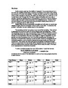
I inputted the results I got from the above table into the equation to get:
The answer I got is 0.4 (to 1dp) this proves there is some positive correlation (when used in conjunction with the table on page 4) so I do have some grounds for further investigation. The answer also proves I have a positive linear correlation between the two variables. Based on the value of r2 (0.42108310812 =0.177310984) therefore I can say that with a 17% chance that from any point on the line of best fit an increase in height will lead to an increase in weight. This positive correlation along with the positive correlation shown on the scatter graph, proves that from my pilot study there are grounds for further investigation.
The main study
After the results of my pilot study, I have proven there are grounds for further investigation and produced three hypotheses for this further investigation:
Hypothesis 1 – As height increases weight increases. This relationship will become stronger as you become older.
Hypothesis 2 – Boys are taller and heavier than girls. The difference between boys and girls will increase as the students get older.
Hypothesis 3 – Height and weight is normally distributed. Around 68% of the data will lie within ± 1 standard deviation from the mean.
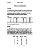
To test these hypotheses I first need to take a sample, I have chosen to sample 6 of the 10 strata, allowing me to make comparisons between the year group and gender the groups are as seen below:
I have chosen to exclude Year 8 and Year 10 students as these changes between year 7 and year 8 and year 9 and 10 would be too small to consider them in my test and also to include them would make my study more time consuming, as I would include insignificant information. Also the changes will seem more obvious because I am only using the first, middle and last year group. This choice is also based on growth rate, if I was studying a theory where the factors took a short period of time to show a huge difference then more frequent studies would be required however human growth takes a longer time to develop meaning that a few years gap would be needed to see a noticeable difference.
I need a larger sample than my pilot study, I have chosen to take a sample of 30, of each strata as that number is sufficient to perform calculations on. I have already randomised my data , during my pilot study so I will use the same randomised data and take the first 30 from each group. Instead of an overall sample size of 100 in the pilot study I will take a sample of overall size 180, with a larger sample it will make my conclusions more valid as they will even out any problems that could occur naturally in the data, however 180 is still a small enough size for data to make it practical to manually search through the data to remove anomalous data, that has been incorrectly entered. As in my pilot study if I find a student that is an extreme value I will remove the anomalies and replace it with the next one in line. I have to do this as if the anomaly was left it will make my result void, meaning my conclusion is not valid. The data I have selected can bee seen visually in my stem and leaf diagrams I produced (see appendix 1-6)
However some members of the population of the data that is not manually detected as extreme, (an example of extreme data is a 180cm student weighing 4kg), others may be outliers (results that differ significantly from the sample). These outliers could still affect the validity of my conclusion so it is best to test for these outliers.
To see if outliers exist in my data there are two possible routes to go down:
- Standard Deviation, the use of standard deviation to work out outliers means that a piece of data is deemed an outlier if it is above 2 standard deviations from the mean.
- Inter Quartile range, data is deemed an outlier if it is more than 1.5 times the IQR above the upper quartile or 1.5 times the IQR below the lower quartile.
The method I have selected is the second, the use of IQR to show outliers, this is because method 1 (using standard deviation) means that you have to assume the data is normally distributed, which until I prove my third hypotheses I cannot be certain of so IQR is the best option for me. I am going to create statistical graphs utilising all of the data and then I am going to create boxplots without outliers and then I will draw comparisons between them. This will allow me to make a conclusion from my data and conclude the reliability of the data with and without the outliers.
To test my various hypotheses I will do these calculations and compute the following graphs:
- Frequency polygons, I am going to produce these as it will enable me to find the mode and look at the asymmetry of the data, to see if it is skewed. If the data is suitable.
- Cumulative frequency curves and boxplots, these will allow me to show the spread of the data again and how skewed it is, however these curves are also good as the allow me to estimate the weights and heights by comparing the cumulative frequency curves across the different year groups and genders
- I will find averages (i.e. mean, median, mode and modal class intervals) this will hint at the changes in data between genders and year groups.
- I will find the IQR, the range and the standard deviation of the data making it possible to see how spread out the data is and the consistency of the spreads allowing me to draw conclusions.
- I will produce boxplots without outliers to show the impact they have upon my data
- I will produce scatter graphs for each year to show the correlation pf height and weight. These graphs will have the line of best fit plotted and the line of regressions equation so we can predict in realistic terms the rate at which pupils gain weight based on how much they grow.
- I will find Spearman’s rank correlation coefficient, enabling me to see the strength of the correlation
- I will produce stem and leaf diagrams to clearly show the data I have selected and sampled
Hypothesis 1
‘As height increases weight increases. This relationship will become stronger as you become older.’
The pilot study I conducted showed there was a definite relationship between height and weight, as there was a positive correlation I had a base to investigate this relationship with age as another influencing factor.
I have calculated the correlation coefficient comparing height and weight for year 7.9 and 11. The calculations I preformed are seen below:
Year 7:
Year 9:
Year 11:
I collected the data in the table below:
-1 = Perfect Negative Correlation 1 = Perfect Positive Correlation
-0.8 = Good Negative Correlation 0.8 = Good Positive Correlation
-0.5 = Some Negative Correlation 0.5 = Some Positive Correlation
0 = No Correlation
The rough guide above shows us how the value of r (the correlation which is between -1 and 1) relates to our data. Based on my results, we can assume that when students arrive in year 7 there is a small positive correlation between height and weight, also based on my result for r2 we can say that with a 11% chance that from any point on the line of regression it will fit the hypothesis that an increase in height will result in an increase in weight. However it also supports hypothesis one as I predicted that it would not be a high value as the strength of the relationship increases with age.
For year 9, I obtained a result which supports my hypothesis, the correlation got stronger, not a lot stronger, but an increase still. The obtained result meant that for year 9 pupils there is a 17% chance that from any point on the line of best fit the hypothesis that an increase in height will result in an increase in weight.
However by the time the students reach year 11, there is a 32% chance that from any point on the line of regression an increase in height will result in an increase in weight, supporting my hypothesis, it also proves that with age the relationship gets stronger as there has been an increase in the probability of the data fitting the pattern, this may not be a strong change but it is still an increase and the value of r I obtained for year 11 shows that based on the table there is some positive correlation, again supporting hypothesis 1.
Although my results do support my hypothesis year 7 and year 9 results seem low, this could be due to environmental issues that the students themselves face or it could mean that my results are not representative of the population meaning further research would have to be done.
To see my results in a sense that would mean something physically I plotted a line of best fit to see how the gain in height affects the gain in weight:
The correlation coefficients support the results I obtained from the testing of my line of regression , proving that as height increases weight also increases, supporting my hypothesis.
To analyse the frequency polygons I produced (see appendix 16,19,22) for the different heights and weights of males and females, we can look at the modal class interval, all can be seen in the table below:
Results for height (m):
Results for weight (kg):
As you can see these results are inconclusive and do not support my hypothesis so I looked at the means instead:
Average height and weight for females:
Average height and weight for males:
The tables provide conclusive evidence that the taller you are the heavier you are, you can tell this as the height in each year increases so does the weight, you can see that the relationship is strong as there are no results that do not fit into this pattern. If I wanted to make my data more reliable I could collect more data from other schools to further increase the validity of my results, it would be more reliable if I collected this data first hand as the data provided is second hand data, however time is a limiting factor in this study meaning that I will have to trust the data provided.
Percentage increases in mean height and weight (females):
Percentage increases in mean height and weight (males):
The box and whisker diagrams I have computed (see appendix 25,26) also show that the medians increase for males and for females, with both the males and females on the same diagram they look as though it fluctuates however you must isolate the male and female data as the growth rate is also dependent upon their gender. By proving the median increases I can say that hypothesis 1 has been statistically supported and proven.
Hypothesis 2
‘Boys are taller and heavier than girls. The difference between boys and girls will increase as the students get older.’
To compare the difference between males and females I produced box and whisker diagrams (see appendix 18,21.24) to directly compare each year group I also produced these tables to see numerically rather than visually the data:
After the analysis of cumulative frequency curves, box and whisker diagrams and the tables above (see appendix 17,18,20,21,23,24), you can see that in year 7 the boys and girls are around the same weight however the boys have a larger spread of data, they both have the same inter-quartile range, however the extremes of the data are larger for the boys. This data could support the hypothesis as it is proven that girls have growth spurts easier than girls.
In year 9, the boys are heavier than the girls and are still more spread out, they still have a larger extreme however the lowest value is above the height of the shortest girl in the range. This supports my hypothesis that boys are heavier than girls.
There is a significant difference in weight between year 11 males and females with the median male weight being 9.5kg above the median of the females.
In year 7 both the males and females show a positive skew for the data this could be caused by a good diet. The positive skew continues for the females throughout year 7 to nine this good diet could be due to peer pressure to stay thin. However for the males the positive skew shown in year 7 eases and by year 11 there is a negative skew which could be caused by a lack of exercise and poor nutrition, or the opposite as muscle weighs a lot more than fat. The offered reasons are suggestions for the data I have collected however I would need to study deeper to draw more valid conclusions.
In year 7 boys are slightly shorter than girls as expected as girls have their growth spurt before boys, caused by puberty starting earlier in girls and growth hormones being produced before males start to produce it (in quantities needed to make a change in height) (information from ). The middle 50% of the data. Is spread out similarly with the females having a larger spread.
There is a clear difference in height by the time the pupils reach year 9, with the boys median being higher than the girls, also the upper extremes of the data is held by the males, also demonstrating a larger range. The boys heights are less consistent than the females as they have a larger inter-quartile range.
I have chosen to include outliers and extremes as the restuts included demonstrate the different growth rates of humans, and problems such as obesity and anorexia are common in schools.
By the time the pupils reach year 11 the pattern held in year 9 continues with the extremes of the data held by the male results.
Standard deviation of height
Standard deviation of weight:
For height, the year 7 results verify that the boys heights are less spread out than the girls heights but he standard deviation is quite close so the data is approximately spread out the same. However by year 11 the standard deviation for the males prove that the boys data is much more spread out than the females. The results for males prove that the spread for males is much more spread out than females throughout school life.
All of my results can conclude that this hypothesis can be supported by statistical data and has been confirmed.
Hypothesis 3
‘Height and weight is normally distributed. Around 68% of the data will lie within ± 1 standard deviation from the mean.’
The normal distribution is described as 68% of the total data will lie within one standard deviation both sides of the mean, 95% of the data values will lie within two standard deviations of the mean and 99.8% of the values lie within three standard deviations of the mean. For a normal distribution the mean mode and median are the same.
To see if my data fit this distribution I compared the obtained results for year 11 males and females separately with what I would expect for normally distributed data. Height and weight can be normally distributed as you would expect most of the data to lie close to the mean, and less data to lie near the extremes, with the extremes tailing of to 0.
For year 11 you can see in the table below, the results I obtained for height:
For males and females independently the data shows an interesting result, showing that the data is very close to the mean, the averages for the males and females are close but not exact as one would expect for a normal distribution. However this could be explained by variety in diet or it could have been inherited genetically.
From the table above you can see that collectively year 11 males and females fit the normal distribution very well together, all of the averages are equal as one would expect for a normal distribution, 65% of the values lie within 1 standard deviation above or below the mean which is very close to the 68% you would expect for a normal distribution, then 93.3% of the data lies within 2 standard deviations of the mean again fairly close to the expected 95% and all of the data lies within 3 standard deviations above and below the mean, very close to the 98.8% for the normal. From this I can conclude that the year 11 height data collectively fits the normal distribution.
For year 11 you can see in the table below, the results I obtained for weight:
For females the median and mode are equal with the mean slightly above, this fits in quite well with a normal distribution, 70% of the data is ± 1 s.d. above the mean which is quite close to the 68% for a normal distribution and again 93.3% is within ± 2 s.d from the mean, again close to the 95% expected for a normal distribution, all of this combined with the obtained result for ± 3 s.d. from the mean (100% close to the 99.8%) proves that the data for females fits in well with the normal distribution
For males the averages are not as closely linked as one would expect with a normal distribution however the percentages I obtained for the standard deviations above and below the mean fit in well with a normal distribution (as you can see in the table). This pattern for year 11 males is closely mirrored with the whole of year 11 with the averages slightly out and the percentages being close to what one would expect for a normal distribution.
The reason behind the data not matching the normal distribution exactly could be down to diet (good and bad) it could also be due to levels of physical activity, for both males and females, for both cases further research would be needed and more data could be taken and compared.
However overall this hypothesis has been proven for height as there is definite statistical support for it, weight on the other hand is affected heavily by environmental factors so it is more likely that the data for weight is not going to fit the normal distribution.
Removing outliers
I produced boxplots (see appendix 25-28) to see how heavily outliers affected my data, this did not dramatically affect the results for height as only 4 outliers were removed in total most were removed from year 9 males as they held most of the extremes, by removing these outliers it reduced the range of the year 9 male data, however apart from that not many affects were shown. I chose to leave in the outliers for my main study as extreme results are part of a school environment, height is a factor that is mainly affected by genes instead of environmental factors such as diet, although a good diet does contribute.
Again taking out the outliers for weight did not dramatically alter the result I obtained as I conclusively proved that males were heavier than females earlier in my study. Again as weight is affected by environmental factors over inherited factors extremes can be expected due to obesity/ anorexia both conditions you would expect to find within a school environment. A more in-depth study of their lifestyles, ethnic roots and general health would be needed to make very firm conclusions however with or without outliers I was able to statistically prove my hypothesis.
Conclusion
Although all of my hypotheses were proven statistically, they were not firmly proven this could be due to the sample size, or the second hand data I have used. I would need to compare the results from this school to other schools to make sure it is representative of all schools in the UK. This first hand data would have to be collected and compared. However time is a limiting factor in my study so the conclusions I have made must be taken into consideration. Again had time not been a limiting factor I could have studied year 8 and 10 to get a better picture of what is happening throughout the students school life and what factors could have contributed to increase in height/weight.
It has been a useful investigation to provide me with great insight into statistical analysis and improved my analytical skills.