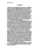
The next advert I looked at was very shocking and distressing. It is of a very young child holding a drug needle with a piece of string tied around his arm above his head is the title “John Donaldson age 23” although the chid is clearly around 1 year old. He is wearing a white nappy, the white usually symbolises innocence and the nappy clearly shows that he is an infant. He seems to be sitting on a kitchen floor but it is hard to tell because the surrounds are very dark the only light that is shining on seems to be coming from a torch. The string is in the child’s hand and he seems to be tightening it. His surroundings are very messy and unhygienic; they look very unsuitable for a very young child.
I found this to be the most distressing of all the adverts because it looks very realistic and the child is the youngest out of the children featured in the campaign. When I looked at the advert I had a felt shocked because I thought the boy had everything to live for and I wanted to intercede to stop the boy taking drugs. This is why I believe this advert is successful because adults will believe that by giving donations they have helped barnados stop young children such as the little boy turning to drugs in the future.
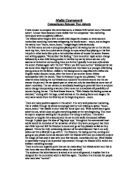
The adverts also have some hidden messages within the language, they give us a feeling that the graphical picture they have shown aren’t the way that things have to happen and that with barnados help the reader can change their future by donating. In every advert there is the same paragraph about the child individual situation and how barnados helps children with similar text, “it was always possible” this implies that it is not a certainty that the child has an unhappy adulthood but that it is a possibility, the word “help” is repeated several times to connote that we as the reader are the only ones that can help barnados to help the children. We are put into a powerful position. There is also a hidden message in the names of the children. Martin is a more modern name and very western rather than an ethnic name. The name Ward is connected with the hospital and being helped to recover from an illness or being in a mental ward were you have psychological problems. In the narrative Martin is a black boy who is preparing to commit suicide by jumping off a building. His name suggests that the scenario could happen to any race and that he needs help via the medical profession or care workers. John is the most common name in Britain this generalises the advert to everyone because it is popular the reader feels like it could happen to anyone, not just a select few. Donaldson means ‘son of Donald’ and we are reminded that this child’s father is not doing his job properly, the text says the boy was battered; his name puts blame on his father, Donald.
The adverts are very similar this helps the audience identify each of the adverts in the campaign. They are young children with names and an age in their twenties above them, the barnados logo and slogan “Giving Children back their future” Both of the boys look illuminated compared with their surroundings which gives them their innocent quality in their picture, they are also clean although their surroundings are dark and dingy, both of the children are isolated, Both paragraphs start with “ it was always possible that”.
The adverts are also different which shows the children’s individual scenario Martin is In a large open space while john is in a closed, confined space and martin looks to be quite older than john.
I believe that both the adverts are shocking and effective but the narrative with john Donaldson was the most effective because of his age, most people like the sight of a newborn baby starting out life, and they would sympathise with such a young child than anyone else but to see one in the circumstances of taking drugs proves very disturbing which would make quite a few people want to take action to stop it which would bring. donation to the company, Overall I believe the adverts were made to shock the audience into donating towards the children.