The overall attentiveness message of the campaign was targeted at a general audience. However the key target audience is to adults in the age range of thirty to fifty-five years with children. Barnardo’s advertisement was intentionally placed in broadsheets and ‘middlebrow’ tabloid newspapers in order to meet there their target audience.
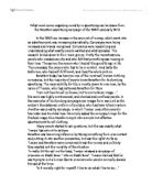
A further analysis of the stolen childhood advertisement (advertisement 1) is listed below.
The key denotations for advertise one are listed below. This advertisement is set in a bedroom. In the bedroom is a brown wooden bed with a white bed throw. The bedroom has a wooden floor (a dark colour). In the distance of the advertisement is a window with the curtains drawn closed. At the end of the bed there is a little girl sitting down, she had an old lady’s face. Behind the little girl is a larger person lying down, also is the advertisement is part of a white doorframe with something black hung up.
The key connotations that I was able to pick out were the following. The large person behind the little girl is lying down, this represents that the larger person is finished with the little girl. The curtains that are drawn closed represent the activity that is taking place is private. The little girls posture shows she is protecting her genitals.
The written code for this advertisement is not such a large font but in white colour to stand out from the background and be more eye-catching. The Barnardo logo and name is the largest text used on the advertisement. At the bottom of the advertisement there is also a caption that is difficult to read.
The visual code for this advertisement is the two people (the little girl and the larger person behind her). These are the main two images that are drawn to your attention when you see this advertisement.
The anchor for this advertisement is the slogan ‘abuse through prostitution steals children’s lives’. This is an anchor due to that fact that this tells you that the advertisement is focusing on child prostitution. Another anchor on this advertisement is the logo at the bottom right hand corner; this is the Barnardo’s official logo and shows that this is a Barnardo’s advertisement.
In this advertisement the girl looks around nine years old and the person behind looks at least in their thirties although it is hard to tell because you can only see the legs. The girl in the foreground is obviously a girl and the person in the back looks male after looking at the leg hair. You can tell that these two people are not two people that would normally meet and socialise. The posture of the little girl in the foreground is indicating that she is covering her genitals, you can see this because she has her hands clenched together and her toes together. The posture of the person behind her is shown to be very relaxed as the person is lying down.
The key technical code for this advertisement is the face as it has been digitally changed from a little girls face, as it should be to an old woman’s face. This advertisement has not been framed, although this advertisement may have been cropped as it only shows a part of the bedroom. The upper body of the larger person in this advertisement has been left out to show the relation of size between the little girl and the person behind. The lighting in this advertisement is from the back of the image. The camera angle is a bit tilted to the right and quiet low as it shows the floor and the bottom of the bed.
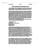
A further analysis of the stolen childhood advertisement (advertisement 2) is listed below.
The key denotations for advertisement two are listed below. This advertisement is set in a public toilet. In the toilets you can see a boys toilet and some pipes. The colour of the floor is black/dark green. The white walls have green marks on them. In the back, in the corner, is a little boy. He is wearing a blue t-shirt, black shorts, black socks and black shoes. In the foreground of the advertisement you can see the lower body of an older person.
The key connotations that I was able to pick out were the following. The larger persons open belt represents his penis. The belt is open quiet long out, this shows his penis is large (too large for the little boy). The hair on the larger persons arm shows the larger person is an older male. The larger person is wearing a red tie which represents he has a professional occupation. The green filth on the wall indicates the activity is unpleasant. The posture of the little boy directs you to think he is protecting his genitals.
The written code for this advertisement is not such a large font but in white colour to stand out from the background and be more eye-catching the Barnardo logo and name is the largest text used on the advertisement. At the bottom of the advertisement there is also a caption that is difficult to read.
The visual code for this advertisement is the two people (the little girl and the larger person behind her). These are the main two images that are drawn to your attention when you see this advertisement.
The anchor for this advertisement is the slogan ‘abuse through prostitution steals children’s lives’. This is an anchor due to that fact that this tells you that the advertisement is focusing on child prostitution. Another anchor on this advertisement is the logo at the bottom right hand corner; this is the Barnardo’s official logo and shows that this is a Barnardo’s advertisement.
In this advertisement the boy looks around nine years old and the larger person looks at least in there thirties although it is hard to tell just by looking at the lower part of there body. The boy in the background is obviously a boy and the person in the foreground is obviously a male after looking at the arm hair. You can tell that these two people are not two people that would normally meet and socialise. The posture of the little boy in the background is indicating that he is covering his genitals, you can see this because he has his hands clenched together. The posture of the person in the foreground looks very strong, you can tell this from the veins in the hand and the posture of the hand itself.
The key technical code for this advertisement is the face as it has been digitally changed from a little boys face to an old man’s face. This advertisement has not been framed, although this advertisement may have been cropped as it only shows a part of the toilet. The upper body of the larger person in this advertisement has been left out to show the relation of size between the little boy and the larger person. The lighting in this advertisement is from the same angle as the camera. The camera angle is straight from the boy as you can see all of the boy and only a part of the larger person in the foreground.
Barnardo’s claim the purpose of the Stolen Childhood campaign is not to raise money but challenge attitudes.
Barnardo’s should show these advertisements because people should be aware of the issue. Another reason why Barnardo’s should show the advertisement due to the fact that it allows people to help. The main reason why the advertisements should be shown is because it is a serious and important issue that cannot be ignored.
On the other hand Barnardo’s shouldn’t be able to display the advertisements because they are extremely unpleasant as they are over exaggerated. The advertisements are also disturbing and upsetting, if a child was to view the advertisements their frame of mind may change. It could also influence the attitude of a child. The advertisements are also implying prejudice to poverty.
To me both these Stolen Childhood advertisements signify a very important issue that people need to be aware of. I think that although this issue is extremely important the advertisements are unpleasantly over exaggerated. As a final opinion I think that Barnardo’s should have advertisements out about child prostitution but just not as unpleasant.