Street Safety – to see if there is sufficient lighting and other security levels which links to vandalism or crime levels.
Pavement Quality – this is linked to street quality but just focuses on pedestrian’s access ways, this enable to show if this is linked to deprivation.
Landscaping Quality – this is relevant to linking housing maintenance levels.
Litter – this is to link together whether if vandalism has any effect with the amount of litter on the streets.
Vandalism – this data was collected to show if there were any relationships between litter level and street safety.
Land Use Mix – this was to see how the land was, e.g. if there was greenery or buildings or a mixture.
Amenities Access – this was collected to allow us to show any links between household income and shops/services available
The data sampled was every 100 paces because this was a sufficient distance to record data, the intervals where neither to close nor far. I would walk 100 paces and stop and record the relevant data and verify it by my partner. This verification was to minimise the potential of in-accuracies this was important because any incorrect results would come up as anomalies and make comparing secondary data invalid giving the wrong conclusion. The data was recorded onto a prepared medium where we only rated the criteria. We walked every 100 paces until we covered all of Sutton Four Oaks Ward using the map supplied to guide us. At the end we repeated the whole processes because we had to double-check our data records in case of any in-corrections. Safety was not an issue because of the area we were in, but just to make sure we were still careful. Also road safety was a priority especially when crossing the main Lichfield Road as traffic is always of high volume so I took utmost care.
Data collection
The six wards were chosen by using a map of the region because we expected to find relationships in these areas (e.g. built up areas), this was a stratified random system were we had to cover the majority of our individual ward. I collected the data at Sutton Four Oaks, Northern part of Sutton Coldfield College and town Centre (Lichfield road, station drive, Wentworth road, brace road, Oaklands road and many other smaller avenues (See Map Below).). I tried my best to collect the data in as sensible and logical way as possible to avoid inaccuracies, although small problems such as houses were being obstructed by huge trees and greenery where overcome by moving closer to the house to obtain as accurate results as possible. The majority of the data collection was recorded in ease and satisfaction and I followed all the routes as planned in a start to end manner, where I did one street at a time and not have to randomly move from one part of the ward to another. The main improvements that I could have made where to repeat the readings, I could have also measures different readings such as noise levels, traffic volume, ratio of greenery to building.
Analysis, interpretation, evaluation
There are various methods of analysing the data but the most suited would be to draw graphs of correlations and/or using the spearman’s rank correlation coefficient.
I can use the crime data and the street safety levels to contrast to contrast between vandalism and litter. Or the values of the house prices in the area and the housing maintenance and landscape quality. A positive correlation would give proportional results and negative values would give inversely proportional results. The best way to approach my hypothesis with the statistical records are to draw tables and log them into order then draw scatter graphs and conclude from them comparing all the time with my hypothesis.
From secondary data supplied from the government statistics website on average house prices and crime offences recorded. I can use this data to draw graphs of correlation and use spearman’s rank to verify my hypothesis.
All secondary data taken from: www.neighbourhood.statistics.gov.uk
Secondary data supplied
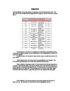
This first table shows the average house prices in the Birmingham district. I will select the data I need for my 6 particular wards and draw a scatter graph of average house prices against housing maintenance (from my primary data.)
I have included data for all Birmingham districts so we can compare other values such as house prices and household income or crime levels on a larger scope.
The data for my 6 wards is below:
Average house prices in (£);
Residential survey results for Housing Maintenance;
Housing Maintenance
The following graph shows a positive correlation meaning that housing maintenance increases as the house price increase. This shows that people who have bought higher valued property tend to keep their housing in good condition whereas people who property value is low do not look after their houses. There is a high result on the Erdington properties, this could be because of an error whilst recording the results or it shows that some lower value property tend to be looked after properly. This graph has proven my hypothesis to be correct.
Spearman’s Rank correlation coefficient
Two things correlate when they vary together. The housing maintenance and the average house prices. The graph shows a Positive correlation - as one variable increases in value so does the other.
I have drawn a scatter graph, but the most precise way to compare several pairs of data is to use a statistical test - this establishes whether the correlation is really significant or if it could have been the result of chance alone.
Spearman’s Rank correlation coefficient is a technique, which can be used to summarise the strength and direction (negative or positive) of a relationship between two variables.
The result will always be between 1 and minus 1.
Calculating the coefficient
- Create a table from your data. Rank the two data sets (highest = rank 1).
- Find the difference between the ranks of each of the pairs (d). Square the differences (d²) and then sum them (x d²).
-
Calculate the coefficient (rs) using the formula provided. The answer will always be between 1.0 (a perfect positive correlation) and -0.1 (a perfect negative correlation).
x d² = 0.9
Spearman’s rank clearly indicates a positive correlation of my hypothesis which was proven in the scatter graph drawn.
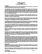
This table shows the crimes recorded by the police in April 1999 and April 2000.
I will use the primary data for vandalism, litter levels and the housing quality to compare with the crime in the 6 wards. I will take the mean result of all the crimes committed.
The graph below shows the street quality against crime levels:
The graph clearly shows that the as street quality increases the level of crimes committed decrease.
The graph below shows the relationship between the level of vandalism and crimes committed.
This graph shows a very weak negative correlation. This shows that vandalism can occur in any place, vandalism is not necessarily linked to crime. The more the vandalism the more the crime. This shows a very different opinion as vandalism is always associated with crime.
From my results I believe that my conclusion is that I have proven my hypothesis to be correct. Street crime in proportional to the amount of vandalism and the housing quality decreases. Also litter levels; tend to decrease as housing designs become more beautiful. My second hypothesis is also correct as the graphs clearly show as house prices in the area increase the better the people maintain their houses and look after their landscape. The primary data is very subjective as it clearly needs a persons opinion, this can be a disadvantage because every human is different and therefore there views are going to be different to others. The primary data can neither be classified as wrong or right as it is of personal opinion whereas secondary data is an objective statistic and is unbiased and has a more solid stand. Therefore the data recorded is of personal opinion and this greatly affects the relationship towards the results such as me saying that house quality is nice in one area and another person views the same area but dislikes the house quality and if we correlate them into a graph against finance levels in an area we will have different results.
My limitations were only the aims which were to explore relationships between 6 wards in the Birmingham area. Overall I believe that this investigation was undertaken in an appropriate and logical manner.