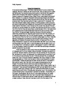
The page is laid out well. It is split into approximately thirds. The top third being the picture, the middle third being the text and image and the last third being the donation form.
There is use of sub-headings. These are there for the readers who just skim read. It gives them a vague idea about what the article is about. The subheadings, along with the images, start to paint the picture quite well. There are three bold subheadings; ‘ You’d pull out your eyelashes too’, ‘ The cost of preventing this agony? Just £1.20.’ and ‘ Please give the gift of sight’. The first subheading is quite dramatic and persuading ‘ You’d out your eyelashes too’, this is again making it personal, bringing the reader into it. The contraction of you would to you’d gives it a more informal feel. Suggesting that you would do this as well. The second sub heading is clear cut and straight to the point. It tells you the answer. The word agony is used, this is a strong word and makes it more dramatic but effective. The use of ‘ Just £1.20’ emphasises the fact that it is easy to help. It is affordable. This makes you feel like you should help. The third subheading invites you to be a benefactor. It is personal. It gives you a chance to feel good about yourself for helping others. It is softened by ‘Please’. It is pleading with you; they are asking you to please help these poor children. This gives you another twinge of guilt and you are more likely to help if you are pleaded with rather than told ‘give the gift’ would not be as effective.
There is not a lot of text. It is nice and easily laid out. It uses a restrained and effective use of emotive language. There are no scientific facts and there is no scientific language being used. There are in fact only two ‘technical’ words in the whole text, the name of the disease, Trachoma and the prevention, Tetracycline. The text is quite informal but it is not too ‘matey’ or friendly so it doesn’t lose the authority or respect needed. It would be out of place to be to colloquial and make jokes as it I not that type of piece. It is emotive language. The text is ‘loose’ it is easy to read, easily ‘accessible’.
In the text there are some quite disturbing and descriptive sentences and facts. ‘ With each blink, the eyelashes scrape against the surface of the eye. The result is agony, then blindness.’ The use of scrape is very effective and is also alliteration. Above this they give the facts about what they have and what is involved in trachoma. This is quit disturbing and makes you feel very sorry for the poor children who are going through this. The descriptions are graphic but not scientific. Later on when they are talking about the girls pulling out their eyelashes they ask ‘ Who wouldn’t?’ this is a rhetorical question not needing an answer, it is just there to make you think about it. It specifies that trachoma is easy to prevent.
‘ The infection can be stopped in its early stages with just a small tube of Tetracycline ointment. The cost of the treatment is just £1.20’. The use of just twice and small emphasis the fact that it doesn’t take much to help. Then it brings the reader into it again. ‘ That means a small donation from you of just £12 would be enough to treat TEN people, stopping their agony and helping to save their sight.’ the use of ‘you’ makes it personal again, specifying that it is you that can help. Then it uses ‘just’ suggesting that it is only a little thing that can help. Ten is in capitals; this is the only time that there has been anything has been in capitals I this article. It is used for effect; it is pushing the fact that you can rid ten people from this agony not just one, ten. Under the last subheading is a little information about the sightsavers society. This is the first time that the actual organisation behind this has been mentioned. It gives some quick information about what they do. It also says that they need ‘ the continued help of those who are prepared to give a little of their money to save the sight of others’. This again shows that the prevention of these terrible eye disorders is down to us, without our help none of this would be able to be rectified. This is another try at making the reader feel that they really need to help.
They then appeal again and soften the imperative with, ‘ Please, if you possibly can…’ this is emotive language and appeals to the readers soft side.
At the bottom of the sheet is the donation form. The form is simple. They use boxes for the donation amounts; the amounts stated are reasonable and affordable. At the top of the form it says ‘ Here is my gift of’… The use of ‘gift’ gives the reader the extra push towards making a donation, it is stating that the money would be a gift and it will help whoever you are sending to.
There are many different ways of sending your donation, which makes it easier for you.
In every dialogue in this form they either start the sentence with ‘Please’ or it is in it somewhere, this shows that they are not demanding money they are asking, please.
The number for the donation hotline is in big bold numbers, which stands out and is easy to read.
Underneath there is the address. The word ‘FREEPOST’ is in capitals as if they are emphasising that the company itself isn’t getting any money its all going to a good cause.
Then comes some short information about the company. This is the first time the company has been mentioned, which shows that the company isn’t the main issue the Trachoma sufferers are. It shows the company as stable and respectful.
In the bottom right hand corner there is a picture of a girl holding a baby looking at you. The words printed in capital bold letters say ‘ THANK-YOU’. Thank-you is there to make the readers feel more happy and good about themselves for donating. The girl in the picture can see clearly meaning that she has been cured. This makes you feel like you can make a difference.
Next to the picture is the logo. It’s shaped like an eye, which is effective. The pupil is the world, which shows it is a worldwide organisation. The name ‘sightsavers’ is alliteration. It is also a lot easier to say and rolls of the tongue more easily than ‘ Royal Commonwealth Society For The Blind’.
In conclusion, this ‘advert’ is very effective. It has good emotional appeal and works on the reader through guilt, pity and then self-satisfaction from helping the poor children. It’s giving you the chance to use your money and do something good with it to help others.