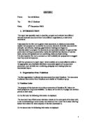
The letter tells me that the customer has a place in the apprenticeship placement and he needs to fill in the application letter
The document is set as a formal letter and is very friendly, and it says “if you have any queries regarding your application please contact me on the above telephone number” I feel that this is very friendly and helpful.
The document has not very many league terms in it as it is aimed at school leavers and they may not understand what some of them mean.
Doc 2
Halifax
I have collected a document from the Halifax building society, it is about company shares from a supermarket called Sainsbury’s, and this document is in the form of a standard letter. It is intended for the shareholder, or the staff member at the supermarket.
The lay out of the letter is very professional, in the top right hand corner of the letter is the logo the “X” with the word “Halifax” Running through it, the logo is in a blue font size “18” this logo is an national logo that can be recognised all over England.
Below the logo is the company address, it is eight lines long and is left aligned, the text is in size “12” an in “Aerial” and in black, it contains the company address and contact details e.g. Phone number, Fax Number and Web Site.
On the top left hand side of the letter is the letter reference, so if you telephone the company regarding the letter they will ask you to give the letter reference and they will know what.
Below that it says “Dates As Postmark” this mean the date the letter was written is not relevant. The “Date as Postmark” is inappropriate to the content of the letter, as the customer would have thrown away the envelop and the date would not have been known for the customer if they wanted to contact the help line.
In the main salutation are about four returns from the company information, and is a public formal greeting, it reads “Dear Plan Member” this is an open greeting and it will be sent to all plan members.
After two returns is the Re, or subject has been put into bold and a larger to stand out from the page, The Re is two lines long.
The main body of text is four paragraphs long with the first paragraph being four lines long; the others are only one line each
All four paragraphs are in font size “12” and style “Times New roman” this is a normal font size and style to use in business letters, the text is “Left Aligned” and in a black colour.
After each paragraph are two returns to give it a professional look and to make it readable.
The first paragraph is four lines long, the paragraph is it telling the customer there is a cheque enclosed and the date the shares where last recorded,
The second paragraph is only half a line long, this paragraph is telling the customer what rate the shares were when they where last checked and is the amount on the cheque per share.
The third paragraph is also only two-thirds line, it is telling the customer that another letter will be sent at the end of the tax year, that that will contain a tax certificate,
The forth and last paragraph is only to inform the customer that if they have any problems that they can telephone a help line on the special telephone number, that is given at the end of the paragraph.
After three returns is the closure, it reads “Yours sincerely” this is inappropriate to the content to the letter, as it is addressed to a “Plan Member” and no name is given, so it should read “Yours faithfully”, only if it had a name like “Mr Smith” then it should read “Yours sincerely”.
There are four returns after the closure to make space for a signature.
After the signature is the name of the person who sent it, then a return, the job role and finally after the last return is the department he works in. The signature is electronic signature; this means the sender didn’t sign it with a pen the just copied it in to document.
The background of the document is plane white,
I think that this letter is a standard letter, and it is more professional that the other three letters I have collected, it has been spaced out well and has clear and correct information for the main body of text,
Doc 3
Nationwide
I have collected a letter from the “Nationwide” building society, the format of this document is in the form on an information letter, and it tells the customer that there new bankcard has been sent to them, it tells the customer other information.
On the right had side of the letter at the top of the page is the company logo,
The logo of the business is a well know icon all around England, the logo is the company name in big white text on a blue background with a red line under it, on the left of the name is the logo, is a small line drawing of a house in white with a blue circle behind it.
Below the logo is the company Address and Contact details, the address and contact details are seven lines long, the address is five lines and the telephone number and website address is only a line each, the text is in size “10” and style “Times New Roman” this is a usual font size and style to use as letter header,
There is one return form the postcode to the telephone number.
On the right hand side of the letter is the customers name and address, the customers address is the line with the last three lines of the company address, it is five lines long and is in font size “12” and style “Times New Roman” it is in a black font,
Just below the Customer address is the reference number so if you telephone the company regarding the letter they will ask you to give the letter reference and they will know what letter you are talking about. The Ref is size “8” in the “Times new roman“ style
Below the Company address in line with the reference is the date, it is in size “10” and style “Times New Roman”
After the Ref and the Date there is a full returns then that main body of text starts
The Salutation reads “Dear MR AS JOHNSON,” this is a private formal greeting, for an individual the customer, it is in font size “12” and in style “Times New Roman,”
The main body of text is only three paragraphs and is font size “10” and style “Times New Roman”,
The first paragraph has two lines, and it opens with a welcome and tells the customer has opened a new account, and tells the customer that a card has been enclosed
The second paragraph tells the customer that the PIN number will be sent separate from the card to reduce fraud,
The final paragraph tells the customer that there is a leaflet enclosed as well and it will inform the customer the best way to keep there card secure,
After the final paragraph is a big blank space, this is because the new bankcard would have been stuck on it, also where there is a barcode, on the fight hand side
At the bottom of the page is a small subsection there are three paragraphs,
The first paragraph is only a short sentence and it reads, “You may use your card to:”
The next paragraph has five lines, each line has been set in to bullet points, each bullet point tells the customer about different ways to use there card, e.g. changing pin at ATM machine, free internet banking
The last paragraph is three lines long, this paragraph is an informational paragraph, it says if you have any queries telephone or go to the website that has been provided at the top of the page.
There are two returns and the closure begins, it has “Yours sincerely”,
Then there are four returns to make space for a signature
Then there is the name of the sender, and the job role and the department they work all on one line, I think this is very unprofessional, but I think they did this because they didn’t have enough space at the end of the document,
In the footer of the document is a small registration outline of which they are registered with.
On the back of the letter is a checklist; it has a bold red title in font size 16, cantered in the middle of the page, below the title on the left is a image of a pencil and the words ”Tick when completed”
The check list has been put in to seven bullet points, each of the points have been numbered, one to seven, and each have a short description of what needs to be done, each about two lines long the after each of the bullet points on the right hand side is a tick box that the customer can tick when they have finished.
There is a statement under the check list, it reads, “this check list is for members only please do not return” this is so the customer does not accidentally return the letter, the statements it centred in the middle of the page, and is in a blue font size “12” style “Aerial”
There is a paragraph below the with a heading “General information” the heading I centred in the middle of the page, its is in a red font colour size “14” style “Aerial”
There is a paragraph below which are two lines long it tells the customer that there are numbers they can call if they have any problems, the text is the colour blue, size 12 and style “Aerial”
After the bullet points are three text boxes, in two of these text boxes are the numbers of the help lines, one for the “FlexAccount” and the other for the “Credit cards”, the “FlexAccount” text box has a telephone number and a web site address, the second text box a two telephone numbers, one for general queries and a second for lost or stolen cards, the final text box is information box, it tells the customer that they can get the “Card Protection Policy” by ringing up a telephone number.
Finally at the very bottom of the page is the company logo company name in big white text on a blue background with a red line under it, on the left of the name is the logo, is a small line drawing of a house in white with a blue circle behind it.
The entire document has been printed on a special paper with a blue water coloured background with a wavy design
Doc 4
Microsoft web site
I have collected a website page of Microsoft website, the website is very plain for the home page,
At the top of the page is the Microsoft title it is the word “Microsoft” in a white text and a blue background, this is not their logo, their logo is a waving flag with four different colour squares, the text is in size 14 and is Italic
To the right of the title is a search bar, above the bar are two command buttons that can send the customer to different pages
Below the title are three lists of links that take you to different pages on the site, there are nine links in the first set, and the title of the links is “Product Families” the second list has the title “Product Resource” and it has eight links, the last list only contains one links, the title reads “Microsoft.com world wide” and only has only that says Countries & Reasons” and link the links are in size “12” and font style “Times New Roman”
On the right hand side of the page is a picture link, the image is of a computer monitor and, and it shows the word “Searching….” On the screen, in the bottom right hand corner of the screen is a link that says “Windows marketplace” there is an icon at the beginning of the text, this is the Microsoft logo, it is the four coloured squares flag. In the top left hand of the Image is a little bit of information, it tells you what to expect when you click on the link,
There are two more image links one the page and each of them takes up half of the bigger link picture, the first one has the image of a calendar, and the second has the image of a dart in a bulls eye both of them have information about the link,
Below the entire picture links are more links and like the list of links on the side these have titles too, there are four sections of links, and each section of links contains at least three links in each, the first three have normal links under the heading, but under the forth, there are six subheading. Each links is in size “12 “ style “Times new roman” and in the colour blue
On the left hand side next to the links is an image link for a lone, when you click on this link you will be taken to another site
At the very bottom of the page is are four more links, these links are for customers to use if they wanted to contact the manager of the business and to subscribed to there newsletter,
Then under the links is a copyright statement,
The overall layout is very bare they’re not a lot of text so if you click on one of the links it may not be what you thought.
Doc 5
Nationwide web site
I have collected a web page from the nation wide building society, the website allows users to access their accounts and open new accounts and access other accounts like Loans, mortgages and investments
The at the top of the WebPages is the company logo, the logo is the company name in big white text on a blue background with a red line under it, on the left of the name is the logo, is a small line drawing of a house in white with a blue circle behind it.
Before the logo is the words “Welcome To…” then the logo, the font is size “18” and Style “Aerial” the colour is dark blue, the text is left aligned, on the right is a small paragraph it tells the customer that you can use the search bar to access more of the website quicker, then below the paragraph is a search box, to the left of the box is the word “Search” then there is a box, and after the box is the word “GO” in a small green circle
There is a small gap and the logo starts a new section, under the logo are nine tabs that contain links, the links send you to different parts of the website.
Below the links is a title that reads “ Internet Banking” the text is font size “18” and Style “Aerial” the colour is dark blue, the text is left aligned, on the right are two links, one reads “Sign-in” the other reads “Register” both links are in size “16” and Style “Aerial” the colour is dark blue, to the left of the text is an arrow pointing towards the text.
Below the links is a paragraph that tells the customer you can select and area of the site you wish to explore, the paragraph is size “14” and style “Aerial” and the colour is black, below the paragraph is a small dropdown box, the box contains different areas of the site and different subsections on each page,
At below the dropdown box is a icon of a circle with the number “1” in side and surrounded by pound signs “£” and the words “Minuet personal loan Promise” with a link as the icon and the word, the words are in size “16” and style “Aerial”
Below the logo is a title “One-Minuet Personal Loan Promise” and below it gives you a brief outline of what the loan is about.
Below the paragraph about the “One Minuet loan” are two blank text boxes above one box has the words “Amount Of Loan(£)” and above the second is “Loan Period (1 to 7 yrs)” then below both boxes is the word “GO” in a small green circle
The website has a purpose to help the customer, and I think that the way it is set out is easy and cleat to use, it has many options,
Doc 6
HSBC Bank website
I have collected a web page from the HSBC Banking the website allows users to access their accounts and open new accounts and access other accounts like Loans, mortgages and investments
At the top of the website is the word “HSBC” and there logo, the logo is a four read triangles and two white triangles set in to a stretched hexagon, The logo of the business is a well know icon all around England and the world, after the logo is there slogan “The World’s Local Bank” the text is in style “Aerial” and in the colour black, but the “HSBC” is in size “16” and the Slogan is in size “12”
Below the logo is a title that reads “Welcome to HSBC Group” the text is in size “14” and style “Aerial” the colour is black, below the title is a smaller title “Countries & Other HSBC Services:” in size “13” and style “Aerial” and below the second title is an icon of a globe then next to the icon is a dropdown list of different countries around the world, from Asia to the USA it also lists different services like Banking accounts, Mortgages Etc. at the end of the dropdown box is the word “GO” in a small green circle.
Below the dropdown box is a title that reads “HSBC Group” the text is size “12” and style “Aerial” below the title are four links, and each link has been given a title that is underlined, the links are in font size “12” and style “Aerial” all the links are in black, each link tells the user different news events that have happened to the company. Below the link title is a small paragraph that gives a brief outline of what happened in each event.
After the news is another title that reads “Internet Banking in your country or territory:” the title is in size “14” and style “Aerial” below the title is the icon of a laptop, next to the icon is a dropdown list, then next to the dropdown box is the word “GO” in a small green circle.
There is another title that reads “HSBC Product and services” The title is in size “14” and style “Aerial”,
Below the Title are four links and each link has been given a title that is underlined, the links are in font size “12” and style “Aerial” all the links are in black, each link tells the user different services the company provides for customers, then below the link is a small paragraph that gives a brief outline that tells the customer what each service is about.
The site is easy to use and the layout is clear for the user to read and use,
Compared to the other two websites the Nationwide website is the better website to use, as it is much clearer and understandable to read.
