The distance from a point where y= -1 (the minimum value) to the nearest point where y=1 (the maximum value) is.
According to the graph BMI, we can see that the point (5; 15.2) represents the minimum value of the graph if it is to resemble the shape of the graph y=sinx. Even though there is a possibility that the graph BMI will extend further than the point (20; 21.65), in which case its maximum point is not shown on the graph BMI, we come to a hypothesis that the point (20; 21.65) represents the maximum value of the graph which is nearest to the point (5; 15.2). The distance from the point (5; 15.2) to the point (20, 21.5) therefore is: 20-5=15.
Base on the theory of horizontal stretch, we can conclude that graph y=sinx is stretched horizontally by a scale factor of. The first approach to our model function is:
y2=sin (x)
The graph of this function is presented below
-
The range of the graph y2=sin (x) is: 1- (-1) = 1+1= 2
The range of the graph BMI is: 21.65-15.2=6.45
Base on the theory of vertical stretching, the graph y2=sin (x) has been stretched parallel to the y-axis by a scale factor of = 3.225
Hence the second approach to the model function is:
y3= 3.225× sin (x)
The graph that represents this function should look like this:
Using the GDC we find out that the maximum point of the graph y3= 3.225× sin(x) is (7.5; 3.225). We take this maximum point into account for further calculations.
The maximum point of the graph BMI is (20; 21.65). Therefore to approach the graph BMI, the graph y3= 3.225× sin(x) is shifted horizontally to the right by: 20-7.5=12.5 places and it is shifted vertically upward: 21.65-3.225=18.425 places.
Therefore we can fully develop our model function:
y1=3.225× sin [(x-12.5)] +18.425
The graph of this function is presented below:
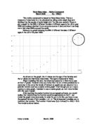
Having developed an equation that is deduced to fit the original graph BMI, it is interesting to see how my model graph fits the points on the original graph BMI as well as to see the differences.
There are clear slight differences between the graph Y1 and the graph BMI. We can see that the graph Y1 is an approximation of the original data. The table below shows how the values of y corresponding with the same values of x vary between the two graphs.
These differences can be down to various factors such as: _The assumptions that we make at the beginning about the maximum and minimum points on the original graph.
_The fact that we round the results of the calculations up, for example: the maximum point of the graph y3= 3.225× sin(x) is (7.4999999995; 3.225) and was rounded up to be (7.5; 3.225). This fact can have a slight effect on how our model can fit the original graph.
Now we will see if technology can help generating a function that models the data better.
It is possible to use the GDC to generate another function that models the data. If we use the regression function of the GDC, the outcome equation for the data would be:
y4=3.12304422×sin (0.21784813x-2.7488445) +18.4294971
Whereas the function y1 can be written as:
y1=3.225× sin [0.2094395102x-2.617993878] +18.425
If we use Autograph to graph y4 and y1 on the original graph BMI, we can see the differences between the two functions and which one fits the data better:
We can see that both functions do not go through all the points of the data. Due to the differences in the parameters (the values of a, b, c, d), the two graphs’ shapes look slightly different but none has the better ability to fit the data than the other.
It is interesting to see how our mathematical graph can be applied to actual situations. If I use my model y1 to estimate the BMI of a 30-year old woman in the US, the result would come out as 16.812 as shown below:
However, the reasonableness of this result is very questionable because the natural BMI data may not follow the rule of this trigonometric graph. The formula for the BMI is:
BMI=weight (kg) ÷ [height (m)] 2
The BMI is not calculated as: BMI=3.225×sin [(ages-12.5)] +18.425
Therefore what the graph represents here is merely a point on the curve which was found based on mathematical calculations, but not the natural tendency of the BMI for females in the US. Therefore the answer is reasonable in the mathematical sense, but it can hardly be strictly applied to the real situation.
Now we will see if our model also fits the data of another situation.
This table below gives the data of the mean Body Mass Index for adolescent girls of different ages in Lebanon.
These are the data points presented on a graph:
It is clear from the graph below that my model does not fit this data:
This graph show that the data does not follow the rule of my model function and it is difficult to generate a function that models the behaviour of the BMI data in this case as its shape hardly resemble any particular type of function.
Having said that, it is interesting to see some other BMI-for-age percentiles graphs that look similar to our original data BMI.
This is the data on the BMI related to ages for girls from the ages of 2 to 20 years.
SOURCE: Developed by the National Center for Health Statistics in collaboration with the National Center for Chronic Disease Prevention and Health Promotion (2000).
If we go through the process of transformation again, we could also develop functions that model the behaviours of these graphs. However, it is unlikely that we can use the graph to estimate further feature of the data.
In conclusion, mathematical models in some cases can hardly be used to explore the natural tendency of certain real situations; in this case the BMI data. We can generate functions that model some behaviour of some data, but the actual data will not follow the rule of mathematical graphs. This fact is most obvious in the case of the BMI data of the females in Lebanon, in which it is very difficult to develop a function that fits the data well.
Bibliography:
http://www.health.vic.gov.au/childhealthrecord/growth_details/chart_girls4.htm