Example of an Exponential Graph Underneath
The graph above shows how the exponential line of best fit should look in the following graphs.
DATA OBTAINED
Average Car Price for each year
I used standard deviation to explain the average spread of the values from the mean for each year.
Example of SD
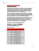
ACTUAL MERCEDES DATA ANALYSED IN THE FORM OF STANDARD DEVIATION
The results gathered from the standard deviation information show that the spread of all the plotted figures is fairly small. This is also the case for the fifth year in the Mercedes car data, which means that even though the results are out of line, the plotted data is close together within a small price range.
Analysis
As seen in the data table above, all the Mercedes C-Class cars that are five years old seem to be out of line compared to the expected pattern (they are highlighted in the table). The graph above shows these anomalous results. They could be due to one of the following:
- Features which have been added to the car by previous owners.
- There could have been a limited edition/selected batch of this type of car made that year.
-
Due to the rate of inflation, as all the cars that are five years old are priced higher than would be expected according to the trend. This is by far the most likely reason.
The exponential decrease of the Mercedes C-Class was discovered by examining this data. When anaIysing the data obtained, the average price drop after the initial year of sales was found to be from £32k to £22.5k, a drop of £9,500 (30%) compared to the original price. In the second year, the car price dropped by another £8,000 (a 35% decrease in value). Then, the rate of decrease, in terms of value, slows down, levelling out. This fits the theory of exponential devaluation indicated by the “line of best fit”.
One of the drawbacks in analysing the data was that the averages were taken for each year. This type of average, i.e. the mean, suffers from distortion based on single anomalous or outlying values. Under the circumstances a different type of average e.g. the median may have been more appropriate. One point to make here is that the mean price for the 5-year-old vehicles was obtained from four sample values. If this year’s average had been discounted from the plotted data, a much truer analysis would have been possible. Therefore, when I marked in the exponential curve “line of best fit”, I discarded the anomalous result and drew the expected trend of devaluation for the car.
Also, the average for the 4th year’s data is likely to be more accurate than the 8th year’s, because it is an average of 14 pieces of information whereas, for the 8th year, it is an average of only three pieces of data. In general, the greater the range of data, the more accurate the constructed picture can be.
The same experiments were carried out on the Volkswagen Golf GTI Hatchback to confirm the results of the hypothesis further:
Average car Prices for each year and Standard Deviation
Analysis
The use of standard deviation for the results from the VW Golf GTI was to show the average spread of the values in each year range. The smaller the value, the closer the results and, as seen in both the second table and graph, the annual values are quite close to their respective means. All results for the standard deviation are below £345.
The points on both the graphs indicate that an exponential relationship exists between these two factors because they would not correlate well enough to fit a straight “line of best fit”. The VW Golf GTI holds its price well compared to the Mercedes as, in the first year its price dropped from £16,000 to £13,000 (a 19% decrease). In the second year, the car price dropped by a further £2,200 (a 17% decrease in value). In the third year the Golf GTI loses £1420, a vast difference compared to the first two annual decreases. This then seems to level out and the decrease between the 7th and 8th year falls to £284. As you can see in the table of averages, the Golf GTI holds its price better in percentage terms than the Mercedes C-Class. This may be due to the size of the car, the target group of the car, speed of the car etc.
Although both the Mercedes C-Class and the VW Golf’s values decrease exponentially, there is a large difference in the uses of these cars. The price of the Volkswagen Golf GTI starts at around £16,000 because this would be suited to the needs of a small family, young singles, etc. and would be very useful in and around city centres. On the other hand, the Mercedes C-Class Saloon range would be aimed at high-powered business executives, as they need to give a good impression when meeting with clients and its price would be within their substantial salaries.
Conclusion
The first graph shows us that there is a definite correlation between the age of a Mercedes C-Class and the price of the car. The second graph, which shows the average price of a Mercedes against its age, comfirms that there is a strong exponential correlation. Therefore, this proves that the hypothesis made initially is correct.
The results shown above would have been more accurate if the same number of data points were available in each ‘year group’, and this would give a more accurate mean. This was noticed and the data for the VW Golf GTI was adjusted accordingly to see if there was any significant data. There may well have been, but more data points would have to be available for each year range.
The results for the VW Golf GTI show that, with fewer data points for each range, the standard deviation tends to be lower. This implies greater accuracy, but a greater range of points may show that this is not the case. On the other hand, the limitations of the data would improve the level of accuracy.
Also, all the data used is from two particular types of newspaper/magazine. Not everyone who has a Mercedes C-Class to sell decides to advertise in these particular publications. Therefore, if I were to repeat the experiment or develop it further, I would have to take into consideration data from other newspapers/magazines.
Using spearman’s rank may produce a more accurate line of best fit. If there was more time to conduct this experiment, I would have investigated this area.