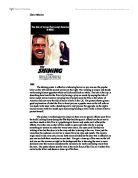
First impressions from the poster are that the film is going to be a thriller genre. Once you look in more detail at the poster you can see that there are different images that have been used to create the feel that the film is going to be of the above genre. Firstly the title ‘Halloween Resurrection’ shows that it is going to be a thriller because you usually associate Halloween with ghosts and rising people from the dead, also the word resurrection is associated with the rising of dead people. Another image that shows the thriller side is the use of the knife which blood on the tip of it, also the way that the knife has had a sparkle put on it shows that it is sharp and it makes you feel as though it will be used for evil. The use of the Michael Myers mask as the background image shows that it is going to be a thriller, but people who have seen the other films in the Halloween series will pick up on this up. If you haven’t seen any of the other Halloween films then you will not realise who the person is in the background but you should be able to realise that he seems evil because you are only able to see half of his as the other half is in shadow and the sockets of his eyes are completely black. The poster does conform your expectations of the genre because it shows many images that you can associate to other thriller films.
The way that the sentence ‘Evil finds its way home’ is placed across the face in the background makes you think that maybe this face is in fact the face of evil, and it is his home where he is planning on going back to. Also the image of the knife with the blood on it shows that there will be death within the film and that is more than likely the way that people are going to be killed. The enigma which is used to bring people into watch the film is the face in the background because people are going to want to know who’s face it is and why it is being kept in the dark. The review given to the film that has been printed on the poster again ties in with the thriller genre as it says that the film is ‘more gore-splattering than you might expect’.
The image used as the background of the poster is an extreme close-up on a very pale face. The camera has been positioned face-to-camera on a slight upward tilt. The light has been angled so as though only half of the face is lit up and the other half is in the shadows, the side that has been lit up is the side with the writing running across the cheek. The other stars in the film are collaged together to fit inside the blade of the knife, it has been done in this way because all these people are going to be victims of the killer. The order, which they have been put in the blade could symbolise the order of which they are going to be murdered. The way that the image of Tyra Banks isn’t only a close up of her face like the other stars is used to try to bring in an audience of males because it shows her cleavage. The further back the images are in the knife blade the more shadowing there is on their faces, the face at the front has hardly any shadowing whereas the face at the very back has half of her face in shadow.
The faces within the knife blade all have serious expressions with a slight look of anxiety and fear, this could show that they are going to be victims of the killer or they know something about the killings. The face in the background is expressionless. The main framing is open but within that there is the framing of the knife blade, which is a closed frame. The image in the background is slightly out of focus and this helps to bring the knife into focus in the foreground.
In the review written on the page there is the use of hyperbole, the way that the word hugely has been used to describe how entertaining it is has been put there to emphasise it. There is a range of ages of the people who star in this film, the people who we can see from the film range from teenagers to 30’s. There is also an even range of gender, in the majority of films males have more roles than women do but from the people you can see on the poster there is an even range.
The images used within the poster are used in a typical manner to show that the film is going to be of the thriller. The use of the mysterious person in the background and then the knife blade in the foreground with all the other stars from the film collaged into it also help build tension about the film. The film poster was directed mainly towards people who are over 15 and into thriller films. It is also directed towards people who are fans of films from the rest of the Halloween series, these people are aimed at by the use of the Michael Myers face in the background. I think that the poster was also successful because it builds tension about the film and makes people want to go and see what is actually going to happen.