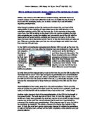
Zone 2 Field Sketch
These houses are as cheap as [possible, designed for students who go to King Alfred’s College. The picture shows this clearly, as the buildings are made entirely of brick with corrugated iron roofs and little windows. There are no decorative extras to make them look nice and they only have a few square meters of garden. These are found in the inner suburb.
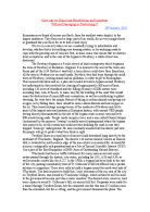
Zone 3 Field Sketch
This picture is of a building in the CBD. It shows the area is very well kept, with large expensive buildings. The building itself is a department store, which makes sense as the only buildings on the CBD are ones that pay for themselves. The area is also very crowded and noisy, which might lead you to expect more pollution, but the area is surprisingly tidy.
Zone 4 Field Sketch
There are two pictures here, one of the housing and one of the industrial estates. This is visual evidence for the poor score it got in the EQAs. The building is old and possibly even condemned in its bad condition. It would still be very expensive, however, due to its location near the CBD. The industrial estate does not look well cared for. It is very simple in design and very overgrown. The windows are dirty and it is nearly deserted.
Zone 1
The radar diagram, which I used to depict the environmental quality assessment, or EQA, shows that it scored very highly. Two of the attributes, high cost housing and level paving, scored 100%, whilst the majority scored 80%, including the degree of freshness, houses in good condition, good light, cleanliness and little street furniture. The other figures, noise level and lots of landscaping, scored a respectable 60%. Most of these scores can be explained by the position of this Zone in the city. Poor noise level can be accounted for by the fact that the survey was carried out next to a main road (Romsey Road) during rush hour. The high-cost housing results can be related to Burgess’s model, in which the most expensive land is in the CBD and the cheapest is on the rural fringe. Because the land is cheaper you can build bigger houses on that land.
Zone 2
You can see at once that this zone has not scored as well as Zone 1, as the shaded area is far smaller. This would have been because the location is nearer the city centre, in the inner suburbs. Two attributes, few parked cars and lots of landscaping, scored 100%. The ‘few parked cars attribute may have scored highly as a result of the time, about 10.30am, when most people were going to work. There was only one score at 80%, which was the ‘light level’ attribute. All the rest scored low, between 40 – 60%. Things such as the ‘well cared for housing’ could have scored low because the housing would cost too much for the people to repair. The attribute that scored lowest was the noise level, with 20%. This was probably because the survey was conducted on a main road into the city
during rush hour. This could also have been the cause of the low score for ‘freshness’.
Zone 3
This zone has also scored low compared to Zone 1 and even worse than site 2. This is because it is extremely near the city centre, on the main high street. It scored very well in three areas by getting 100% in attributes of ‘well cared-for housing’, ‘few parked cars’ and ‘level pavement’. There were also a lot of street furniture and noise in the area. Most of this can be related to it being a pedestrianised area. The traffic and pedestrian counts for this zone support this. The ‘well cared-for housing also has a good explanation: this is that there is little or no housing here, as the entire street is full of shops, as you can see from the field sketch for this zone.
Zone 4
As Zone 4 is approximately the same distance from the CBD, we could expect the results to be more or less equal. When comparing their two graphs, both are very similar in size and shape. Most of the values are within one mark of Zone 2. The main difference is that the pavement is of a better quality, as well as the housing. They are probably higher as this site is also on the urban fringe, yet about the same distance from the CBD as Zone 2. These results can be related to both Burgess’s and Hoyt’s models. Burgess’s theory states that places of equal distance from the CBD will be similar, and Hoyt’s says that development will occur more along major transport routes. Zone 4 was a part of the city jutting out to meet the M3 motorway. As expected, this site also scored poorly, only scoring 100% in ‘no parked cars’. Things such as noise level and cleanliness can also be explained, as Zone 4 is in part of the industrial zone of Winchester, with lots of garages and craft works etc.
EQA Conclusion
The EQA results can be used to partially answer Aim 1: How and why does Winchester change as you move from the rural urban fringe to the city centre. The EQA results show us that Winchester’s environmental quality declines as you move towards the centre. On the rural urban fringe, site 1, all the houses are big, expensive and well cared-for. Because people of great affluence live here, they keep their property tidy and can afford top quality products, such as brickweave drives. As we move into the inner suburbs, Zone 2, we can see a tremendous drop in the quality of housing and cleanliness. The terraced housing here was in a state of disrepair, because the land on which it is built is expensive and the owners could not afford to repair things like windowsills, doors etc. The CBD had no housing, only shops. All the people walking around were the cause of the noise and the litter. The buildings were a top priority to maintain in order to attract more customers, even though the land cost so much there. That’s why there is no housing there, as only buildings that help pay for themselves can afford to be there. The last zone was in the industrial section of Winchester, with very little housing. All of the garages, carpenters and metallurgists here have made it a very untidy, unclean and noisy place.
Overall this shows us that where the rich live the conditions are very good and, as the land prices go up, the condition of the housing goes down, apart from the shops in the CBD.
Traffic Count for Zone 1
This is a traffic graph for Zone 1. It shows what types of vehicle were going to and from the city centre during a two minute period, from 9.50am until 9.52am. The largest number of vehicles by far was cars, which was most likely to be commuters travelling to work. The numbers were high because the traffic survey was conducted during the rush hour, although it was constricted by the traffic lights we were directly next to. The graph clearly shows that the number of vehicles travelling in and out were almost equal, with 31 vehicles going in and 32 going out. They were probably balanced due to people commuting to work in smaller settlements, such as Twyford.
Traffic Count for Zone 2
The traffic survey again shows that the majority of cars were moving to the city centre, but there were also a few vans and lorries heading out. These could have been delivering products to places on the rural urban fringe. Three of the lorries were carrying building materials, which could have been delivered to a new development site at the rural urban fringe. The number of pedestrians was still very low, with only one going in. This was still done in the rush hour, during the period from 10.37 until 10.39am.
Traffic Count for Zone 3
This site was the High Street in Winchester. The reason why so few vehicles were driven through is that it is a pedestrianised zone. The vehicle count was conducted at the bottom of the street, just beyond the cathedral. Since Zone 3 covers the entire street, I did three separate pedestrian counts at Jewry Street, the Butter Cross and Abbey Gardens (see the land use map for Zone 3 for exact co-ordinates). They showed that the majority of people were heading to the centre, and were therefore probably shoppers or tourists.
Traffic Count for Zone 4
This traffic count shows that there were more vehicles heading away from the city centre by three cars. However, there were two buses of people heading inwards. As in the EQAs, this zone matches Zone 2 very equally. Only two pedestrians passed during the two minutes, with one going each way. This may be because it was lunch time, as the count was done from 13.26 until 13.28.
Conclusion for Traffic Survey
These traffic surveys show us that there were far more vehicles than pedestrians in the suburbs of Winchester and far more pedestrians than vehicles in the centre. Relating back to Aim 1: How and why does Winchester change as you move from the urban rural fringe to the city centre. This shows us that the traffic thins out as you get to the city centre, although that could have had something to do with the timing of the surveys as I started in the first zone during the rush hour and finished the last zone around lunch time. The graphs also give us a very clear idea of what types of vehicle are travelling around, and clearly show that cars are by far the most common, followed by slightly larger vans and lorries.
Land Use Survey for Zone 1
This map shows that there is a great deal of housing in the outer suburbs. This is also supported by Burgess’s model, where all the expensive, well cared-for housing is in the edge of the settlement. The flats in the top right corner are developing into even more housing, to add to the very large quantity of terraced housing there is. The only other types of buildings on the map are small businesses, proving that the outer suburbs are really dominated by housing.
Land Use Survey for Zone 2
As we move further into the city, into the inner suburbs, you can see immediately that there is far less housing than in the outer suburbs. This area still has a lot of housing in it, mainly terraced and a small amount of detached housing. There are also far more businesses than in Zone 1. Examples of the latter include a garden centre and two pubs. There is also Winchester Prison and the Hampshire County Council Headquarters. The land use is turning less towards housing and more towards small businesses and public services.
Land Use Survey for Zone 3
As you can see from the map, the High Street is given up completely to shops. These consist mainly of specialist shops, personal services and the odd department store. There is no housing at all, as the land rent would be tremendously high for land so near the CBD. Only buildings that make a profit can really afford positions here. As it is a pedestrianised zone, there are very few vehicles and hundreds of shoppers here. None of the land has been wasted on parking space.
Land Use Survey for Zone 4
We could expect these results to be the same as those for Zone 2, according to Burgess’s theory, as they are approximately the same distance from the CBD. As you can see, they do look something alike. There is still not a lot of housing, but what there is is terraced. As in Zone 2, there is far more in the way of small businesses, such as estate agents and cafes. Some of the businesses there were construction-type companies, such as metallurgists and carpenters, as this is what could be called the industrial section of the city.
Land Use Survey Conclusion
This data can give us a very good picture of what Winchester’s buildings are used for as you move out of the city centre. At Zone 1, in the outer suburbs, nearly all the land is being used for housing, large and of high quality. There were very few businesses here. As you move further into the city, to the inner suburbs, or Zone 2, we can see that there is a dramatic drop in the amount of housing and a big increase in the number of small businesses and public buildings. In the CBD, Zone 3, there is no housing at all and the entire street is dedicated to shops, restaurants and the odd department store towards the bottom end. As you move back out of the CBD, to Zone 4, there is an increase in housing again, much like in Zone 2.
Relating back to my original aim - How and why does Winchester change as you move from the rural urban fringe to the city centre - this shows us that we can conclude that the outer suburbs are devoted to housing, the inner suburbs are used for both housing and small businesses, and the CBD is dominated by shops of all kinds.
The Proposed Sites
My second aim was: How and where will Winchester change in the future.
This basically considers where new housing will be built in the future, in and around Winchester. To answer this, I collected data from three sites I chose myself to see which would make the best spot for a housing estate. These three zones were Sarum Golf Course, the old bus bay and a field in the outskirts of a village near Winchester.
Sarum Golf Course:
This site is directly on the rural urban fringe and is literally the barrier between the city and the countryside. I chose this as it is on the rural urban fringe and different from the other sites. The advantages of this site include: lots of space; cheap land; proximity to building companies in the city; it would provide high quality, large homes. The disadvantages include: very poor road access; it would suffer from NIMBY (Not In My Back Yard) objections; if the land in question forms part of the greenbelt, then it would be very difficult to get planning permission.
The Old Bus Bay:
This site is very near the CBD, on the edge of the High Street. I chose it because it is a brownfield site and the land is not being put to good use. The advantages of the site include: it being a brownfield site; space for lots of hosing flats to be built; a very convenient position for its residents. The disadvantages include: the land would be very expensive; building would be difficult as it is in the pedestrianised zone; the existing building in question is in very bad condition; the housing may turn out to be expensive even if they are small, due to their location.
A Field in Swanmore:
I chose this site because it is part of a dormitory settlement, away from the major settlement. The advantages of this sit include: It is a very attractive place to live due to the surrounding countryside; there are vast amount of space; it would probably help the village shops by bringing more customers. The disadvantages include: it may be part of the greenbelt, thus very hard to get planning permission; there may be more NIMBY protests from local residents; it would be very difficult to get the required building materials down to the site through the string of small lanes that provide bad access.
Proposed Site 1 : Field Sketch
This picture shows us that the site has loads of space and demonstrates why it got such a good mark in its EQA. The area currently has little housing in it, but the area is still very posh, much like Zone 1. The land would be cheaper than in the CBD as it is right on the rural urban fringe. As you can see from the second picture, the access is extremely poor. The lane is narrow and needs resurfacing in parts. This accounts for the low number of vehicles counted in its vehicle survey.
Proposed Site 2 : Field Sketch
From these two pictures it is possible to surmise that the area is not tidy at all, as shown by its EQA. The first picture shows that the buildings, which are low-rise, are highly expensive and grubby. Despite the bad appearance it has, you can also see a security camera at the top, showing that it is well protected. The second picture shows that the access is poor, especially since it is in a pedestrianised zone.
Proposed Site 3 ; Field Sketch
As you can see clearly from these two pictures, this site also has vast amounts of space. The first picture shows the field the houses would be built on, demonstrating that it is flat enough and large enough for many large houses. The second picture is of the road leading to the field. It is not a track, but it is still very narrow and in bad condition. I doubt if the road surface would survive lots of heavy building lorries.
Proposed Site 1
This proposed site for housing scored very highly, seven attributes scoring 100%. These were: freshness; high cost housing; well cared-for housing; light levels; cleanliness; lots of landscaping and noise levels. The other three categories all scored very respectable results. This is mainly due to their location on the very edge of the rural urban fringe. This shows that the site would be well suited for housebuilding, but that it might be difficult to get planning permission if it is part of the greenbelt.
Proposed Site 2
This site is extremely near Zone 3. It scored very low in general, only getting 80% for level paving and 100% for parked cars. This is because the paving throughout the city centre is of very good quality, this being no exception. There were no parked cars, literally because there was nowhere for them to park. The EQA shows that it would be quite a bad place to build housing, but, as it is a brownfield site, it would have an edge over other places in the city.
Proposed Site 3
This site is a large field in the village of Swanmore. As you can see from the EQA, it scored very highly, getting 100% in eight of the ten attributes. The only categories that scored below 100% were: lots of landscaping, scoring 60% because this obviously isn’t appropriate in a field; level paving, which got only 20% because there isn’t actually any paving there except for the road, which has grass banks next to it. This shows that it would be very good for housing development, but that actually building the houses there might be difficult.
Proposed Site EQA Conclusion
The EQAs show that all three of the sites have their advantages and disadvantages.
Site 1 would be perfect, but it would be very difficult to get planning permission due to its location on the rural urban fringe. It scored very well in total and has all the right qualities to create pleasant housing, such as its freshness and light levels.
Site 2 scored very badly in general, but it may be the best place due to its being a brownfield site near the city centre.
Site 3 would also be a very good site, and the EQA reflects this well. It would be good for housing, but it might create a dormitory settlement as there are no really big shops or other businesses in the immediate area. It would also be very difficult to get planning permission for a development of new houses in the middle of a field. Although the site is near perfect therefore, development could be blocked by local authority objections.
This shows that sites 1 and 3 are ideal locations for new housing, but that it would be too difficult to get planning permission due to their locations. Site 2 scored very badly, yet, as it is a brownfield site, it could get planning permission more easily and could therefore be the ideal site for development.
Traffic Count for Proposed Site 1
These traffic surveys were conducted on a different day to all the others, on Tuesday, 1st July. I did the count from 15:40 until 15:42. Again, there were very few vehicles, only seven cars and one van. This was probably because the road was of poor quality and provided very bad access. There were five pedestrians in total, three going in and two out. They may have been people leaving Kings’ School late.
Traffic Count for Proposed Site 2
As proposed Site 2 is very near Zone 3, we could expect their traffic counts to be somewhat similar. The few vehicle scan again be explained by the fact that it is in a pedestrianised zone. Four buses did go in though, which is far more for than any other site. This is because the site incorporates an old bus bay, which they were returning to. There were a large number of pedestrians, as expected, as the High Street is always busy during the afternoon. The count was conducted between 16:27 and 16:29.
Traffic Count for Proposed Site 3
This site is a field with a lane alongside it, which provides extremely bad access and is probably why so few vehicles passed. I do not think the lane would be capable of supporting anything larger than a van. There were also three bikes and two pedestrians, which is most likely because it is a popular place to walk, cycle, walk dogs etc. I conducted the survey from 17:20 until 17:22.
Conclusion for Proposed Site Traffic Survey
The traffic survey on these sites allowed me to see what types of vehicle usually travelled down the roads leading to them. There may have been hardly any vehicles at any of the three sites but, as in the previous surveys, cars are still the most predominant. The vehicle counts may have been so low because of all the sites having very bad access. Proposed Site 1 has only a tiny lane leading to it, meaning that bigger vehicles could get stuck going to a development project there. At Site 2, the area is pedestrianised, meaning that it would be very hard to transport materials there unless parts of the High Street were blocked off. This would cause mass chaos for all the shoppers and probably would not be allowed. At Proposed Site 3, instead of having one small lane leading to it there is a string of narrow, tiny lanes leading to it. This definitely accounts for the lack of vehicles at this site.
Out of all of these, the best site in terms of traffic for the building of new houses would have to be either Proposed Sites 1 or 2. They may have poor access, but their access is still better than that of Site 3.
Conclusion
All of the data I have gathered can now be used to answer Aim 1. The field sketches basically show us the buildings, but they also show us what their condition is. They show that the buildings are big and posh on the outskirts and get smaller and more the worse for wear as you move towards the city centre. The EQAs show us how the general condition of the land changes. They show us that the quality deteriorates as you move further into the city and that they start to recover as you go out the other side. The traffic surveys show us that the further away from the centre you are, the more vehicles there are, and vice versa for pedestrians. The land use maps show us that the outer suburbs are nearly all housing, the inner suburbs have nearly equal amounts of housing and social service buildings, and that the CBD, as expected, is completely full of shops and has no housing. When you go out the other side of the city centre, you again have half housing, half businesses.
I have also gathered data from my three proposed site to answer Aim 2. After looking at all the results, it is clear to see that Proposed Sites 1 and 3 have the best statistics, space and location and are overall the best sites. However, they have the problem of obtaining planning permission on the rural urban fringe and in the greenbelt. Because of this, I conclude that the best place to build new housing would be on Proposed Site 2, as it is a brownfield site for which planning permission would be much easier to obtain. You wouldn’t be able to build cheap housing here because of its location, so it would probably be economically best to build luxury flats or large houses.
Evaluation
There are several factors of my data collection that I do not believe are completely accurate. The first and most important thing would be that doing the same teats at different times of the day would give unfair answers. Ideally I would have to do all the traffic counts, for example, on the same day at the same time, because the traffic flows might be completely different on a Monday compared to a Tuesday.
Another problem I found was counting pedestrians in the CBD. Because of the large numbers it would easily have been possible to miss one person walking behind another through human error. I could have countered this by taping the two minutes so that I could then look back at it and count them as many times as necessary.
If I got any results wrong, then there is a great chance that something in my conclusion could be wrong as well. If I had mistaken one type of building for another during the land use surveys, I would have ended up with the wrong majority of building type, throwing my conclusions into inaccuracy.
If I had to do this study again, there would be a few things I would change, apart from those mentioned above. I would use more sites at various points throughout the city, as this would hopefully give me more accurate results to work with. I would also conduct a study at a dormitory settlement near Winchester, such as Twyford, to see how it compares.
I also think I could have investigated more topics, such as land value and building value throughout the city. This would then allow me to be able to see how prices should be far greater in the centre than at the outskirts, proving the theory about large houses being built on the cheap land.