As Stratified sampling is a form of random sampling, I must use a random number generator to acquire the numbers of the students to collect data off of. To do this I use the =RAND() function in excel and multiply the numbers by 1183 to get numbers between 0 and 1183, the number of students in the school. This method is not guaranteed to collect all of the data required in each group, if this happens then I will just keep generating random numbers until it does.
Prediction 1
I believe that the taller the person, the heavier they will be. I believe that on an XY Scatter graph, a strong positive correlation will be seen supporting this prediction. I believe this because it is fairly simple physics that, the bigger you are the heavier you will be.
Prediction 2
I believe that girls will be shorter than boys across all year groups. This correlation may not be as strong as the previous prediction but I do believe that it will be apparent.
The Data
Average Heights (m)
Average Weights (kg)
Height Groups (m)
Weight Groups (kg)
Graph 1: Height to Weight
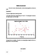
Firstly, let’s just get an overall image of the correlation between height and weight. To do this I will use an XY scatter diagram with weight as the X axis and height as the Y axis. I am using this graph because it is the best for seeing correlations between data, especially with large amounts of information. The fact that scatter diagrams can hold large amounts of data as opposed to multiple bar charts which can only hold limited data, is the reason for the choice of this graph.
As can be seen in the graph, there is definitely a relation between height and weight. As the trendline (line of best fit) shows, this relation shows a strong positive correlation. That is to say that, as I predicted in my hypothesis; the higher the person, the heavier they are.
I have located only three anomalous points. These have been highlighted in blue. Anomalous points are entries in data which don’t follow the normal path or flow of the rest of the data. The three anomalous points in this graph may have been caused by incorrectly entered data, or possibly an inaccurate reading. The point circled in pink is a negligible entry. The reason I have classed this entry as negligible and not anomalous is purely because I know somebody that weighs about 110k.
This proves that as I predicted, the taller a person is, the heavier they are.
Graph 2: Height to Gender
This particular graph aims to prove my second prediction that girls are shorter than boys. For this I am using a multiple bar chart with all the year groups comparing each others gender groups. This is very effective because it gives an easy-to-view, visual reference of the difference.
Again this graph proves instantly that my hypothesis is correct. As the red bar shows, males are generally taller than the females of the year. This is true for all of the year groups apart from year seven in ehich the boys are on average 1 centimetre shorter.
There is one very obvious anomaly on the girls data series and as can be seen, that is in year eleven. The reason this is an anomaly is because this graph is suggesting that girls shrink when they reach a certain age!!! And as we know, people don’t just shrink.
So again this graph shows us that girls are generally shorter than boys.
Conclusions
- I believe that my first prediction of “taller the person, the heavier they will be” is correct. As can be seen in graph 1, there is an incredibly strong relationship between the height and weight of a person. The trendline generated by Microsoft Excel backs this fact and shows that the taller the person, the heavier they are. There were only three anomalies in this data, which means that the variation in the data is fairly minimal.
2. I also believe that my second hypothesis of “I believe that girls will be shorter than boys across all year groups.” Is true due, mainly to my graph. The bars show that girls are shorter than boys (except for in year seven) and that girls apparently shrink in year eleven. This anomaly in year eleven is due to the sample size for year eleven only being 5!!!
Extended Research
This Chart simply shows the proportion of the heights in the school. From this I can see that over half of the school, including all years is between 1.5 and 1.75 metres tall. From the above graphs I can see that most of the people in this group are between years 8 and 10
The below radial diagram again shows the difference between girls and boys height. As above it shows that boys are generally taller than girls.