Before any other diagrams are drawn I would like to draw some pie charts to represent the information itself. Then I will see if any correlation is present in the data by using scatter diagrams, and finally I will look at the dispersal of data using box plot graphs. To further help show and clarify the spread of the data I will use standard deviation. The diagrams, graphs and calculations will all help to add to my conclusions and test the ideas I presented at the beginning of the investigation.
Using and processing the data
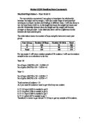
Above, is the data I am going to use to analyse my hypothesis. The year group, surname, forename, average hours of television seen per week and the weight of each student are all displayed in the table. From the original population of 370 students, 170 were year 11 and 200 were year 10. I worked out how to achieve my intended random stratified sample of 60 by using the following calculations…
Year 10 = 200 x 60 = 32
370
Year 11 = 170 x 60 = 28
370
Having checked the data I have found that all of the values I have, make sense. This means that there are no anomalies amongst the data that could seriously hinder my final results. I will start to display my data by drawing up two pie charts for both year groups. Later on, I will go on to look at the mean average and the median average of the two year groups this will then allow me to look t the inter-quartile range, how spread out my results are and it will allow me to start looking at the differences between the results gained for both year 10 and year 11. I will demonstrate the spread of results using four box plot graph and standard deviation. Having completed this, I will go onto drawing a scatter diagram, which will allow an overall comparison of results.
Presenting and criticising the data from each year group
Year 10
Year 11
The modal group for year 10 is 10 to 15 hours, but the modal group for year 11 is 20 to 25 hours. This could represent a very strong difference but the class boundaries chosen have only been chosen because they were simple.
Angles
Year 10
Year 11
Pie-charts
Weight Pie Charts
Year 10
Year 11
The mode for year 10 is 55 to 60 and the mode for year 11 is 50 to 55. This again shows a higher mode for year eleven results than year ten results. I cannot whole-heartedly back this conclusion as the class boundaries were used for there simplicity, but there is definitely a at least vague correlation between the results I got for average time of television watched per week and the weight. There is definitely a difference between the results produced for each year group.
Angles
Year 10
Year 11
#
Both Year Groups Pie chart for hours of television
Angles
Both Year Groups Pie chart for Weight (kg)
Angles
Any conclusions so far…
These tables and pie charts show that the average time spent watching television in hours per week is between 0 hours and 50 hours. The mode for the year 10’s is from 15 hours to 20 hours and for the year 11’s the mode is slightly higher and lies between 20 hours and 25 hours. This could be an indication that year 11’s watch slightly more television than year 10’s however this will have to be checked with the mean and median averages. The overall mode for hours of television is either 10 to 15 hours or 20 to 25 hours. The year 10’s mode for weight is from 55 kilos to 60 kilos. However, for the year 11’s mode is from 50 kilos to 55 kilos. The overall mode is also 50 to 55 kilos. I would have expected the mode for the year 11’s to be slightly higher because, they should, according to the mode, on average watch more television, but it is lower which conflicts my ideas presented in my prediction. In weight the spread for year 10’s is between 40kg to 80kg. The range for the year 11’s is from 35kg to 95kg. This shows how closely clumped together the data from year 10. So far I have found out that about half of all the students weigh from 35 kilos to 55 kilos. And about half of all students watch from 0 to 20 hours of television weekly. I will later go onto calculate the median, inter-quartile range, mean and standard deviation for both year groups.
Average Hours of Television a Week
Year 10
Minimum value: 2
Maximum Value: 48
Range: 48 – 2 = 46
Median: 32 + 1 = 16.5
2
The median is halfway between the 16th and 17th value.
16th value = 17
17th value = 17
So, median = 17
Lower quartile: This is between the 8th and 9th value
8th value = 12
9th value = 12
So, lower quartile = 12
Upper quartile: This is between the 24th and 25th value.
24th = 25
25th = 26
So, upper quartile = 25.5
Inter-quartile Range: 25.5 – 12 = 13.5
The mean: Σx = 620 = 19.4
N 32
Year 11
Minimum Value: 3
Maximum Value: 48
Range: 48 – 3 = 45
Median: 28+1 = 14.5
2
The median is halfway between the 14th and 15th value.
14th value = 17
15th value = 17
So, median = 17
Lower quartile: This is between the 7th and 8th value
7th value = 12
8th value = 12
So, lower quartile = 12
Upper quartile: This is between the 21st and 22nd value.
21st = 22
22nd = 24
So, upper quartile = 23
Inter-quartile Range: 23 – 12 = 11
The mean: Σx = 550 = 19.6
N 28
Box Plot Diagrams
Year 10
0 10 20 30 40 50
Year 11
0 10 20 30 40 50
Standard Deviation
Year 10: 15.4
Year 11: 15.3
Any conclusions or observations so far…
Although year 10 has a larger range than year 11 the median for both year groups is the same. The diagram for the year 10’s being the most to the right suggest that they watch more television than the year 11’s, this fact is not supported by the median or the mode of each group, and even when looking at the mean values you find that the year 11’s mean average is higher which would suggest that an ‘average’ watches more television than an ‘average’ year 10. The standard deviation shows that the spread of both year 10 and year 11 is nearly the same. So, the only great difference we find here is that the range for year 11 is slightly greater than that of year 10. No other clear conclusions have been made. I am starting to think that my original hypothesis will prove to be incorrect but I will have to examine the other variable as well to make sure.
Year 10 Weight
Minimum Value: 40
Maximum Value: 75
Range: 75 – 40 = 35
Median: 32 + 1 = 16.5
2
The median is halfway between the 16th and 17th value.
16th value = 56
17th value = 56
So, median = 56
Lower quartile: This is between the 8th and 9th value
8th value = 50
9th value = 50
So, lower quartile = 50
Upper quartile: This is between the 24th and 25th value.
24th = 60
25th = 60
So, upper quartile = 60
Inter-quartile Range: 60 – 56 = 4
The mean: Σx = 1797 = 56.2
N 32
Year 11
Minimum Value: 38
Maximum Value: 93
Range: 93 – 38 = 55
Median: 28+1 = 14.5
2
The median is halfway between the 14th and 15th value.
14th value = 54
15th value = 54
So, median = 54
Lower quartile: This is between the 7th and 8th value
7th value = 45
8th value = 47
So, lower quartile = 46
Upper quartile: This is between the 21st and 22nd value.
21st = 63
22nd = 63
So, upper quartile = 63
The mean: Σx = 1552 = 55.4
N 28
Box Plot Diagrams
Year 10
30 40 50 60 70 80 90 100
Year 11
30 40 50 60 70 80 90 100
Standard Deviation
Year 10: 8.1
Year 11: 13.5
Any conclusions or observations so far…
You can see a very great difference between the ranges of both year groups. The year 11’s range is far greater than the year 10’s. The year 11’s standard deviation shows that the results for year 11 are much further spaced out than the results for year 10. The year 11 diagram is furthest to the right which would suggest that year 11’s weigh more than year 10’s, however the mean, median and mode all suggest that an ‘average’ year 10 weighs more than an ‘average’ year 11. This data just shows that year 11 have more people who weigh different amounts than year 10. There is no real conclusion that concerns my initial hypothesis that I can make. These findings make my doubts even more profound that my original hypothesis will prove incorrect.
Scatter graphs to see if there is any connection between the hours of TV watched per week and the weight of a pupil
The line of best fit is almost horizontal. The main outline of the graph differs to the year 11 graph because the results for year 10 are less spaced out. However, both graphs show that most people watch less than 25 hours of TV a week. But, there seems no correlation between my two variables.
There appears to be a slightly negative correlation but the line of best fit is nearly horizontal, this would mean that students who watch more TV are thinner. The overall results look like that of year 10. There seems to be no relationship between average hours of TV watched per week and weight of a pupil. There also seems to be no notable difference in the two sets of results.
Again I have drawn the line of best fit, but even after combining the two year groups the end graph still shows no real correlation between the average hours of TV watched per week and the students weight. The graph shows that most people watch less than 25 hours of TV per week but apart from this there is not much information concerning my hypothesis. This graph confirms some of my earlier doubts that my hypothesis was incorrect. There is little or even no correlation between the hours of TV per week a student watches and the weight of a student. This maybe because the data for hours of TV watched per week was collected together by the students themselves and therefore is unreliable. The weight, however, if measured correctly cannot be wrong. There was a slight correlation in the year 11 results however this is not even worth mentioning, as it was so slight and didn’t affect the overall results.
There was no notable correlation between the two variables I chose, this fact has been illustrated quite clearly in my scatter graphs. Although both year groups have a similar spread of results for average hours of TV watched per week, year 11 seem to watch slightly more TV than year 10. The mean is higher for year 11. This is quite surprising as I would expect year 11 to be revising for their GCSE’s, and therefore I would expect them to watch less TV. The spread of year 10 is greater for TV than year 11, but for weight the year 11 results are far more spread out than year 10.
The only real difference I have found between the two year groups is that year 11’s watch slightly more TV and on average year 10’s weigh more than year 11’s. Initially I thought that there must be some relationship between TV and weight but the information I collected has proven my hypothesis to be wrong. It would be interesting to see that if you increase the amount of TV being watched over a 12-month period if the weight increases. Although this data was only I sample I am sure that my data is correct because it was a put together using the method of a random stratified sample, which means it is accurate and avoids bias. The size of 60 was an appropriate size of sample. So, in the end all I conclude is that there is no correlation between the amount of TV watched and the weight.