As I have found out in my science lessons, when girls and boys hit puberty, they start to grow more so by investigating the set question I can find out whether the effect of their height directly affects their foot size. As I am also a teenager it will be interesting to see what my results turn out as.
Furthermore, I have chosen to express my data using histograms, scatter graphs and box and whisker plots as they are good ways of expressing statistics. Scatter graphs are good for showing spread in data this also being the case with box and whisker plots although you can also tell the median, lower and upper quartiles and the range of the data. Whilst histograms are good for expressing data that is held in groups e.g. 1-2, 3-4 etc.
Results for Primary Data
The results below are those I have acquired from my maths set. The table shows both Male and Female heights and Foot Sizes.
Scatter diagrams
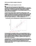
From the data above I constructed the scatter graphs below to show male and female height plotted against their foot size.
By observing the two scatter graphs I have constructed I can tell that they both aren’t highly positive but still correlate I can tell this by the way they fit around the line of best fit as the data is sparsely spread around its sides. This tells me that Height is related to Foot Size and proves the first part of my hypothesis. However, a reason for why both graphs have a fairly low positive correlation is the size of the data, as it doesn’t provide sufficient evidence to make a conclusion to apply to a wider range of people.
The majority of male results are around the 70-80 marks on the x-axis (which shows height). While the female results are sparsely spread around the line of the best fit.
Moreover, I can tell that the line of best fit I have drawn onto my female scatter graph has a lower gradient than the male scatter graph. This suggests that female shoe size is less varied and tends to be smaller in comparison to male shoe size, which has a higher gradient telling us it has more varied data.
Box and Whisker Plots
I have decided to use Box and Whisker Plots to convey my result’s as they can be useful for handling many data values. They allow me to explore data and draw informal conclusions when two or more variables are present. Additionally, box and whisker plots only show certain statistics like the median, upper and lower quartiles and the smallest and greatest values in the distribution.
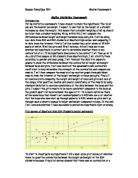
This diagram clearly shows that males have a larger range of values than females as the “whisker” part of the diagram reaches further along the x-axis.
Again, this tells us that males are taller than females. However, the Standard Deviation of the male plot is larger than that of the female plot, this tells us that the data is more varied so could account for the larger distribution.
Additionally, the middle value or “median” of the male Box and Whisker plot is also a lot larger than the female plot which tells us that the male results are larger than the females.
Contrasting male and female foot size I can see that the female plot has a larger range than the male plot. This suggests female foot size is more varied than male. This is also backed up by the Standard Deviation of both the plots as the female plot has the biggest variation in data. However, the male plot reaches further along the x-axis in comparison to the female plot. This tells us that the range of male values are larger than that of the females.
Additionally the median of the male plot is larger than the female plot which tell us that “the middle value” of male foot size is therefore bigger than “the middle value” of the female plot.
Histograms-Height
Histograms are bar graphs of a frequency distribution in which the widths of the bars are proportional to the classes into which the variable has been divided and the heights of the bars are proportional to the class frequencies. This makes histograms a good idea to use when showing results as they convey statistics data well.
To find the average height for males I am going to add up all the values of their heights then divide it by how many males there are, this is called the mean. The reason why I’m using the mean is because it is a more accurate way of finding an average as it uses all the data values.
Sum of values 2404.4
= = 171.7 to 1d.p.
Number of values 14
Again, to find the mean of the female set of data I will add up all the values then divide it by how many females there are. I will repeat this method for every histogram I will do.
Sum of values 2309
= = 164.9 to 1d.p.
Number of values 14
The males have a higher mean average than the females this tells us that they have higher values in their heights. Males also have a higher Standard Deviation result showing a more varied piece of data, this could explain the larger mean result with the males having a larger range of values than the females.
Histograms-Foot Size
Sum of values 376.6
= = 26.9 to 1d.p.
Number of values 14
Sum of values 321.8
= = 23.0 to 1d.p.
Number of values 14
Males have a larger mean Foot size than females this tells us that on average males have larger feet than girls.
Males have both a larger mean height and foot size in comparison to females this proves that the taller you are the larger your foot size is- this is because males have always had the larger mean results while females have smaller mean results.
Interestingly, the Standard Deviation of the Female histogram is larger than the male histogram, this tells us that the data is more varied but in this case obviously this has no effect on the mean.
Now I have analysed my Primary Data, I will look at my Secondary Data to see whether I can draw the same conclusions as my Primary Data. In my conclusion I will discuss my findings for both pieces of Data and state whether I have justified or disproved my hypothesis.
Results for Secondary Data
The results below are those I have acquired from Systematically Random Sampling a Secondary source of data. The table shows both Male and Female heights and shoe sizes.
Scatter Diagrams
From the data above, I have constructed both a male and female scatter graph to compare the spread in each set of data.
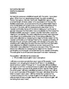
In order to compare both Scatter graphs I have drawn a line of best fit to portray an average. Additionally, I have circled anomalous results to show non-correlating data.
Both graphs have a strong positive correlation this shows that height is linked with foot size-the higher the data value for the height the larger the foot size value is. This justifies both of my graphs except for the anomalies that I have drawn, they show where my conclusion is incorrect as they do not correlate.
Furthermore, I can tell that the line of best fit I have drawn onto my female scatter graph has a lower gradient than the male scatter graph. This suggests that female shoe size is less varied and tends to be smaller in comparison to male shoe size, which has a higher gradient telling us it has more varied data.
Also, the majority of male results are densely situated towards the higher values on the y-axis while the majority of female results although sparsely spread are situated around the middle y-axis. This justifies my hypothesis as I said earlier in my investigation that male shoe size tends to be larger than female shoe size. However, in order to ensure my observations are correct and I haven’t constructed my graphs wrong, I will form other graphs to prove my theory further.
Box and Whisker Plots
By observing the two Box and Whisker Plots, it is clear that the male data (blue) has a larger spread than female data (red) this is because the male plot reaches further along the x-axis than the female plot. The Standard Deviation of the male plot is larger than the female plot which tells us that the male data is more varied, this could account for the larger range that the male plot has.
The males also have a larger median than the females this tells us that the middle value of the male results is higher than the females so male height is larger.
Comparing the male and female plots I can see that the male plot has a larger range than the female plot this is because its “whisker” part of its plot reaches further along the x-axis. This suggests female foot size is more varied than male. Another piece of information that also tells me this is the Standard Deviation, the higher it is, the more varied the data is and in this case the male data has the highest Standard Deviation.
Both the male and female boxes are different in size while the Primary data of male and female foot sizes seem fairly the same, this could be because the sample of Primary data is smaller than that of the Secondary. Ignoring this fact however, this tells us that the Primary data have more equal quartiles than the Secondary data suggesting a smaller variation in data values.
Also, both the lower whisker and higher whisker parts of the Primary data plots are not as inline with each other as the Secondary Data plots this suggests a larger variation in range.
Additionally the median of the male plot is larger than the female plot which tell us that “the middle value” of male foot size is therefore bigger than “the middle value” of the female plot.
Histograms-Height
Sum of values 3254
= = 155.0 to 1d.p.
Number of values 21
Sum of values 3157
= = 150.3 to 1d.p.
Number of values 21
In comparison, males have a larger mean average height than females.
However, Females have a larger median than males. The Standard Deviation of the male histogram is a lot larger than that of the female histogram which tells us that the male data has a larger variation.
Histograms-Foot Size
Sum of values 518.5
= = 24.7 to 1d.p.
Number of values 21
Sum of values 468
= = 22.3 to 1d.p.
Number of values 21
As with the Primary Data, males have a larger average Foot size in comparison to females.
Again, the Standard Deviation of the male plot is larger than the female plot which tells us that males have more varied data.
Conclusions
Now I have studied each graph, I have come to the following conclusions
- Height does have a relation to Foot Size this was proved in each of my Scatter Graphs for both Primary and Secondary Data as I saw a positive correlation between the two. Although I found the Scatter graph for the Primary Data a lot less highly positive than the Secondary Data, I have dismissed this to the fact of the size of the data I used as it still correlated. This proves my hypothesis wrong as I thought height would have no relation to height.
- The medians and means of male height and foot size are larger than female height and foot size in both Primary and Secondary Histograms and Box and Whisker Plots- this tells me that males have (on average) larger feet and heights than females. This justifies the second part of my hypothesis as I thought that, “boys generally have larger feet than girls”.
Evaluation
Through investigating the set question “Does foot size increase with height and do boys have larger feet than girls?” I feel I have obtained sufficient evidence to both disprove and justify my hypothesis.
The quality of evidence, I feel is that of a reliable nature as I have been careful to not make mistakes and have constructed my graphs with the help of a computer program called “Autograph” which is a lot more accurate than hand drawing. I also obtained my Secondary source of information from a website containing the statistics of teenagers from across the world in which I feel is reliable and gives justice to my evidence. The anomalies I have encountered have been situated within the Scatter graphs I have constructed as they successfully represent the spread of data and anomalies are easy to locate. As there have not been a large amount of anomalies I have dismissed them as the measurements that could have gone wrong or there might be people above average in height that do not have a correlating foot size or people with an above average foot size that does not correlate with their height.
Even though I think my investigation has been successful, I still feel there are ways in which I could have conducted differently in order to make what I am explaining, clearer.
The reliability of the evidence I obtained is fairly good but I feel that the primary data I collected should have the following changes:
- Both the height and foot size of every pupil should have been measured by one person to ensure a set way of measuring so no variations are made.
- A witness or a second person should be present to watch the person measuring to make sure they are measuring the pupil fairly.
Additionally, my sets of data are very small and are not reliable enough to make a solid conclusion to apply to everyone. In other countries there are variations in genetics from that in England, for instance; stunts in growth because of famine and lack of food could result in data that doesn’t conform to my conclusions. So in order to overcome this problem and if I was to make a more universal conclusion, a larger set of data would have been more suitable to use taking the statistics over a broader area of the world. But considering the lack of information, resources and time needed to accomplish this, I feel I have done my best to perform a solid investigation from the information I did obtain.
Furthermore, I could widen the age range in my Primary Data this could ensure I more accurate conclusion to apply to the “boys” and “girls” parts in the set question as I only took the data from my Maths Set and we are only 15 or 16. With my Secondary Data I have no idea as to what age the data I obtained was as it only specified the titles “boys” and “girls”. This could mean any number of ages, if I was to do the investigation again I would make sure I knew the age range in which the data I obtained was as my conclusion may apply to 15-16 year olds but not to 13-14 year olds and both ages fit in to the categories “boys” and “girls”.
Further work I could do to provide relevant information could be to also collect the weight of “boys” and “girls” and see whether that could have any effect on height or foot size. I would have three variables to work with and if height or foot size did turn out to have a link to weight then my results would be very interesting and provide extra evidence to support the conclusions I have already made.