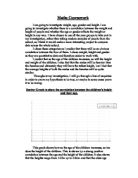
As I have drawn diagrams and tables and then drawn conclusions for the height of 30 boys and 30 girls I have done the same with the weight.
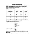
Here is the weight of boys and girls represented in a table.
GIRLS
BOYS
Then I drew the histograms
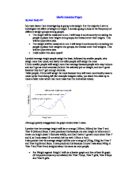
To better compare this data I drew a frequency polygon
Since the data is grouped into class intervals, I have recorded it in a stem and leaf diagram so to make it easier to find the median.
GIRLS
BOYS
I also recorded the mean, modal class interval, median and the range so to better compare the data.
As seen in the table above boys have a greater mean and median yet the modal class interval is higher for the girls. The mean for the boys is higher because there are a greater number of boys with a height greater the 60 then girls, 6 boys more. So the mean is higher. The median is also higher for the boys for the same reasons. So I can conclude by saying that more boys have a greater weight then girls. Also from looking at the data I can say that the weight of the girls is more concentrated between 40kg to 60kg while the weight of the boys is more widely spread out. About 14 out of 30 girls or 46.66% of the girls have a weight between 50kg to 60kg while 9 out of 30 boys or 30% of the boys have a weight between 50kg to 60kg. The same numbers of boys have a weight between 40kg to 50kg. The frequency polygon tells us that the weight of the boys is steadier while the rise and fall in the weights of the girls is sharper. From this I conclude that the difference between extreme values for the weight of the girls and the middle values for the weights of the girls is greater then the same difference in the boys meaning that the number of boys at every class interval is closer then that of the girls.
I can finally conclude that boys have a greater average weight and height then the girls but the weight of the girls is concentrated at a smaller base then that of the boys so the weight of the boys is more spread out, the same is true for the height with the boys height being spread out over a wider base then that of the girls. Also most of the boys have a greater median height and weight then that of the girls.
As a further investigation I will investigate the relationship between height and weight in the same gender. I have drawn three scatter diagrams with the line of best fit to show this.
The first graph is the scatter graph for the boys. It shows us that there is a low positive correlation between height and weight for the sample I have selected. The next graph is the scatter graph for the girls. It shows low positive correlation between height and weight. The third graph which is the scatter diagram for the mixed population. It shows a low positive correlation but when compared to the boys and girls scatter diagram we can say that the correlation is stronger in this graph. The graphs also shows us the line of best fit which I can use to make predictions such as. For a boy having a weight of 40kg would have a height of 153cm, a girl of the same weight would have a height of 158cm but if we took a boy and a girl weighing 70kg we would see that the boy’s height would be about 173cm while the girl would have a height of 165cm this tells us that boys at a lesser weight would have a smaller height then girls at the weight, while boys at a higher weight would be taller then the girls at the same weight. This tells us that the line of best fit for the boys is steeper then the line of best fit for the girls but the extreme values are greater in the graph for the boys. Thus I can conclude by saying that as the weight increases the boys grow taller then the girls whereas as the weight decreases the girls grow taller then the boys.
I have also calculated the equations of all three lines. They are as follow:
Boys only: y = 0.67x + 126.22
Girls only: y = 0.24x + 148.32
Mixed: y = 0.51x + 134.52
Where y represents height in cm and x represents weight in kg.
I can use these equations to make predictions just like I did using the line of best fit.
For a boy with a height of 153cm his weight would be
y = 0.67x+126.22
x = y-126.22/0.67
y = 153
x = 153-126.22/0.67
x = 39.97
For a girl with a height of 158cm her weight would be
y = 0.24x + 148.32
x = y-148.32/0.24
y = 158
x = 158-148.32/0.24
x = 40.33
Since all the heights are given in whole numbers, I will round my answers to the nearest whole number.
So I can now predict using the line of best fit that a boy with a height of 153cm, will weigh 40kg while a girl with a height of 158cm will weigh 40kg
The lines of best fit are only at best estimation and not exact. There are some exceptional points in my graph such as the girl weighing 44kg with a height of 136cm or the boy weighing 38kg with a height of 132cm. These point influence the line of best fit as they make the line of best fit more or less steeper. Also by rounding my answers my results become less accurate.
Another useful way to compare two different data sets is cumulative frequency. Below I have shown the table for the cumulative frequency for height for boys, girls and mixed population.
From this table I made a cumulative frequency curve as that is the best way to represent this data. I made the curve for boys, girls and mixed population on the same axis so comparing them will be easier.
Then using these curves I found the median, lower quartile, upper quartile and interquartile range. Below I have shown this in a form of a table.
Another usefulness of drawing this curve is that you can predict how much percentage of students will have a height within a given range. For example to find the percentage of boys who have a height between 160cm and 170cm.
We know from the cumulative frequency curve that in the sample 12 boys have a height of up to 160cm and 22 boys have a height of up to 170cm so 22-12 = 10 boys had height between 160cm to 170cm so we can say that 10/30 or 33.33% of boys in the school will have height between 150cm to 160cm or the probability of a boy in the school having a height between 160cm to 170cm is 0.33.
By looking at the table I can say that the boys have a slightly larger median then the girls. Also the interquartile range is greater for the boys then the girls, this is because the upper quartile for the boys is higher. I think this is so because the boys are slightly taller then the girls and also the biggest value for the boys height is bigger then the biggest value for the girls height this causes the upper quartile to be higher for the boys.
Also we know that the median height for the boys is 163cm. By looking at the graph I see that there are 18 girls with height less then 163cm so there are 12/30 girls who are taller then the median height of the boys that is 40% of the girls.
In general the boys are taller then the girls, our data tells us that 40% of the girls are taller then the median height of the boys.
Now I will calculate the 90th percentile for the boys, girls and mixed heights.
90th Percentile of the boys = 185
90th Percentile of the girls = 177
90th Percentile of mixed = 178.5
By looking at this data I can conclude that the upper 10% of boys have a height of 185cm or more whereas the upper 10% of girls have a height of 177cm or more and the upper 10% of both the boys and the girls have a height of 178.5cm or more. So we can say that the upper 10% of boys are taller by 8cm then the upper 10%of girls.
I also drew same tables and graph for the weight of boys, girls and mixed population.
And then drew the curve
And then I calculated the median, lower quartile, upper quartile and interquartile range.
The lower quartile is the same for boys, girls and mixed but the upper quartile, median and interquartile range is highest for the boys and lowest for the girls. This tells us that the boys’ heights are more spread out whereas the girls are not that spread out and when we consider both boys and girls we see that it is not as spread out as the boys nor is it as narrow as the girls, it is somewhere in between.
We can also see that from 50kg to 60kg the number of girls out weigh the boys by quite a large margin so there is a high probability that if we chose a girl at random her weight will be between 50kg to 60kg. The probability is (26-12 = 14) 14 girls out of 30 or 14/30 which is 46.67% and so the probability is 0.47. While the probability of a boy having the weight in the same range is (20-11 = 9) 9 boys out of 30 or 9/30 which is 30% and the probability is 0.3. So there is a greater chance of a girl weighing between540kg to 60kg then a boy.
Also we know that the median weight for the boys is 54kg. By looking at the graph I see that there are 18 girls with weight less then 54kg so there are 12/30 girls who are heavier then the median weight of the boys that is 40% of the girls.
In general the boys are heavier then the girls, but our data tells us that 40% of the girls are heavier then the median height of the boys.
This is the same number of girls who are taller then the median height of the boys.
I will now calculate the 10th percentile of both boys and girls together and seperatley.
10th Percentile of the boys = 41
10th Percentile of the girls = 42
10th Percentile of mixed = 41.5
From this we can see that the lower 10% of girls are heavier then the lower 10% of the boys.
Next I have drawn box and whisker diagrams for both heights and weights.
The box-and-whisker diagram shows us that the interquartile range is more for the boys then for the girls by 1cm. This suggests that the boys’ heights are more spread out then the girls.
In this graph we can see that there is a suitable difference in the interquartile range between boys and girls of about 6kg with the boys having a larger range. Also the lower quartile is the same for both the boys and the girls.
I can conclude by saying that the boys’ weights are more widely spread out then the girls. This is due to the greater number of boys having a weight greater then that of the girls.
Next I calculated the standard deviation. The standard deviation is a statistic that tells you how tightly all the various examples are clustered around the mean in a set of data. It tells us how spread out the data is from the mean.
The method to calculate the standard deviation is as follows:
For each value x, which is the midpoint of the class interval, subtract the overall average x| from x, then multiply that result by itself (otherwise known as determining the square of that value) and then divide it by the frequency f. Sum up all these values. Then divide that result by sum of all the frequencies. Then, find the square root of that last number. Below I have shown the formula for this.
∑ [f(x-x|) 2]
∑f
Now I will calculate the standard deviation of the boys’ height.
Standard deviation = √ (4300/30)
Standard deviation for boys’ height = 11.97
Now I will calculate the standard deviation of the girls’ height.
Standard deviation = √ (2921/30)
Standard deviation for girls’ height = 9.87
The standard deviation for boys is greater then that of the girls by 2.10. So I can say that the values for the boys are more spread out then that of the girls.
Now I will calculate the standard deviation of the boys’ weight.
Standard deviation = √ (3601.20/30)
Standard deviation for boys’ height = 10.96
Now I will calculate the standard deviation of the girls’ weight.
Standard deviation = √ (2387.11/30)
Standard deviation for girls’ height = 8.92
The standard deviation for boys is greater then that of the girls by 2.04. So I can say that the values for the boys are more spread out then that of the girls.