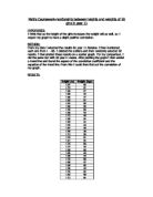
Averages
With my Mean height, my averages for Males and Females were exactly the same but my Mean weight for my Females are greater than my average weight for my Males.
My Modal height for my males is slightly greater than my modal weight for my Females. This shows that I have more males of height 1.65m than I do Females. My modal weight for my Males is also slightly greater than that of my females. This is again, showing that I have more Males of weight 45kg than I do females.
My Median height for my Males is greater than my Median height for my Females. This shows that although my central Male is taller than my Central Female, I still have more males of a greater modal height than my females but my Central Female has a greater weight than my Central Male. This to goes with my mean weight that the Females are heavier than the Males.
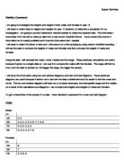
Scatter Diagram (Graphs 1 & 2)
I chose to represent my data on a scatter diagram because I can put on a trend line and show my correlation coefficient for each graph. It also helps as I have a large amount of data and the scatter diagram helps me to see the relationship between the Male and Female Height and Weight.
My scatter diagram for my Male and Female Weight Versus Height shows that there is a very weak positive correlation. This shows that the Taller the Males and Females are, the Heavier they are.
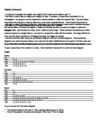
Cumulative Frequency Graph (Graphs 3 to 6)
I chose to use a Cumulative Frequency diagram because it would allow me to draw a box and whisker diagram to compare the two sets of data for Height and Weight.
I used my Cumulative Frequency Graph to work out the Interquartile Ranges and the Median for my sample and also to help me see the wide spread of my data.
Box & Whisker Diagram
I chose to show my data on a box and whisker diagram because it made it easier to compare the bits of data for my male and female cumulative frequency graphs.
My box and Whisker diagrams for Male and Female height are practically identical to each other. It shows though that the Females are ever so slightly taller than the Males but that there isn’t much in it. The Median height for the Females is slightly great than the males but the Interquartile range for the Females hold more females of a taller height. This shown and backed up by my mean average which shows the males and females to be of 1.61m.
My Male and Female Box and Whisker Diagram for Weight are very different to the way my diagrams for height came out. Here we can see that the Females have a smaller highest and lowest weight but they are all heavier weights. The Males have a wider highest and lowest weight but the Median for the Males is lower than the Females. The Interquartile ranges are also slightly different. The Females have a slightly wider spread in weight than the Males as they have a slightly smaller spread. This evidence is backed up by my Mean average. My Mean average for Males is 49.42 and the Female Mean weight was 52.64. These show as my box plots do that the Females are in fact heavier than the Males.
Conclusion
From this evidence in this project, I can tell that the Males and Females are practically identical in their height as the Averages and the Box Plots show but the Females are heavier than the males as the Averages and the Box Plots also show. It also shows that I have achieved my aim to investigate the difference in the height and weight of 50 Males in Years 8 & 9 and 50 Females in the Years 8 & 9.