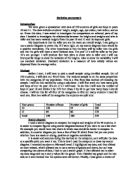
Method
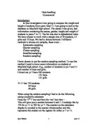
Before I start, I will have to pick a small sample using stratified sample. Out of 370 students, I will pick out 40 of them. The random sample is on the same proportion with the categories of my population. This is a free from bias method of choosing the sample. I will do this method by using a calculator. I will first work out how many girls and boys of out the year 10’s an 11’s I will need. To do this I will take the number of boys in year 10 and divide it by 370 then times it by 40 to get how many boys I should choose. I will do this for all four of the categories to find out many students I need for each one. Here is a table of the categories the students are split into:
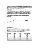
Scatter diagram
I used a scatter diagram to compare the heights and weights of the 40 students. It is easier to compare figures using scatter diagrams because if you were to use a bar chart for example you would have two charts in which case would be harder to compare. In addition, in a scatter diagram you have a line of best fit which from that you can prove whether there is a weak or strong, positive or negative correlation.
It is easier and accurate doing this method on the computer, as it will plot the data at a specific point you want it too. This is how I used the computer to draw my scatter diagram. I recorded my data on Microsoft excel. I highlighted my data, and then clicked on chart wizard, which allowed me to use a variety of graphs and charts, but as I was comparing two pieces of data, I had to use a scatter graph. It then allowed me to select my data range and my x and y values for the graph. Then I labeled my graph and the two axis on it and checked that the options were all correct. Finally, I was given a choice of whether I wanted to place the graph on a new sheet of paper or the same sheet of paper with my data table on it.
Box plots
I used box plots to compare the heights of all the students as by using this I would be able be find which set of students are taller and which has the variated heights.
It represents whether most of the data is above the median or below the median and that the bigger the median the taller the students are going to be and smaller the median the shorter the group of students are going to be. The wider the box plot is the more variation it has on the heights and the smaller the box plot the least variation it has on the heights.
To draw a box plot, I had to find the lower and upper quartile of the data. I did this by adding one to the maximum value then dividing it by 4 to find out the lower quartile. I added 1 to the maximum value then divided it by 2 to find out the median. I added the median and the lower quartile to find out the upper quartile, as the upper quartile is ¾ of my data. To find the interquartile range I subtracted the lower quartile from the upper quartile. To plot the box plot I drew the scale of my data and plotted the median and the lower and upper quartile on it. The interquartile range will help me find out who has the most variated heights. The higher the interquartile range is the more variation the data has and the lower the interquartile range is the less variation it will have.
Standard deviation
I used standard deviation so that I could see who had the more variated heights. This gives you a measure of how widely the values are dispersed from the average. The larger the difference between the heights, the average height, the higher the standard deviation will be, and the higher the variability. The closer the heights are to the average height, the lower the standard deviation, and the lower the variability. Standard deviation takes into account all the data unlike the box plot where it just looks at the lower quartile, median and upper quartile. It is useful in comparing sets of data, which may have similar mean but a different range. If a set has a low standard deviation, the values are not spread out too much.
To work out the standard deviation for my data I first calculated the mean for each piece of my data.
Conclusion
I did this so that I could prove whether my hypothesis was right as I said that the taller you are the more you would weigh. I was partly right because as you can see on my scatter diagram there is a weak positive correlation.
I found out that the boys were overall taller then girls because as my box plot shows the median of the yr 10 boys and the yr 11 boys higher then the yr 10 and 11 girls.