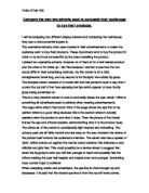
The whole air of this advert is considerably light hearted and refreshing. The colours used are all fairly neutral and are easy on the eye, however the drama of the picture itself attracts the audience’s attention. The advert also has a splash of ‘pink’, which stands out against the neutral colour scheme; this indicates a very childish and girly feel. This could possibly be a device aimed to suggest that when the lip gloss is worn you will feel younger at heart and possibly feel the effects making the user feel happier and maybe even look younger. Something most women hope to achieve!
When analysing media and advertisers, the eye line is often brought up and discussed. It is said that the natural eye line is from the top left hand corner, through the centre, down to the bottom right hand corner of the page where the bourjois logo is located alongside a picture of the product.
Along the process of this eye line we also pass a quote that I am assuming is about the product.
What is also interesting about this advert to me is that in the top right hand corner, there is a section saying ‘discover’, taking us out of our natural eye line. Now the fact that it heads ‘discover’ suggests to me that it is there to seem as if you’ve discovered it yourself and that bit describes ‘beauty secrets’ that are just between the audience and the advert. It makes the advert seem more personal to each and every reader. This is a clever marketing device in my opinion.
You can see quite clearly that the second advert differs. It consists of a model, seemingly larger than the plane behind her, holding the cosmetics travel bag being advertised. Also, the slogan ‘thou shalt not…’ gives a sense of command and authority as if the Ghd trend is something to be obeyed. This slogan is located in the top left hand corner and the logo is in the bottom right hand corner there is a small description in the bottom left and a burst of colour, amber browns and oranges.
The eye line previously discussed is also present here, going from the slogan, through the product, and down to the company logo in the bottom right hand corner. The colours used, ambers, golds, browns, oranges and reds are all colours used often in the media industry to give a sense of warmth, however in this instance I feel it is more of a smouldering, glowing feeling the creators of this advert were after.
This is a very powerful advert with many obvious and striking features as well as some hidden subtleties. The model has a fierce expression on her face and looks mildly aggressive but at the same time somehow appealing and inviting. I think she is made to look larger than the plane behind her in the picture in order to give the impression of power, which adds to the effect the face expression, has. To add to this, the camera angle is shot as if we are below the model looking up at her. I think this is to make the audience feel inferior to the model clutching the bag. We are made to feel that she is far superior to anyone and anything around her because she has possession of this wonderful product. The bag seems to just add to her already commanding presence.
The model featured, also comes across as classy and elegant, I really feel this advert has the dimina of ‘Buy our product, and you can be like the model too’.
The fact that in the bottom left hand corner it says ‘the new Ghd travel bag has arrived’ may have some connection or significance to the aeroplane in the background, somehow implying it has just got here and we are the first to know.
Also the fact that the model is only half turned to face us the audience reinstates this feeling or her superiority maintained throughout; she can not even be bothered to turn to face the readers properly. As of the audience are not worth bothering with, not worth the effort.
So these adverts differ quite greatly from each other in many ways, but both aid the sales of their product and both are very effective.
They do share common qualities though, an example being the location of the company logo. Both logos are positioned in the bottom right hand corner of the page, leading our eye down to those points. They also both use beautiful models so that the audiences they are appealing to will want to buy their product in the hope that they will be able to achieve the same looks as the models featured. They also have similarities in the sense that both adverts use the top and bottom third for written information concerning the product, and both adverts, although the colours themselves vary a lot, have used colour to their advantage.
Both models have been made to appear as of they have turned a few heads with their product , the dramatic parting of the hair in the bourjois advert, and the sense of superiority in the second, making their product appear to have a real impact, so any potential customers can hope to achieve the same effect.
Both adverts are fairly simple as well which I think is important, over crowding an advert makes it an effort for a reader to look at. When looking at adverts, consumers don’t want to know everything they just want to know what it does and what it is and who manufactures it. These two adverts do that well.
There is no escaping the fact that, yes, advertisement have been known to be deceptive, after all most of the time they are trying to sell us things we simply don’t want or need, but these two adverts come across as quite the opposite-honest and informative.
So although to look at these adverts seem to share no common bonds, when you take a closer look, it becomes apparent there are many. Both models have been made to appear as of they have turned a few heads with their product. These advertisers clearly know what sells and obviously how to sell it!