Pop Art developed primarily in the United States and Britain. Popular arts including music and cinema provided several of the British artists with a recognisable range of famous names and images. Assemblage was another factor in the rise up to the success of Pop art, specifically in Britain, with the environment being a main influence. With Britain being first to generate this pop art sensation, America came closely behind, with the Second World War affecting society in a large way.
In Britain, popular culture and technology was just the subject of the popular art. David Hockney in the 1960s was one of the leaders of Pop Artists in the UK. Reaching success at an early age, Hockney’s paintings consisted of bold, vibrant colour, with a ‘jokey edge’ to his work. His magazine style images stood out compared to other British artists, and by 1961 his first tea paintings and love paintings showed various consumer goods. He adopted a cartoon style in his early stages, owing a lot to the drawings of children. A dream world of America is portrayed throughout his work, showing a perfect image through using a large amount of colour.
The American Pop Era emerged during the late 1950’s, early 1960’s. America, in contrast to Britain, tended to concentrate more upon advertisements and mass production. They reproduced, combined, overlaid, and used details in their work about the American society. The ‘glitz and glamour’ played a big part in American Pop differing from Britain, particularly with Warhol’s famous images that he used largely throughout his work. According to Lucie-Smith (1989) the ‘quality of American life was the basic inspiration of most Pop artists, wherever they hailed from’. Abstract Expressionism, like Britain, was a major influence upon the work, although America specifically focused on its large field of colour.
The developments of British and American Pop art have played a large role in artistic movements it the twentieth century. With Britain being first to develop the movement, many areas of art has helped to form Pop, with abstract expressionism and surrealism playing prime factors in the formation. The images used in American Pop art do show a large variety of fame within the work, contrasting to the British Pop art. America was influenced by the Pop phenomena in Britain, although took it to its own accord introducing new elements to the era.
His Bio
Andrew ‘Warhola’, was born 6th August 1928 in Pittsburg. He was the youngest son of Czechoslovakian immigrants. Like millions of other families, Andrew’s father could not find work and his early childhood was very difficult and deprived. After several years his family’s financial situation improved and as he grew older he attended a commercial design course at Pittsburgh’s Carnegie Institute of Technology. Although he was very shy and had a strong fear of failure, he did very well there.
In 1949, Andrew Warhola moved to New York. After his first commission to illustrate shoes, Andrew noticed that the final ‘a’ of his name was omitted in the credits and since decided to call himself Andy Warhol (a name that he considered youthful). He quickly became a successful and highly paid commercial artist in the 1950’s but desperately wished for fame as a fine artist. He wasn’t very unsuccessful in his efforts and sold few of his works. Andrew became depressed and believed that the ‘fine art world’ had rejected his art as old fashioned and not really very relevant.
Warhol needed new ideas to help boost his creativity. He got several ideas from a woman named Muriel Latow; a gallery owner he knew. She advised him to paint what he loved most (like money) or what everybody would recognize (soup cans and coke bottles). Warhol expanded on these ideas and his paintings of the early 60’s reflected his progress as a Pop artist. He finally gained the financial success and international fame he had worked so hard and dreamed for.
Although Warhol was identified with Pop art, it was a misunderstanding of his creative ability. He knew that Pop was much more complicated than it seems. In creating Pop art, what must be created is unrealistic and memorable images and awareness of the random and unpredictable forces in nature and society in whole. It is not really about the image of popular icons, but more of an expression of what is familiar and accepted as American society. Pop art also contains a serious sub-message that is not apparent at first sight. Trewin Copplestone - author of ‘The life and works of Andy Warhol’, pointed out that Pop artists were aware of this and used it in their work.
During his working career, Warhol used various different methods and media for producing his art. He was able to create the same subject in different media and by different methods. Before 1962 he used paint – acrylic or oil – and stencil for his subjects. After 1962 he used variations of silk-screen process. He used this technique for much of his work.
In 1963, Andy began a wide range of disaster works. Under the advice of Henry Geldzahler, who was a friend and art critic. He felt that everything wasn’t so fabulous in America and that it was time to reflect that in Warhol’s paintings. Warhol took his advice and began painting images of death and chaos. His ‘Red Race Riot’ is a perfect example of art, which shows human suffering and the anger and fear felt on both sides. This pain is emphasised by the suggestion of blood, which shows in the overall textured red tint. Other disaster works by Andy included various death images from suicides, auto wreckages, war scenes and many other visions of death.
In 1964, Andy began silk-screening images on wooden boxes. He became well known for making art from household items such as soapboxes and ‘Brillo’ pad boxes. I have made a miniature version of a brillo pad box from wood and painted the features on it, like Warhol. This again is a fine example of how he likes to promote the everyday things we use in life and create an artist view from them. It was during this time that Geldzhaler, his friend who redirected Andy from soup cans, coke bottles, and celebrities into disaster themes, once again advised Andy to leave disasters and paint flowers. This was big change for Andy who quickly adopted the idea. Warhol and his assistant produced and sold several hundred paintings of flowers in a many different colours. The first lot of paintings sold out and the industry continued to run strong and successfully. Geldzhaler’s casual idea definitely paid off but it was Warhol’s creative ability to shape this idea into a more powerful imagery that’s behind it all. Dave Hickey writes in ‘Warhols’s Enterprise: Nothing Special’ “Warhol did not change the ‘look’ of the images we see. He changed the way we look at them, the importance we attach to them, and the similarities we see between them.”
By the time of his death in 1987 he was ranked on the same level with Pablo Picasso and Jackson Pollock as one of the three most important artists of this century. He was a workingman, a social climber, a person who liked to build things, an acquirer of goods, and a known homosexual. These skills and attributes all contributed to the interesting but complicated nature of his art.
Warhol’s Style
Warhol was probably most discussed in relation to his Campbell's soup tins, which David Bourdon (a author who wrote a bio on Andy Warhol called “POPism – The Warhol 60’s”) says "were to prove bothersome on several counts, including subject matter, style and artistic intention." It is not possible to think of any feelings Warhol may have had about soup or anything else from these paintings and Bourdon states that critics may have been more tolerant if there was a distinct attitude towards his subject matter. Viewers expected the artist to take a position. Bourdon also states " his unpainterly, inexpressive technique" definitely upset viewers. The soup tin paintings were generally identical except for the flavours on the labels.
I think Warhol’s work consists of quite random and strange influences. He regularly found interests from the news that made him think of how he could put that into art. For me the most bizarre artistic response from Warhol was when he produced a series of works based on a news story about two Detroit women, who died of botulism, a few hours after making sandwiches with tinned tuna fish. Warhol's 'Tuna fish Disaster' paintings consist of multiple images of a tuna fish tin, the batch code of the seized shipment clearly displayed on the tin.
The Factory
The pop artist not only creates mass products but he also wanted to mass-produce his own works of pop art. Consequently he founded The Factory in 1962. It was an art studio where he employed in a rather chaotic way "art workers" to mass produce mainly prints and posters but also other items like shoes designed by the artist. The first location of the Factory was on the 5th floor of a building in New York.
Warhol's favourite technique was silkscreen. It came closest to his idea of idea and aim of art. Apart from being an Art Producing Machine, the Factory served as a filmmaking studio. Warhol made over 300 experimental underground films - most rather bizarre and some rather pornographic. His first one was called ‘Sleep’ and showed nothing else but a man sleeping over six hours, which I think is particularly odd, but also very experimental because it is interesting to see what motions a human does when they are asleep. I think it would be fascinating to see the reaction of a human when in a dream, or even a nightmare.
The attempted assassination
Warhol’s art hit a major block in 1968. He was a victim of a failed assassination. He was going to The Factory, his workplace and a 32-year-old woman, who knew Warhol was waiting for him on the sidewalk, carrying two handguns in a paper bag. The woman, Solanas, was a unbalanced individual who was fed up of being controlled by Warhol. She was a common drug user. She was also part of a gang named SCUM, which stood for ‘Society for Cutting Up Men’, a sick and twisted name. She eventually pulled the trigger on Warhol but missed the target, as the bullets didn’t manage to hit any organs. Warhol survived the attempted murder. He never recovered completely from his wounds and had to wear a bandage around his waist for the rest of his life.
But the most important thing to him, fame and art was not ruined. He made a fantastic comeback with his artwork. The ‘philosopher of art mass production’ then spent most of his time making individual portraits of the rich and affluent of his time like Mick Jagger, Michael Jackson or Brigitte Bardot. Warhol's activities became more and more interesting and attractive. He started the magazine Interview and even a nightclub. In 1974 the Factory was moved to different location.
His work any my opinions of it
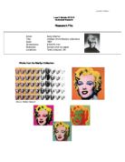
My personal favourite piece of Warhol’s work is the Mick Jagger portraits (1975). I am originally a great fan of The Rolling Stones anyway, and as soon as I saw his pieces when studying him, I loved them. The series of ten screen prints of the rock star were characteristic of change in style and the artist used a selection of ten of his own photographs that he had taken of Jagger. Warhol had met Jagger in 1963 when the band the Rolling Stones were not well known in the United States. Warhol had designed the band’s provocative album cover for ‘Sticky fingers’ with its focus on a man’s crotch and a zipper that opened. The album and the design proved to be a huge success and Warhol, ever keen to make money, typically said that he had not been paid enough given the millions of copies that sold. I think this shown how much Warhol was obsessed with money and his demands were huge.
The pieces that Warhol had done carry a pronounced collage look and a surprisingly dark palette highlighted by occasional bright pinks and oranges. Warhol done other megastars in the same style and technique as Jagger, but as I’m so fond of the man myself I prefer these. I also think they carry an ‘off the wall’, rock n roll edge to the pieces, rather than the Muhammad Ali and Michael Jackson portraits.
The piece is created from using the silkscreen process. I think it almost looks as if Warhol has painted Jagger and the glued ripped shapes of different types of paper on to the painting in certain places. I think the rough image adds to the rock n roll style and. This piece defiantly appeals to rockers, as it is very different to most of his other work he’s done. Even though most of his prints are of famous people like Jagger, but this on is messier. The way Warhol has only shown the head and shoulders makes it feel much more personal, which I admire, as I think it puts the fame behind Jagger and showing his natural image. I have done a piece myself resembling Mick Jagger and one of his poses he pulls in Warhol’s photos. I have used black paper for the blocks that appear in the original pieces, and drawn him Jagger with ink.