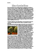
Another key feature of this piece that I noticed is the gradual fade from light to dark from the top to the bottom of the image respectively. This is almost implying that there is another whole or viewing point to this image but that the artist has decided not to allow us to view it from that angle. I particularly like the arrangement of this picture, although don’t think that the placing of the black pole and the other gold object between the two sides of the book fits too well with the other objects.
I am certain that this piece has been planned do to the fact that this is not a normal scene you would expect to find and take a picture of. It is much more likely that the artist put this scene together himself, which also gives the opportunity to make it exactly how he wants, rather than finding something like it and attempting to adapt it to as close a likeness as his ideas.
When I look at this picture I think of escape. When I see it I think that the artist is trying to explain to the viewer that there are many paths that are created mentally by your imagination. All you need to do is find the door into your imagination to unlock the direction of these paths. The words that best describe what I feel when I look at this piece of work are surreal, escape, direction, progression, possibility and alienated.
This picture is quite similar to the next piece shown, also by Boostra that I looked at. Both of the images have subject matter which is quite dream like and also have some reference to a new beginning or moving on from the present point to a point further ahead, in what context I am not sure.
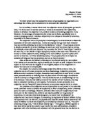
This second image shows what looks like pillars collapsing. On taking a closer look it is easy to see that they are actually rolled up pieces of lined paper. At the bottom of the image there are what appear to be rocks, with one of the smoother rocks having a flame resting on top of it. Some of these are also floating around the middle of the image possibly representing clouds, aligned in a slight curve across the image with a bird finishing the series of rocks. It is likely that this picture addresses the thoughts of the artist about his imagination and getting perfect inspiration for his work. It is likely that all of the objects in this piece were quite small but by taking the picture from a close angle and making the bird quite small he has given the impression of the stones actually being huge boulders. The meaning of the work is hidden but it looks as if the artist is trying to depict a dream vision. It looks as if the pillars are falling and there is some kind of storm going on.
The picture is taken from quite a close up angle with all the objects arranged fairly evenly over the whole frame, no particular part of the picture is emptier than another. On the right and left sides of the image there are slightly darker tones than in the centre of the image. Possibly because there is a bright light in the centre and the artist wished for there to be a large contrast between these 3 sections. It is also quite dark at the bottom almost creating an ellipse shape of light. I think that this picture has most definitely been planned as all of the objects are placed in a very particular composition, so that no part covers another part. This picture makes me think of the end of the world, and possibly how I have seen the end of the world happening in a dream. Although there are a lot of objects in this image there is still a sense of openness and the feeling of being deserted. The dull purple colours give it a morbid aura but then the bright light gives a contrast to this possibly implying a new beginning breaking through from the past. This is also because the light is situated at the back of the image.
Another similarity between the two is the use of a graduation of dark and light tones, although in the first piece it was from left to right and not top to bottom. Both of the scenes that are viewed are also man-made and not something that you could easily find in reality, but are put together in such a way that conveys the idea of being able to be found in reality.
There is however a key difference between the two. The first image is an example of manipulation by the camera and the way the shot has been framed. The second image is much more likely to have been computer manipulated. In particular the “pillars” look like they are being held up by string, which would have to be disguised using a digital process, possibly a clone tool to copy the surrounding areas very carefully.
Many of Boostras images feature doorways whose entrance is slightly obscured by objects blocking them. Not so much actually blocking the space but just blocking the view of the doorway to the viewer. When these doorways are not obscured they are often viewed from a very distant angle to possibly give the impression that they are unreachable or take much effort to reach.
I have also researched another image by Laszlo Moholo- Nagy which is very different in a lot of ways to the two pieces I have already looked at but still has the surreal feel to it. The subject of this image is two boats, one larger than the other. The smaller boat appears to be being towed by the large boat. By the looks of things it appears that this picture is a reversal and has possibly had some sort of digital filter used on it. From a first glance I can gather no information as to the thought patterns behind this piece. It looks as if there is someone asleep in the smaller boat.
The picture is viewed from above, almost looking as if the photographer is standing on top of the mast of the larger boat. The framing of the picture is very spacious with the majority of the frame being taken up by the water surrounding the boats. The bottom right hand corner of the piece is filled with the larger boat, but the boat is not viewed as a whole, only the back of the boat is shown. There are not any particular shapes created by the objects in the picture but I noticed that most of the lines are curved ones and the only prominent straight line is that of what looks like a rope, possibly holding the mast up. As with some of Boonstra’s images Moholy-Nagy makes use of a graduation from light to dark tone, however in this image it goes from dark to light to dark to light then to dark again from the top to bottom respectively. This could possibly be to divide the image up and make the viewer pay attention to each part of the image individually.
I particularly like the arrangement of this picture, as with many Boonstra pieces, the photographer, Moholy-Nagy has left the frame very open with only two objects taking up a small amount of the space. I feel that this links well with the content as this is precisely the way it is in reality, the boats being a small speck in the ocean. It looks as if Moholy- Nagy has tried to capture this feature on a smaller scale.
I think it is very likely that piece was planned. This is because it is unlikely that Moholy-Nagy just happened to be standing on the mast of a small boat. As well as this only a small part of the large boat was included and then a large amount of the sea was included in the frame. If the picture was just intended to show what the boat looks like he would have taken it from the shore or from a side view where the whole boat would be seen in the frame. It is possible that the whole of the larger boat was shown which would mean that the artist has cropped out part of it. it is also quite obvious to see that this is a reversal, but as well as this it appears to have a more silvery than grey colour to it, suggesting that an unusual darkroom process has been used, possibly solarisation.
In my opinion this picture is quite relaxing. When I look at this image I can envision myself lying asleep on the boat, under a summer sun with a cool breeze blowing. This is the thoughts that I have solely on looking at the content. On the other hand the great contrast in tone almost draw away from this sense of calm, as they have the connotations of something bad that is about to happen. This feeling is also added to by the fact that this piece is a reversal and the strange silvery effect that is placed upon it. The process of how the picture was created that gives me these feelings and not so much the content.
This next image was created by man ray and also illustrates another darkroom manipulation technique. It is believed that many of his processes are very complex but in actual fact they are very simple but used in a particular way to make them look more elaborate.
The subject matter is the artist wife Juliet, she is naked and has her backed turned to the camera. It appears that the artist is trying to shock through the use of not conforming. This technique was described as
“wilfully broken, ironic, aggressively playful art”
Jonathan Jones Saturday October 27, 2001 The Guardian.
In my opinion Jones was trying to say that ray visually attacked through his art, but that it was in a somewhat light-hearted manner.
I think that this picture is addressing issues about the war and the Nazi’s as many of the artist pieces were destroyed during the war as many of his pieces were very controversial. The technique used looks much like solarisation which can now be done in a few clicks of a button, digitally. The piece is framed so that it includes almost only part of the woman. Judging by the fact that she is not facing the camera and the fact that her legs are not shown I think that the artist is trying to draw attention to her back, although I am not sure why her back in particular. The image contains a lot of contrast. Not so much in the content but the lighting.
All around the image of the woman is very dark, so I am presuming the artist used a black screen behind the woman. The right side of the woman’s body is very dark however the right side is much lighter which means that the artist could have used a flash positioned on the right of the woman to give this effect. The composition of the piece seems to be quite normal in comparison to the content. The content is quite normal, however the lighting and the illuminated edge around the body makes it look quite surreal and revolutionary. I definitely think that this picture was planned due to the positioning of the model and the lighting that has been used. Both of these elements together make this a very dramatic piece. It would never have the same effect if it was just a picture of a woman with her back turned. It is possible that the whole of the woman was included in the original picture, and that it has been cropped to place a focus on the upper body. One way that the artist could have achieved the whole border around the woman is by using a mask. It also looks as if Man Ray may have used the same process as Moholy-Nagy, solarisation. Having researched techniques in more depth I discovered a technique called the Sabbatier effect. This technique is produced by partially reversing an exposed film or print by re-exposing during development. This technique was discovered by accident in 1862 by a French photographer named Sabbatier, hence the name of the process. It is mainly around the left side and the face and head that it is particularly visible so it is very likely this is the method he used. He may have also feathered it slightly to give it a less harsh edge. When I look at this piece the words alien, mystical, surreal and enigma. Having discussed images that have been manipulated in the darkroom I feel that it is appropriate to talk about images that have been digitally manipulated.
As part of my coursework I experimented with taking pictures of every day mirrors, such as car wing mirrors and mirrors in my bathroom, and then using Adobe Photoshop placed images inside the mirrors, to look like reflections being created by the mirror. The majority of my inspiration came from surrealism but the technique was quite similar to that used to make photomontages. The idea behind my work was to contrast the feeling of calm and nothingness, given by the area surrounding the mirror, by placing images inside that were fast and had lots of action taking place. A similar technique was used by Tony Worobiec in a photomontage he created featuring one of his friends. He had used one of his friends as a subject quite regularly and on this occasion he had arranged to meet with him to show him the results of their most recent shoot. As he was developing he realised he had not done anything particularly interesting with the prints and so decided to create the photomontage that can be seen below.
The next three pictures are the original images that were used to put together this photomontage.
The following quote was made by Worobiec himself after completing this piece:
“Seen together, the three elements appear far more menacing. The figure seen out of context looks much more threatening, whilst the old odd shaped oil drum could easily be seen as an approaching planet”
Tony Worobiec
As I have discussed in my essay there are many different ways to manipulate images both digitally and in the darkroom. This leaves us with the question of which is process is better digital or chemical photography? With the lowering of the price of digital cameras they are much more accessible to most people, but as well as this they can produce images just as good and sometimes better than images produced by the chemical process. With digital you are also able to use the same techniques as chemical but instead of long periods spent testing and adjusting it can all be done by the click of a button. This however brings chemical photography to a new light as a fine art medium. Due to the decrease in usage it is now considered a specialist area of photography, therefore the increase in the use of digital supports chemical photography itself. In my opinion digital photography is much better and effective, because although initially it is expensive the outcomes produced make all the more worth while than having spent the same amount on chemical photography equipment.
Sources
Rommert Boonstra
Elenore Welles
Jonathan Jones 27th October 2001
The digital age of photography