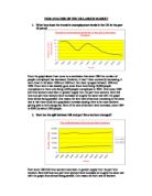
Ever since 1984 full time workers have been in greater supply then the part time workers. Both full time and part time workers have increased at roughly the same rate with the graph lines almost being parallel. One reason for both sets of workers increasing at the same rate is that there could be a population increase causing there to be more workers getting jobs in both categories. Both of the sets of workers have increased, since 1984 to 2004, by about 2500 people. Unemployment differs between the different regions of the UK in quite similar ways. The pattern of unemployment over the year’s looks very similar but with different quantities for the different regions. The North East has the greatest number of unemployed in the duration of the 29 years, whilst the East has on average the lowest number of unemployed. In 2004 the different regions have a lot closer link then ever before with a range of just 2000.
- How does unemployment differ between different regions in the UK
Unemployment differs between the different regions of the UK in quite similar ways. The pattern of unemployment over the year’s looks very similar but with different quantities for the different regions. The North East has the greatest number of unemployed in the duration of the 29 years, whilst the East has on average the lowest number of unemployed. In 2004 the different regions have a lot closer link
then ever before with a range of just 2000. With the five other countries, the UK’s unemployment looks quite good. Spain and Germany have two of the worst rates if unemployment. Japan did have the best rate of unemployment by a long way but now are on par with the UK. The UK did have the second worst rate of unemployment in 1993 but now have the joint best in 2004 with Japan. There are no patterns in this data as the different countries have a continuous change in unemployed people. The UK on the other hand does have a pattern as it is constantly decreasing over the years.
- How does the UK rate of unemployment compare to other EU countries and Japan and USA?
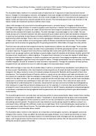
With the five other countries, the UK’s unemployment looks quite good. Spain and Germany have two of the worst rates if unemployment. Japan did have the best rate of unemployment by a long way but now are on par with the UK. The UK did have the second worst rate of unemployment in 1993 but now have the joint best in 2004 with Japan. There are no patterns in this data as the different countries have a continuous change in unemployed people. The UK on the other hand does have a pattern as it is constantly decreasing over the years. The public sector has always had more employment than the private sector. The private sector has had a steady but constant increase in the employment of its workers.The public sector, however, has decreased up until 1998 then, almost symmetrically, increased back up to its starting potion in 1992
-
What changes have taken place between employment in the public and private sectors?
The public sector has always had more employment than the private sector. The private sector has had a steady but constant increase in the employment of its workers.
The public sector, however, has decreased up until 1998 then, almost symmetrically, increased back up to its starting potion in 1992. There are many changes in this graph to be compared. “Manufacturing” is the one that changes the most, with a massive decrease from about 7000 down to about 3500 workers. The one that changes the most next is “Banking, Finances” with a change of about 3000. “Construction” is the only one that stays roughly the same over the 27 years with an increase of only about 250. “Mining, Gas, Water” has slowly decreased over the 27 years with a decrease in workers of about 500.
- What changes have taken place between different industries in the UK?
There are many changes in this graph to be compared. “Manufacturing” is the one that changes the most, with a massive decrease from about 7000 down to about 3500 workers. The one that changes the most next is “Banking, Finances” with a change of about 3000. “Construction” is the only one that stays roughly the same over the 27 years with an increase of only about 250. “Mining, Gas, Water” has slowly decreased over the 27 years with a decrease in workers of about 500. From the graph above I can come to a conclusion that since 1984 the number of people unemployed has decreased. However, it hasn’t been constantly decreasing, it went down in between 1986 and 1990 and then back up again between 1990 and 1993. From here it has steadily gone down from there being 10,000 people unemployed to there only being 3,000 people unemployed in 2004.