Evaluation of tools and techniques used
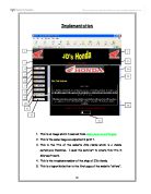
Graphical Images- In the implementation stage of the controlled assessment, I created two images, both in the appropriate format. My logo was created in “Paint” and my original graphic was created in “Fireworks.” When producing these, I applied many of the techniques stated to my graphic using a range of software tools. Firstly, I used the standard shape tool to draw a square; it is much easier to use this tool in order to draw a shape compared to drawing this by hand using the mouse. The fill tool was used to add colour to my graphic. This tool quickly adds colour and saved time since the user does not have to “colour in” the shape manually. The brush tool was used to ad effects to the image. I made us of this technique in both graphics to give a spray-paint texture to the graphic. I also used the cropping tool to eliminate parts of the graphic which were not needed. This tool was used in my second graphic to get rid of extra blank spaces which were not required.
Animation- Before attempting to create an animation in “Fireworks” I initially produced a storyboard to help me plan out the six different frames and what the movement was going to be in each frame. Afterwards I created a six frame animation using a variety of software tools and techniques. For example, onion skinning allowed me to see the previous and next frame so that I could see the overall movement. Looping was used to make the animation repeat itself and run again. This was useful if I did not want the animation to stop after running once. I used the cloning tool to make a copy of part of my original graphic so that it could make a smooth animation. The grouping tool was used to assemble certain images together into one cluster. This enabled me to move a group of images in one movement, which saved time. I explained the frame rate used and explained that it seemed fit for purpose.
Banner- I also produced an animated banner combining both text and a graphic. In this animation I included the name of the school the website is promoting and an image of a school bus. I think the banner is suitable for the task because it relates to children travelling to school.
Sound- For this part of the implementation stage, I used an original sound file and edited it accordingly, using the software “Audacity.” I used a range of techniques to enhance this to fit the purpose of my website. The echo technique was used to add effects to the sound. This made the sound seem memorable and attractive. I also used the “wah wah” technique. However, this made the music sound terrible. As a result, I think a more suitable tool should have been used, for example envelopes.
Justification of choice of image, movies, sound and animation optimisation
The images, sound and animation used in my website were effective in fulfilling its purpose of providing guidance. I used many images which I though would be appealing to 10-11 year-olds such as a school bus, children going to school and smiley faces which would make the site look friendly. However, I do not think the image of the school bus was quite effective, because although it represents school life, the pupils will not be transported in a school bus on ordinary school days. As a result, the image is not fit for purpose. On the other hand, the image of a smiley face encourages pupils to learn about the school and therefore provides a positive attitude regarding the commencement of a new school. My animation is a clip of children going to school. I think this was an effective implementation because it made the website seem interesting, as there is a moving clip on the site. The sound that I used is quite jolly, therefore would attract the audience to look at the various webpages I created. The sound sets the mood of the website thus also makes it seem rather appealing. Moreover, I ensured that I used suitable file extensions of my files as well as optimisation. This is so that my website would be able to be displayed on the web without taking a long time to download. Also, if I were to use large images in my site I would have to optimise it in order to compress the file into a reasonable size. This is also so that the action does not take a long time to download.
Consideration of download times and file size
It is important to take into account the memory sizes of the webpages used. This is because the user may become frustrated waiting for pages to load. I avoided this problem by optimising the files to suitable formats such as .html. Some of the images used in my website are quite large and have lots of megapixels; therefore these would take a long time to download. As a result, I also optimised these to a format which would be suitable for use on the web. As well as optimisation, I could have reduced the image to a reasonable size which would have enabled it to download quicker. However, one possible constraint about this is that the image would lose quality.
Comments on modifications made
As I completed the task of designing my website, I found that I had to alter certain aspects of my work. For example, I was dissatisfied with the colour contrast of the banner. Instead of using the colour blue I used a dark purple colour, which made it stand out more on the webpage, therefore appeared more attractive. The links I had designed in my project storyboard no longer worked efficiently; therefore I changed these to improve site navigation. This made moving around the website easier and less confusing. Initially in the design stage, I had planned for the banner to appear on the top centre area of the webpage. However, after thoughtful consideration, I thought it would look best at the bottom of the page. This made the site seem less cluttered and instead was presented in a professional logical format.
Suggestions for improvement
Although I am satisfied with the overall outcome of my website, I think there are many improvements which I could have incorporated to make the website better. I f I were given more time to complete this task I would have made my webpages a lot more interesting. For example, I would implement an interactivity page where students could play educational games and attempt quizzes to test their capability on a certain subject. This would allow the user to become more engaged with the site and gain a sense of interaction. In order to make the website look better, I could have added more images or animations which would make the site look more animated and fun, since this is most suited to the target audience. Moreover, I think that if I were given more time, I could have improved the sites capacity, by implementing features such as Visual Basic enhancements if I had the knowledge to do so.
Consideration of output to the web
When uploading webpages to the Internet there may be possible difficulties, such as optimisation and copyright. In my website I have used images from the web, therefore, I had to ensure that the image was optimised to the correct format and ensure that they were copyright free. I also considered the amount of time it took to download my website, so that it would not constitute boredom to the user.
Evaluation of effectiveness of final solution
Overall, I think my website meets the criteria of the original assignment, as it provides clear information regarding new pupils commencing year 7. I think my webpages were effective in providing answers that many students may have concerning the school. I do not think I have added to much text as I did not want to make the site boring, especially since the site is aimed at 10-11 year-olds. In order to test the effectiveness of my website, I took a pupils perspective and evaluated my website. I imagined what a student may want to find out about on a school website. With this, I ensured that my site provided this information. As a result I think my website complies with the design brief of this assignment. However, I think that there are many improvements which I could have made if I were given more time which would enhance my final website. For example, implement a larger variety of interactivity for pupils such as a quiz, where they would become more engaged in the site.