A post-production questionnaire was created and then filled out by members of the public to see that audience perception and opinions of the products.
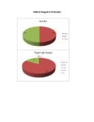
Festival targets particular social groups by using language and formats, which would be appropriate for them. Festival is targeted at the socio-economic groups E (Students, unemployed and casual workers) and D (Unskilled manual workers) and through a post-production survey that was achieved (50% said that E was the target social group). The gender that is attracted to this product is both male and female as both genders have interest in music festivals. When developing Festival, there was no specific ethnicity that was being targeted but when looking at the content of the magazine; the audience would assume that the magazine is targeted at Caucasian people because all images in the 4 products are of Caucasians. The audience’s interests are catered for as best as possible within Festival because some of their interests would be listening to music, going to gigs and going to festivals.
The media institution that would be likely to distribute the magazine would be the publishing house IPC Media as the magazines they have 3 music magazines in distribution at this current time. Festival would make a fitting addition to the current magazines being published and as it is a well known magazine publisher (publishing NME magazine), Festival can be more successful. IPC Media is a very large publishing house that publishes magazines for all sorts of markets ranging from Celebrities to Women’s Weekly Specials.
After taking the results from the post-production questionnaire, the target audience for Festival is male and female, age 16-24 (83%), class E (50%) of the socio-economic model (Casual Workers and Students) and Caucasian ethnicity. Using the data collected from the post-production questionnaire I was able to see that I managed to create the products for the audience I wished to target. Making sure the magazine targeted the correct audience is vital for a successful publication. If the publication were made for the wrong target audience, it would not be a success when being sold on the market.
The audience for Festival would be attracted by the layout, which is similar to that of NME Magazine. This is portrayed in the front cover and contents page. On the double page spread, the audience would be attracted to how the article consists primarily of quotes, which is more interesting for the audience to read. Also not having a very large article with a lot of text is effective, as the audience would not want to read a very large article.
I have learned a lot in the means of technologies that were used in the production of Festival. I learned how to operate a Mac, which I found quite easy to use and understand, how to use Photoshop CS3 which I had somewhat limited experience with in previous versions of the software, how to use iWeb to create this website, iPhoto to upload my photos that I had taken and on the hardware side, how to use a DSLR (Digital Single Lens Reflex) camera which is the digital professional cameras that are used in the industry. Before the coursework started, I didn’t know how to use a Mac very well, I had never used a DSLR before so that was exciting to be able to learn and use the type of camera that is used in the industry. As I said before, I did have some form of experience in Photoshop but not much, for example I didn’t know how to airbrush images, remove backgrounds using the quick select tool to select the parts you wanted to delete (the backgrounds) and do levels and colour balancing. I had never used iWeb or iPhoto before but as soon as I got into them, they were designed so well that they were simple to pick up and just get straight into working with them that I didn’t even need to be shown how to use the software. I just played with it for a bit and was able to operate it fully. I also learnt about lighting and how to get the right lighting for the photo being taken.
Since the preliminary task, I have learned about using the right colour for the right style, design and where to position images to look effective for the audience, how to edit pictures such as removing the background and clearing up blemishes on faces. I’ve also learned about typography, colour of the typography, wording and how a title should be sized and positioned. I have also learned about what can improve the quality of a product such as placement of objects and effects to images such as softening the edge of an image which has had it’s background cut out.
In conclusion, I feel that Festival is a success because it is designed to attract the audience I intended to attract (class E of the socio-economic model), I have been able to create the products in the style of existing products which has given it an authentic look about it (which was confirmed in the post-production questionnaire results). Personally I am happy with the product, I feel that quality is outstanding and I was only able to achieve this quality was because I was aiming to have the same quality of current publications on the market. My peers are also happy with the outstanding quality of the product and feel that this looks like a genuine publication that would be seen in the shops.