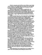
Mr. Woodcock (poster B) tells lots of things, the colours of the posters are all bright which makes the poster effective, which contributes to the story of the movie which is a comedy. The male sports teacher is wearing a red and white sports tracksuit with a whistle in his mouth, he is also holding two basketballs at the bottom, beside his pants in a suggestive manner showing this movie belongs to a humorous comedy genre. The old lady in her mid 30’s is wearing a pink teenage party dress, which looks entertaining as she’s wearing a tiara too, this shows this movie is going to be very outrageous as there is so many things occurring in the poster. The colour pink, which she is wearing, is associated with younger girls and it looks like she has just attended a party. The lady is dressed in a manner that she remembers her teenage days and wants to go back in time as she’s dreaming in the air and in the thoughts of Mr. Woodcock which puts this movie in lots of criteria’s. This movie can be recognised as a humour, comedy, a family film and also a romance. The prom dress shows iconography which then links to the colour and the collision this can have on the genre. Other colours that are used are dark colours like blue for the nerdy guy’s jacket as well as white and marooned red too. The sky is mixed with a blue colour with bubbly clouds in the background, making it look bright and a movie not to be missed.
Poster A has a strong tagline “GET IN, GET, OUT GET EVEN” In this tagline there is commanding phrases used, which show revenge. There are phrases that give clear instructions giving you no other option or a chance to reply by giving your opinion, overall saying “DO IT”. Repetition and alliteration has also been used, this is eye catching and is also easy to remember. The tagline explains the job to get in, do it, and get out, with the money. The typography of the title is bold, it stands out, the lettering is in the font impact which is a font that stands up straight and is really effective. The technique that this has on the audience is this movie is heist, looks effective and advertises the poster. The Italian jobs font has connotations used in it, so the reader is inhibited to the poster.
Poster B has a bold title with all the lettering spread out apart. The title has two colours in it, a red filling and a white outline around it. The colour red is a bright colour engaging all the colours towards it. The tagline of the poster is “Letting go of your past is hard…” This suggests that something happened in the past concerning the male sports coach and the other nerdy man besides him which is wearing a blue jacket. The nerdy man has an expression of which shows that he doesn’t like the sports coach due to something that has happened in the precedent. The other half of the tagline remains on the other side in the middle of the lady and the sports coach who is in the middle too. “Especially when it’s dating your mom.” Dating your mom…This suggests that the Sports coach is going out with the nerdy guy’s mum who is now expressional towards him. The mum is completely fallen in love the coach and is in a dream world with him, but the coach is left in no position to express what he thinks due to a lover and a hater on each side.
The layout and positioning of poster A is set out in a different way. Their is a double yellow line vertically splitting the page in half with images of the characters who are more famous set out in the front as well as who have more role in the film. The positioning of these film characters has a layout of which shows importance in its own way. The vital characters have a big imagery of them made till the least importance taking role to the back but still connecting by shadows individually to make a link. At the front is a young lady standing with body gestures and movement techniques which shows she is a powerful character also she is the only lady in the image and the only one with blue jeans on. The man equally across her on the other side of the double yellow lines, stands very openly with his hands tied, giving an expression of no one can get passed me, with the tender look an muscles intact with him. Lower down beside him there are two other men in different positions standing there with their eyes facing different directions. The men are wearing stereo typical robber’s hat with a sly look on their faces, with their images in a smaller dimension. The other three characters have a role which you can tell what they do, by their costumes.
The geeky guy has a role of an internet hacker along with the bold guy, who looks mean and blends in which shows he’s a handy man. Lastly a dressed up mechanic, who’s shadow is connecting from his character towards the poster, even though he’s small in size, it shows that no matter what the characters size is the effectiveness can be connected if looked in detail. The mechanic is associated with the film by faulting cars for their mission to be completed. As the way this camera angle shot is taken it suggest that this is a high budget film with Oscar winning characters and top actors/actresses making this film a box office draw.
The Box office draw of this film is famous because of the characters as they are really well-known and their names are recognizable too, which ends up making it a box office draw, due to the layout as well as the main characters at the front.
This promotes the film through the box office draw.
The layout of Mr. Woodcock is really good; it shows effectiveness and also comparison between the colours and the characters, making it recognisable of which character is which. The title is mainly in two colours, red mostly, occurring with a white outline around the letters. The lettering is spacious,
Mr. Woodcock is separated in three words, Mr, Wood, Cock and beneath them are three characters with each word under their heads. The sports coach is wearing a red and white tracksuit which suggests that the title of this film is named for the sports coach making him Mr. Woodcock. The costumes that are worn for the poster show their own character. The lady is wearing a banner says “CORN COB QUEEN 1970” this suggests that she was probably voted a queen back in her teen days which she is remembering now. She is also wearing a pink fairy dress and a tiara making her look really odd and different. The characters at the front are mostly known comedy films which they have once had a role in, so as an past experience of their other box office draws, the audience will be willing to watch another comedy which will entertain them and also make them smile. The poster shows other information such as the cast of the film, the director name and other major details like when the film is going to release and this film poster has also got an my space address, incase if someone wants to know any other details about this film. By including an address this shows effectiveness by showing how much effort has been put into this film by a small extra detail, which most film posters don’t include making this film diverse.
Overall, I think that The Italian Job poster is more effective in order to promote a film, due to the use of colours, images, camera angle settings and all the other key information, which has been added for it to become a box office draw. This poster makes you look into it and the connotations make you realise what’s happening, making a link between the typography and the connotations. The cast of the film has been mentioned in the corner, with the director’s name, film title and when the film is going to be released in cinemas. This promotes the film and shows effectiveness throughout the whole film poster.