- To find distinct pattern formations.
- To find the Mean/Mode/Medium from my results on each article.
- To analyse the patterns found and explain what they mean and say.
- To continue to do the same data collection method throughout the project, limiting data repetition and contradiction.
Method
To collect the data promptly and accurate I will need to plan how to do it, in a step-by-step manner.
(1)
Find two suitable newspapers, known for their variations in language usage.
(2)
Find two articles, one from each paper, on the same topic, such as war, politics, sport.
(3)
Begin to count the letters of every other word of each article and note the results down in a tally chart.
(4)
Find the mean, and mode and medium of the results
(5)
Put the results from the tallies into graphs for more analysis and testing.
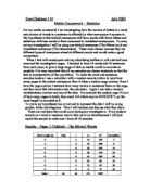
Results
Tally Charts
Above are the results from the data collection on the newspaper “News of the World”. And below is the tally of data from “The Times”.
The following graphs and charts are the results from the tallies, put in different forms.
Bar Chart
This bar chart simply represents the data collected from the tallies.
Line Graph
Line graph to show to variations in the length of words, in different papers.
Below is a Pie Chart of The Times article, showing the data taken from the Tally Chart.
Pie Chart
Below is a pie chart of the article News Of The World, the data was taken from the tally chart.
Analysis and Evaluation
From looking at the bar chart, and line graph I can confidently say that the article in The Times has a larger Vocabulary than News of the World. I can back this assumption with proof from looking at the line graph, from number 2 to 6 News of the world has a larger amount of small words, whereas at number 7 to 12 The Times has a more abundant amount of words with more letters in.
This is one main factor, and pattern that has emerged from just looking at the line and bar graph.
The first graph, the bar chart, is a simple representation of the results I got, therefore I was not aiming to discover any distinct pattern formations. Though one did, as said above, but was not very clear to analyse.
The line graph was although basic, was very helpful in analysing the data, as it showed the variations of the data, and compared them both, and also showed some similarities.
The two Pie charts are just another form of representation of data, the same as the bar graph, just in a slightly more complex form. Although it can be used as a indicator of data variations, it does not exemplify the differences, therefore makes it more time consuming to identify any patterns within.
From working out the mean, mode, medium an it has shown the patterns that are predicted. In mean, the Times has a higher mean showing an average of longer words, 4.4, compared to News of the World which is 4.2.
In medium, which is the most common, the Times have a most common word of 3 letters long, whereas News of the world has 2.
In using the range, which is subtracting the smallest word from the biggest, The Times has a range of 10, whereas News of the world has only 8. These basic workings out prove my prediction is correct.
Conclusion
My investigation in an overall rating I think was quite successful, though I do believe there were some flaws to it.
One flaw was the lack of time to complete my project. If I had more time, I would double the size of the investigation to test four newspapers and analyse them. This would make the project more reliable and less prone to errors because of the larger amount of raw data that I would be able to test and evaluate.
Another area that may of caused inaccuracy in data could be when I was retrieving it. I chose to include every other word in both articles; a simple miss-count and the data will be different from each other, causing an un-fair test. This in turn would affect the final outcome of my result.
In my objectives, where My objective was “To obtain accurate and fair results to aid my project” I would say I was moderately successful because there was some limitations that stopped me completing this objective, but the majority of the work was completed successfully for this objective. From the objective “To find distinct pattern formations of data”, I feel that I was very successful as I have analysed the data, compared, and evaluated it making the maximum use of the graphs to find a pattern. The objective “To find the Mean/Mode/Medium from my results on each article” I am successful, as I have done what I set the objective to do. On the objective “To analyse the patterns found and explain what they mean and say” I am, once again moderately successful as I have explained and outlines as much as possible where relevant, but I feel more data was needed so I could pin-point more patterns.
The last objective I set myself, and arguably the most important was “To continue to do the same data collection method throughout the project, limiting data repetition and contradiction”, because I feel that there was very little or even no data repetition and the data collection process was relatively rapid and easy.