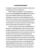
The advertisements I intend looking at in my coursework are to do with food and weight loss. One is about healthy food and the other about junk food. I have chosen to compare these two advertisements because today everybody is health conscious, gyms are minting money and diet foods are the most popular items in supermarkets. I have also chosen these two advertisements because the target groups which they aim at are completely different and at the end of it, both advertisements have a similar message.
My first advertisement is a very bright and colourful one which is extremely tempting and eye catching. It is mainly targeted at children and health conscious people. The bright pictures appeal to children and the fact stating that, ‘The consumer of the product will save on 12,400 calories a year.’ appeals to all those who are trying to loose weight. The purpose of this advertisement is to promote the use of St Ivel butter which is considered healthier than the others. Each of the biscuits have been coloured in different colours. The colours used are highly symbolic and represent ideas that they might be different flavours, strawberry for the pink wafers and the jam sandwich. Brown represents chocolate for the cookies, digestives and the chocolate fingers. The purple can represent blackcurrants in the ice gems and the party wheels. The pictures have been laid out spaciously and a good use of space has been made. The pictures are big and every intricate detail can be seen, such as the chocolate chips in the cookie and the layers of icing on the ice gems. Some of the biscuits have purposely been broken into halves to increase the temptation of the reader. It also gives the viewer an idea of what the biscuits are like from inside. The name of each biscuit has been written near their picture in a small font but it is still clearly visible. At the bottom of the page there is a small picture of the St Ivel butter box and there is a promotion line which says that switching to St Ivel Gold from Flora Light will save the consumer 12,400 calories a year. This really persuades the reader to buy the product. It is almost like a slogan and draws the attention of the viewer. In the advert, colloquial language has been used as it is mainly aimed at a younger age group audience who are trying to lose weight. The advert is titled in a bold font, ‘BISCUITS’ and the page is mainly covered in various pictures. The advertisement makes good use of space and pictures which is very important. The advertisement is completely dominated by pictures and only has a few lines written at the bottom. The advertisement is from a magazine called ‘Health and fitness’ and hence suits its purpose. The only slogan that has been used is, ‘The lowest fat spread.’ and it has been underlined to draw the viewer’s attention towards it. One of the linguistic devices used is simple English that can be understood by people of all age groups. It also uses a fact that is if people change to St Ivel, then they will definitely lose 12,400 calories a year. This proves that the product has been tried and tested. The slogan basically promotes the product; the line under the product has been used to put a little humour into the advertisement. The effect the advertisement has on the viewer is that the pictures are very tempting and it is very eye catching especially for little children, and it is a solution to most middle age obesity crises.
My second advertisement is about a company that helps you lose weight who call themselves ‘Slimming World.’ Again, the advertiser has made good use of space and has given the advertisement a bright red, colourful background. The red colour might symbolise anger or agony that certain people have who are desperately trying to lose weight. Half of the page is covered in a picture of a barbeque bacon burger which looks extremely tempting and looks like one of the burgers from McDonalds or Burger King. The other half of the page has ‘Yes you can! at slimming world we’re full of surprises.’ written in a bold print in the colour white. The white colour might symbolise peace and determination. At the bottom of the page, there is the company’s logo and their contact details with the telephone number. The linguistic devices used are simple English, which can be understood by people of all age groups. Also, the writer uses imperatives by assuring his readers that they can lose weight. The advertisement is mainly aimed at people who are trying to lose weight and want to go visit a dietician or a nutritionist who can put them on a special diet. However, it can also be aimed at other companies who are in the same field and who are looking out for competition. The advertisement is basically assuring its readers that nothing is impossible and that you can definitely lose weight. The slogan used in the advertisement reads, ‘Discover the amazing you.’ It definitely is a strong line and acts as a determination booster for all those who have stopped believing in themselves. The advertisement suggests that the company is very confident and are giving their readers their word that they are bound to see weight loss. This confidence suggests that people have been to them and they have been successful. The picture of the burger is very tempting as it looks like one from those famous fast food restaurants. The purpose of the advertisement is to attract people to join their company to lose weight. The tone used in the advert, is very assuring and confident and hence boosts the publicity of the company. This advertisement is sure to have a major effect and those who are trying to lose weight.
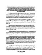
In conclusion, both these adverts have similarities and differences. However, both of them are exceptionally good adverts with their own pro’s and con’s. Both adverts promote weight loss. The language devices used in both adverts is very different, where the first one uses colloquial language, the second advert uses imperatives. Both adverts are picture dominated and use a wide range of colours that each has a particular meaning. Both adverts also have slogans that are very reassuring. Both adverts have very little written work on them. In both adverts, all the pictures are related to food, however, whilst one shows healthy food the other shows not so healthy food. Both adverts make use of bold and italics. Also, both adverts are aimed at almost the same group of people. I prefer advertisement two as it is more attractive and more realistic compared to the first advert. The presentational devices used are also slightly better. The slogan is also very encouraging and hence my preference.