These can only be used to display a single variable which is subdivided. The pie chart then shows relative size of the subdivisions.
These are commonly used to illustrate frequency distributions. They are similar in appearance to bar charts, but they differ in two ways:
- The scale on the x-axis is a continuous scale, not a series of categories. The width of each bar represents the corresponding class width in the frequency distribution.
- The area of the bar is proportional to the frequency of the class.
These are constructed by plotting the midpoints of each class in the frequency distribution. The plotted points are joined dot-to-dot by straight lines. Polygons should be a closed figure, the first and last points should be joined to zero on the x-axis.
- Ogive (cumulative frequency polygon)
This type of data presentation allows us to estimate the number of observations in the distribution which fall below a certain value. It is constructed by plotting cumulative frequency against the upper class boundaries and again it should be a closed figure where the first and last points are joined to zero on the x-axis.
The level below which ‘x’ percent of data values fall is called the xth percentile. There are three commonly used percentiles: the 25th percentile which is known as the lower quartile and denoted by Q1, the 50th percentile which is known as the median and denoted by M and finally the 75th percentile which is known as the upper quartile and denoted by Q3.
Descriptive statistics produce a single value, help to describe data and identify summary measures. There are two summary measures of data, measures of location and measures of dispersion.
Measure of location involves three averages, the mean the median and the mode.
The mean is the sum of all the values in the data set divided by the number of values in the data set. The mean is a valuable and fairly accurate way of calculating the ‘average’ because all of the values in the data set will contribute to the value of the mean, it can also be sued in further statistical analysis and is not purely descriptive and it also reflects small changes in the data set. However, it is affected by extreme values and is therefore less useful as typical values if the distribution is skewed. A sensible interpretation of the mean may be difficult.
The median is the value below which 50% of the values fall when they are arranged in order of size. On the plus side the median is unaffected by extreme values like the mean was and is simple to calculate. However, it does not involve all the values in the data set and it is descriptive rather than analytical.
The mode is the most frequently occurring value is the data set. It is easy to calculate and can be sued with non-numeric data. It is useful in market research when we may be interested in majority opinions. However, an appropriate value may not exist as all the values could be different, is the distribution is multi-modal then the modal ceases to be a useful typical value. The mode does not involve all the data points, the mode may be an extreme if the distribution is highly skewed and again it is descriptive rather than analytical.
Measures of dispersion involve the inter-quartile range, the range and the standard deviation.
The inter-quartile range is Q3-Q1, the 75th percentile minus the 25th percentile. It shows the spread bounding the middle 50% of the values of the observations.
The range is the upper class width minus the lower class width, basically the highest value minus the lowest value in the data set. The range is extremely easy to find and understand; it is however, effected by one or two extreme values and is not suitable for further statistical analysis.
The standard deviation is the square root of the variance; the variance is the average of the squared mean deviation for each value in the distribution. The standard deviation is denoted by σ, the Greek letter for sigma. The standard deviation is based on all the values in the distribution and so is more comprehensive than dispersion measures such as the quartiles. It is also suitable for further statistical analysis but it is more difficult to understand than other measures of dispersion.
There are three main shapes of distributions, symmetrical, positively skewed and negatively skewed.
A symmetrical shaped distribution will have the mode = the median = the mean, or be extremely close to each others value. Here is we were to look at a graph of the distribution we should be able to cut the graph into two halves that would be exact mirror images of each other.
A positively skewed shaped distribution would have the mode < the median < the mean. In a positively skewed distribution graph the graph would lean towards the left hand side with a tail stretching out towards the right.
A negatively skewed shaped distribution would have the mode > the median > the mean. In a negatively skewed distribution the graph should lean towards the right hand side and a tail should be stretching out towards the left.
Rivalpax plc:
Mean = (∑fx) ÷ (∑f)
= (501.8+2036.3+661.8+370.9+205.45) ÷ 25
= 151.05
Range = 215.4-115.5
= 99.9
Modal Class = 135.5-155.4
Median ≈ ((12÷13) × 19.9) + 135.5
≈ 153.869
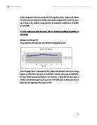
From the Ogive we can see that the actual value for the median is 148.
Standard Deviation = √ [((∑fx2) ÷ (∑f)) – Mean2]
=√ [((∑ 4×125.452 ) ÷ (25)) - 151.052]
14×145.452
4×165.452
2×185.452
1×205.452
= √ 23184.7425-22816.1025
= √ 368.64
= 19.2
Inter Quartile range = Q3 – Q1
= 160.5-139
= 21.5
Loxpax plc:
Mean = (∑fx) ÷ (∑f)
= (627.25+2327.2+496.35+741.8+205.45+225.45) ÷ 30
= 154.117
Range = 235.4-115.5
= 119.9
Modal Class = 135.5-155.4
Median ≈ ((15÷16) × 19.9) + 135.5
≈ 154.15625
From the Ogive we can see that the actual value for the median is 148.
Standard Deviation = √ [((∑fx2) ÷ (∑f)) – Mean2]
=√ [((∑ 5×125.452 ) ÷ (30)) - 154.1172]
16×145.452
3×165.452
4×185.452
1×205.452
1×225.452
= √ 24330.16913-23751.94694
= √ 578.22
= 24.046
Inter Quartile range = Q3 – Q1
= 166-139
= 27
From these calculations we can see that Rivalpax plc and Loxpax plc have the same modal class, no this is irrelevant because the mode can only show us something when it is a single figure, not when it covers a range of values.
If you look at the line graph that shows the weekly wages of Rivalpax plc and Loxpax plc together you can see that they are both slightly positively skewed. This means that on both accounts the mean is slightly ‘out’ due to the odd extreme value. Because of this positive skew it means that the mean is not the best and most accurate value to take, it would suggest that the mode would be the best but as it is a grouped frequency there is only a modal class and therefore the next best value would be the median. However, from each companies Ogive you can see that the median works out to be the same.
When estimating the median from the grouped frequency distribution table we can see that the median turns out to be 153.869 for Rivalpax plc and 154.156 for Loxpax plc. However, the actual values that can be read from the Ogive are 148 for both companies.
The mean shows us an ‘average’ of what employees are paid, now it would seem that Loxpax plc has a higher mean and could therefore state that they are higher paid. The mean is affected by extreme values in the data set and this does therefore mean that the mean is not a good ‘typical’ value to use on its own as supporting evidence to say who is better paid.
If you look at the bar chart you can see that Loxpax plc has more employees paid between 115.5 and 155.4 per week than Rivalpax plc does. Rivalpax plc has more employees paid between 155.5 and 175.4 per week and it does not have anyone paid between 215.5 and 235.4 per week. These statistics will effect the mean and do not prove tat Loxpax plc employees are paid more than employees at Rivalpax plc.
If you look at the range that the two companies cover you can see that Loxpax plc covers a wider range of values than Rivalpax plc does. Loxpax plc covers 119.9 and Rivalpax plc only covers 99.9, this is a difference of 20. The values could be at either the higher extreme or the lower extreme of the distribution and will make the mean skewed. As we can see from the line graph that both companies are positively skewed, Loxpax plc more so than Rivalpax plc. This positive skew means that the mean of Loxpax plc may well be skewed and when looking at the rest of the values you can see that there are more people paid the lower wages in Loxpax plc then there are in Rivalpax plc.
On the Ogive for each company there is a box plot, this box represents half of the distribution, the middle half.
The inter-quartile range is a method of measuring the spread of the middle 50% of the values and is useful since it ignore the extreme values. The inter-quartile range for Rivalpax plc is 21.5 and for Loxpax plc it is 27. This, like the standard deviation shows that the spread of the middle numbers in Loxpax plc is wider than that of Rivalpax plc’s. If we were to ignore the ‘extreme’ numbers when calculating the mean we would find that the mean would actually be a more accurate reading of who is paid more.
Looking at the pie charts for each company we can see that Loxpax plc pays 3% of its employees a wage between 215.5 and 235.4, whilst Rivalpax plc pays no percent of its workers that amount. The largest amount is taken up by 135.5 to 155.4 per week at 56% for Rivalpax plc and that same wage is only 54 % of its employees get that much. Loxpax plc pays 17% of its workers a wage between 115.5 and 135.4 whilst Rivalpax plc pays 16% of its workers that much. Only 10% of workers at Loxpax plc get a wage between 155.5 and 175.4, compared with 16% of the workers at Rivalpax plc. From this we can see that Rivalpax plc pays more of its employees the 115.5-135.4 and 135.5-155.4 than Loxpax plc does.
The standard deviation for Rivalpax plc is 19.2, whilst for Loxpax plc it is 24.046. This is a measure of the spread of data about the mean value. The lower this value is the less spread out the values in the data set are, so we can see that the values in Loxpax plc are more spread out than they are in Rivalpax plc. This means that they are not necessarily paid more at Loxpax plc but they have a much wider range of pay schemes than Rivalpax plc does. Taking off the extreme values that cause the positive skew on the Loxpax plc line chart you will see that the mean becomes equal to the median as it becomes a symmetrical chart and the mean becomes lower than that of Rivalpax plc’s, thus meaning that they receive less of a weekly wage than those at Rivalpax plc.
So to conclude form all the evidence enclosed, charts and tables and equations calculated, you can see that the packers at Loxpax plc are less paid than those at Rivalpax plc.
Bibliography
- Financial Management for Higher Awards – Martin Coles, Heinemann Publishers
- HNC/HND BUSINESS Core Unit 5: Quantitative Techniques for Business, BPP Publishing
-
Business for Higher Awards 2nd edition by Needham et al published in 1999 by Heinemann.
- Data in the tables that show the weekly wages of packers at each company are sourced from the payroll department and were given in the assignment.