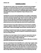
Here I have an advertisement for Dove Body Silk found in a monthly 'Sugar' magazine costing £1.90. This targets an audience who, in the majority are in their teens; the people that seem bothered about looks perhaps rather more than other groups. The advert takes up the full A4 page in this magazine, so it doesn't share with another advert. It was placed somewhere in the middle behind the pop pages, strategically situated here so that having seen all their famous idols, the target audience see this advertisement and relate it to the beautiful pop stars they
long to look like. They then consider this product more effective than they might otherwise have done.
At the top and to the right of the centre of the advertisement are the words "Silk Underwear," written in a reasonably large font. This draws the reader's attention to the advert because the phrase sounds exciting, exotic and wonderful. Silk underwear is sensual and therefore this quality will be transferred to the product and then, of course, to ourselves, if we use the product. To have skin like silk is every woman's dream. The handwriting style of this message, rather than a formal style such as Times New Roman makes the advertisement, perhaps more intermet, like a shared secret. The letters are black against a white background of what looks like a window letting in light and reflecting on a silk negligée and with a few very pale shadows. This foregrounds the message and also the plain difference between black and white and, in the same way, the difference between owning the product shown and not owning it.
When the target audience read the words "Silk Underwear" they will automatically think of sophisticated and sexy ladies dressed in just their fancy lingerie. Silk is quite expensive so the audience will associate it with classy women who they long to be like. Readers are also immediately reminded of the lovely texture and delicacy of this material when they read the words, and that it is almost invisible when worn. This suggests that the cream is light and invisible on the skin also. The audience read the word silk - and think of their body, underwear, undressing, and sensuality. It generally excites them. When the potential consumer reads the word underwear she will think of the same and imagine that to own this product will provide her with all these qualities.
A little lower and to the left is a larger than life-size picture of a pot of the product - Dove body Silk. Again, the word silk is here. Dove have chosen to call themselves by the name of a bird representing peace and love, providing us with the euphoric message that the product itself will give us all this. The word Dove has been written in a fancy, curly, italic font. This makes the pot look more fancy rather than plain. It looks more professional and sophisticated which will make us want it so that we achieve sophistication or at least appear to, if we own the product. The lid has been removed as if somebody has used it, even though the cream in the pot is in a perfect swirl. It looks like perfection - the cream in it, the perfectly rounded
shape of the pot, the perfect white. Indeed, this perfect image can also be yours with the help of this product.
Colour is very important in this advertisement. They have used almost all white and pale shades of gold. The only other colours are blue (the name Dove) with gold also picking out the logo. White was used because it represents purity and the idea is that this cream is also pure and can make your skin pure too. White is also a very clean colour and by using it the advert itself seems clearer and nicer, as does the cream in the pot which will make your skin silky smooth.
The colour gold was used because it is a skin colour desired by many people. This colour too looks clean and if associated with skin, suggests health and radiance without a sign of dullness in it. Indeed, gold suggests quality and exclusivity. It works really well with the white and this represents how well the cream will work with your skin. The picture demonstrates how beautifully these two colours suit each other. But there is a shadow in this area, which is cast by the tub. This suggests that the light is shining on the tub because nothing else is casting a
shadow. This makes the tub the centre of attention, even though it is not quite in the centre of the advert.
Part of the lid is visible behind the full container but it is blurred because it is in the background/and is not the main focus. You can, however, still see the gold dove and part of the name on it. The fact that the product name and its logo are the only items in different colours makes them stand out and grab our attention, overpowering the rest of the advert in catching our eye. This is good because we will remember the name and logo in the future as it was the first thing that we saw and then, when we see it in shops, it will immediately draw our attention, perhaps prompting us to buy.
I have noticed that, as I study this advert my eyes are being drawn diagonally downwards to the left. I think this is intended to make us look at the next part of the advertisement and to stop us from looking away. It works! As I look further down to the left I see the words "Silk everywhere," which has followed on from the words Silk underwear. This is a catchy phrase because it rhymes and it is memorable, which is what the advertisers were looking for. Reading the words 'silk everywhere' lets us imagine the wonderful feeling of silk, only all over us. This is an even better thought than silk underwear. This leads the reader on to see how much better it can get.
A little below are a few sentences of text:
"Imagine wearing silk all over. Dove Body Silk. A rich, silky cream that's absorbed leaving your skin silky smooth. Sheer luxury for your whole body."
This is the finishing part of the advert so the reaction of the reader is important.
The way in which these words are put together makes us feel that Dove Body Silk is the answer. We are asked to imagine silk all over us. Then there are just three words in the next punchy sentence - Dove Body Silk. It is as if this is the answer to the wish of having 'silk all over.' The cream is then described as an amazing product leaving your skin perfect. The words silky, smooth, luxury are all adjectives we like and which describe how we would love our skin to be. We are encouraged to believe that we can get this from the Dove product. In this way, the explicit written text reiterates the implicit message of the image.
This whole advert really is about making the target audience believe that the Dove product is the only way we will ever get the pure skin we want.
I think that the advert does its job really well. I am convinced by it. It is an effective advertisement which is very persuasive and it is well laid out. I think this is a good advert and the techniques have been used well and to their best advantage. It should succeed in reaching its target audience.
Silk underwear is sexy, therefore silky skin is sexy - it is an unspoken but explicit message which will be readily received by women of all ages who wish to be desired and desirable.