When we have a large number of different data values, we can grouped the data into intervals. The mean, mode, and median can then be estimated from the grouped data tables.
Data can be discrete or continuous.
- Discrete data can only take certain values. For example, the shoe sizes can only be a whole shoe size or a half size (4, 5.5, etc), the number of houses built must be a whole number.
- Continuous data can take any value. For example, when measuring heights or times, there can always be another value in between any two measurements. Continuous data must therefore be grouped.
EXAMPLE
The heights, measured tot the nearest centimeter, of 40 students in a secondary five class are shown below,
- 157 149 155 161 154 176 166 168 170
- 150 158 156 171 146 166 159 165 154
- 152 153 160 146 160 159 156 160 155
148 155 156 152 153 149 158 153 154 163
Organize data into a grouped frequency distribution table.
Solution
Notice that the shortest height is 146 cm and the tallest height is 176 cm. the difference between the tallest and the shortest height is 30 cm. if we put them into 7 groups, we can have a class interval of 5cm each i.e. 30/7 = 4.29. The heights can therefore be arranged in groups as shown in the following table.
Class
Each group is also known as a class. For example, the interval 160-164 is a class. Each class has a lower class limit and an upper class limit. So, in the class interval 160-164, 160 is the lower class limit and 164 is the upper class limit.
Class boundaries
Notice that the class limits are chosen to that each score belongs to only one group.
Since the height is measured to the nearest centimeter, the class 160-164 includes all heights greater than or equal to 159.5 cm but less than 164.5 cm. the heights 159.5 cm but less than 164.5 cm. The heights 159.5 cm and 164.5 cm are known as class boundaries.
Therefore, the frequency table can be shown as follows:
Class width
The difference between the upper class boundary and the lower class boundary of the same class gives the class width.
The class width of the 1st class is (149.5-144.5), or 5 cm.
However, the data are grouped in classes, as in the above example, we only know that there are 6 students of heights in the interval (144.5-149.5) cm. We are unable to tell the actual height of each student, unless we refer to the original list of data.
In frequency tables there are three statistical averages, namely mode, median and mean.
Similarly we can also find the mode, median and mean grouped data.
Mode, Median, Mean
If the class (width) interval is the same for all classes, then
- the modal class refers to the class with the highest frequency.
- the median refers to the class in which the middles score lies.
- the mean refers to the average of the scores for the distribution.
Grouped data
For grouped data, we assume that mid-value of each class is taken to be the mean score for that class. Thus, mean for grouped data can be calculated as follows:
MEAN = ____Total fx___ , where x represents the mid-value of each class and f
Total frequency represents the corresponding frequency.
From the table as well, we can also find the quartile range. That is the lower quartile, upper quartile and interquartile range.
Lower quartile is value for which a quarter (25%) of the distribution which lie as below.
Upper quartile is the value for which three quarters (75%) of the distribution lie as below it.
Interquartile range is the difference between the upper and lower quartiles.
Example
The speeds in km/h, of 30 cars which traveled along an expressway were recorded as follows:
Solution:
Mean = __Total fx_ 2315.0
Total frequency = 30
= 77.2 km/h (to 1 dec. place)
The steps for calculating the mean for grouped data can be summarized as follows:
- find the mid-value for each class.
- multiply the frequency and the mid-value of each class.
- find the total frequencies and the sum of all the products of frequencies and
mid values.
- divide sum of product by total frequencies.
.i.e. MEAN= ____Total fx__
Total frequency
Question 3
Bar Charts
Bar charts are used to illustrate measurements of data from different times or at different places. The principle is that the length of the bar represents the value of the factor being measured. Thus, it is important to have a scale of some sort. Bar charts are very easy to draw, and equally easy to understand.
However, they can be limited in power as they are restricted to showing differences in only one factor, through they can be made more powerful by using one of a number of variations, which include:
Component Bar Charts, where each value is broken down into its component parts:
Percentage bar charts, where the components are broken down into percentage parts, each bar representing 100% of some factor:
Multiple bar charts, which can be effective in comparing sets of data:
Pie Charts
Nearly everyone will be familiar with the pie chart, as they are so prevalent. They are so called because they are like a pie, which is cut into slice to represent data. Alternatively, they can be thought as pi charts, because they involve a circle.
The only disadvantage of pie charts is that they make it difficult to read and hence compare exact values.
Here is how we construct a pie chart with a set of figures. Basically, it is the angle at the centre of the circle that represents the value. So if we were illustrating a single factor with a total value of 360 degree (e.g. $360), each $1 of value would be represented by 1degree.
Histogram
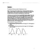
The most common method used to illustrate a frequency distribution is histogram. People often assume that a histogram is just a technical term for a bar chart. In fact they are quite different. With ungrouped data, they do look like bar charts. But in a histogram, it is the area of the bar that represents the value, not just the height. This becomes significant with grouped data, although if the class intervals are the same, then the heights of the bars can be compared.
Histograms are good at representing the shape of a distribution, if the intervals have been chosen well. The distribution can also be represented by a frequency polygon, constructed by joining mid-points of each interval with a straight line. This has been done in the diagram above. Line were finished off in the end, so that the area under the curve represents the total distribution.
Frequency curves
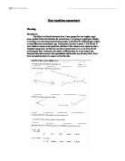
A cumulative frequency identifies the cumulative number of observations below the upper class boundary of each class is determined by adding the observed for that class to cumulative frequency for the preceding class. A smooth curve which corresponds to the limiting case of a computed for a frequency distribution of a continuous distribution as the number of data points becomes very large.
It can also be potayed graphically by accumulative frequency polygon. This line graph is more frequently called as ogive, constructed by joining the mid-points of each interval with a straight line. This has been done on the diagram below. You may noticed it ‘finished off’ at each end, so that the area under the curves represents the total distributions.
REFERENCES
Ref. 1
Schaum’s Outline of Theory and problems
of Business Statistic
Fourth Edition Leonard J. Kazmier
W.P Carey School Of Business
Arizona State University
Ref. 2
Basic Statistics For Business and Economics
Second Edition
Leonard J. Kazmier
Norval F. Pohl
Arizona State University
Noethern Arizona University
Ref. 3
Even you can learn statistics
David M. Levine
David F. Stephan
@ 2003 Pearson Education, inc.
Publishing as Person Prentice Hall
Upper Saddle, NJ 07458