This is why the campaign is so effective.
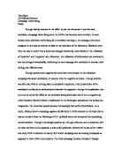
In 1999-2000 the Barnado’s campaign put out a very shocking picture called JUMP. This was a picture showing a high angle shot of a little black boy who was standing at the edge of a very tall building. This image was very upsetting and disturbing because it was strange to see such a young boy in such a grown up adult situation – contemplating committing suicide. Barnado’s did this to show how vulnerable the boy was in the situation of a very stressful, emotional and traumatic time.
They dressed the boy in very bright, vibrant colours in the middle of the page to focus our attention directly on him. He was wearing a yellow top with blue striped trousers and white sandals. The background of the picture was very bland, dull and not very lively. The streets down below were bare. There was only one bit of light which was, I think, to represent the tiniest ray of hope which was in the right hand corner of the picture. The sun was just shining out of the cloud to give the smallest bit of light effect. The light was also very close to the logo which suggests to people that Banardo’s gives people a chance to see the light as well as giving a sense of security and of hope.
Barnado’s was very clever with the name and the age of the person because by putting it next to the picture in bold letters you realize that what you are seeing is actually a real person. By putting it next to the boy rather than in the text it stands out more showing us that this actually does happen. It’s not just a name - it is actually true. The name shows us that he is actually 29 not a child but it still keeps the image’s whole sense of being of a sympathetic nature.
The text down the side of the pictures is in quite small font. This is so that you still read it but it’s not the main focus of attention. The text just explains the more personal side of the person. In this case the person is Martin Ward. It explains his background and why he has resorted to suicide. This text of his life is very emotional to many people because we can actually start to understand why he actually resorted to suicide and how he must have been feeling when he did it.
The Barnado’s logo represents a sense of security and happiness. So when people see the logo they will know that by donating money you are actually making a difference to whether or not another person will actually get the security and happiness that they need in their life.
This message is made very clear in these campaigns - that you can actually help save someone’s life.
SILVER SPOON ADVERTS
The phrase “born with a silver spoon in ones mouth” means someone who is born into a wealthy or well off family who can supply the best opportunities for their child.
Barnardo’s have done three different types of these pictures. One picture has got a lovely, chubby, happy baby lying on a golden floor of fur with a silver spoon in his mouth. This picture reflects the future and privileged life that this baby is going to have. Unfortunately the other two are not as pleasant as the first one. The second one is of a baby that looks as if it’s just been born because it has still got all of its bodily fluids on it. It is in contrast lying on a sheet of rough, hard, green paper. This baby is crying, his fists are tight; he looks very distressed, bruised and red. He has a huge bottle of purple methylated spirits in his mouth. This shows that he is going to be an alcoholic when he’s older. Someone who sees this instantly knows that that’s what his life is going to be like in the future and he’s only just been born. This baby has no luxury, comfort or love. This image is used to make us see that we can help save babies like this one merely by donating a small amount of money to help find a new home and loving parents for him.
Barnado’s have made these images to try and support children in poverty and in an abusive environment. They believe that children should have the best possible start in life and that tackling poverty for all these families is central to the aim of this campaign. The logo on these adverts is the same as the other Barnado’s campaigns because it is still trying to put across the same message, just in a different way. The text down the side of the advertisement page is the same sort of text but in a slightly different term.
In all three of the Silver Spoon baby adverts the camera angles are all the same. The angle is a high angled shot but very close up to the baby. It makes the baby look very weak, vulnerable and small.
IF ONLY EVERY CHILD IN THE UK WAS BORN WITH A SILVER SPOON!
To conclude I would say that all of these pictures are all of small vulnerable children or babies in very difficult adult situations. This is so that we realize that these things can happen to people less fortunate than ourselves. The two sides both tell us the same story. That this is what they are going to grow up to be like when they actually are adults. Barnado’s research shows that one in three children who live in the UK live in poverty and that children who are born into poverty will have a disadvantage in their future. From this people will now hopefully see that these children do need our help and people can give that help to them by donating money to make their futures brighter and full of opportunities that they would otherwise not have.