I feel that in my advertisement I have met many of the potential customers’ needs. The copy is in bold and a different colour to the rest of the advertisement. There are photos placed in different areas of the advertisement. There are photos of natural looking nails, glamorous and creative. Which i feel will attract to most of the female target audience. I think that women feel a lot more attractive with long nails; they’re seen as feminine and sexual.
My advertisement is targeted for women of all ages, there is an image in the upper left hand corner showing a hand with every nail painted a different colour, I think this will attract the attention of younger women such as in their teens. My slogan is place in the upper right hand corner. This is placed in a box with different colours in it so that is catches the eye. This copy is in the same font as the title. There is also alliteration in my slogan so that it plays on the mind; the slogan is ‘Fancy Falsies for Fancy Females.’ Beneath this is a long image stretching across the centre of the page above the company name with 4 different photos of nails along it. These nails have all been painted very creatively. I think that this show that we vary our products. These nails will appeal to the more creative females and are more expensive than the others. Along either side of the pages there are facts about my company. On the left hand side says ‘Nail Extensions’ in bold black copy, which stands out comparing to the background. The other side says ‘Any Length Up To 5cms’ in the same copy. Beneath the title there are 3 images all of which are more natural and elegant looking nails. The bottom left hand corner holds a photo of a women holding nails up to her face, these nails are long and sultry, which I think would appeal to any aged female. There is then a small photo next to this of perfectly manicured nails and pearls around the wrist of the lady. I think these nails would appeal more to the elegant, older females, or for special, classy occasions. The bottom right hand corner then holds an image of natural looking nails in water. These are shorter than the others and I feel would be more appropriate for working ladies, which want nice nails but also need practical nails. Beneath the small centre image there is a brief list of adjectives to describe all the nails we have for example ‘Fashionable, Trendy etc.’
The ad may be set in women’s magazines, as they are our target audience. Also in teen magazines to encourage them to have the nails as well.
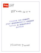
The slogan links in perfectly with my product as it also has the title name in it. The slogan is ‘Fancy Falsies for Fancy Females’ this makes women feel as if they could be fancy and that the nails that we produce are fancy.
I have chosen 3 colours for my design, yellow, orange and the copy in purple. I chose these colours so that they’d reflect a classy image on the company. On my design I have used 5 images to symbolise the theme of nails to promote my product. I am quite pleased of the layout of my final design; the layout includes different images of nails to back up my product. My advertisement will be placed in beauty shops, retailing warehouses, shopping centres and bill - boards this will help to promote my products. The advertisement was created on computer using font for my copy and images of my products.
The only editing I have done on my advertisement is copy in bold font, enlarging images and structuring the layout of my advert.
The image that I give out for my product is very important. I hope to give off a cheerful happy feeling using the colours. Also to give off a professional view. Also because of the descriptive language to make the customers feel as if we will do whatever they want. The central image focuses the attention of my product, as this is the position you will immediately look at on an advertisement.
My title is large and bold. The images are clear to see and the information is fair and appropriate for the eye to be able to see. There is a small amount of texture in my poster; this is the background colour blending into different shades.
Throughout my advert there is continuous alliteration. In my slogan every word starts with F. Also in my company name both words start with F therefore it is more likely to stick in your mind and it’ll emphasise the brand name. My advertisement is made up of graphics from the copy, to the images. I have achieved this by creating it on the computer.
I think that my advert is a success because it gives off the impression that people want it. Also because of the alliteration in slogan and name, the company is more likely to play with your mind therefore you’d remember it better. It gives off the impression that if you have these nails you’d be fancy. And all women want to feel as if they’re better than the average person.
I think that the lifestyle this advert suggests is one that all females want. It suggests that you can be Fashionable, Trendy, Modern, Classic, Wacky, Beautiful and Fancy! Many women want to combine these all in one and that is what you can do from having nail extensions.
The Values that is suggested from this advert is that you can feel and look good at the same time, just from investing in some nails.
Mair Wadley