How effective are the advertisements you have chosen to study in appealing to their target audience?
How effective are the advertisements you have chosen
to study in appealing to their target audience?
I am going to compare two advertisements which I took from the magazine 'Marie Claire.' 'Marie Claire's target audience is young, sophisticated women, aged 18-30s. In the magazine, there is lots about fashion, beauty, relationships and general women's issues. I have chosen two different advertisements to compare. Both advertisements have very different, effective persuasive techniques which I am going to discuss.
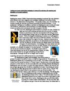
I am going to begin by describing the 'Always Ultra' sanitary towels advertisement. This advertisement is aimed at a wide age range of woman, from early teens to even fifties. The advertisement is not aimed at a particular age group, instead it is quite vague, and could appeal to women from their first period to their last.
This advert, on the whole, is very clear, simple and legible. It has a
light green background which fades into a white colour as it enters the centre of the page. This whole advertisement shares the same green colour scheme, which links in with the colours used for the actual product. At the top of the advertisement, there is a dark green band which is taken from the packaging of the product. This colour scheme is very easy on the eye and it is very calm and tranquil. This colour is neither dull nor really bright, and therefore it would appeal to all target audiences.
The colour of the background is very light and airy and allows the text
to stand out, which is in a much darker blue/black colour. All of the text is in the same legible font which is Arial. This is a widely used font style and is used because its letters are decipherable. The important information, which the company wants the consumer to read, is in a much larger font, for example, the "Always", "Cotton-like" and "comfort" are all in a large font because these words are important and will grab the reader's attention.
The Unique Selling Point for this advertisement is that these
sanitary towels offer "greater comfort" with their "cotton-like feeling." As you will see, all of these words are in a much larger font. This persuasive technique is very effective because the first thing the target audience notices when they look at the advertisement is the large text because it stands out most. Therefore it is important to make the most important pieces of information, such as the Unique Selling Point in a large font because these words will be read first. The Unique Selling Point is aimed at all women, proving that no matter how old you are, comfort is essential.
At the top of the advertisement, a rhetorical question has been used. This is really effective because it makes it more personal to the reader and catches their attention asking them "Do you know?" This really makes the reader think about what the advertisement is asking them and encourages the reader to finish reading the rest of the advertisement, as they would be intrigued as to what it was asking them.
The words "Cotton-like feeling" are repeated twice and "Cotton" begins with a capital letter to show that it is an important piece of information. The repetition is a very effective persuasive technique because it makes the consumer read this information again. Cotton has been repeated because it is a Unique Selling Point, and therefore should be repeated to emphasise this word and to make it stand out more.
Although there is not that much text used in this advertisement, the
Agency that made this advertisement have chosen appropriate, persuasive vocabulary to accentuate what they are saying. The use of the adjective "greater" really emphasises that these sanitary towels have "greater comfort" instead of just "lots of comfort" or "much comfort." This is a very successful way of making the desirable product sound good, and to encourage the target audience to buy the product because of its "greater comfort."
At the bottom of the advertisement there are some statistics stating important facts about the ...
This is a preview of the whole essay
Although there is not that much text used in this advertisement, the
Agency that made this advertisement have chosen appropriate, persuasive vocabulary to accentuate what they are saying. The use of the adjective "greater" really emphasises that these sanitary towels have "greater comfort" instead of just "lots of comfort" or "much comfort." This is a very successful way of making the desirable product sound good, and to encourage the target audience to buy the product because of its "greater comfort."
At the bottom of the advertisement there are some statistics stating important facts about the product. This is a very efficient persuasive technique because it is stating real facts about the product and makes it sound more convincing. The advertisement says "3 million women in the UK use them already." This statistic makes it all seem very realistic and persuasive, and the fact that such a vast number of women use this product "already" would then make the target audience want to try them out for themselves, and it would be reassuring for them to know that many other woman use them too. This advertisement is obviously aimed at women living in the United Kingdom, so this statistic seems real and it would attract the target audience because it is talking about their lives.
At the end of this statistic, there is, once again, a rhetorical question. This asks "what's stopping you?" This rhetorical question makes it personal to the reader asking them why they weren't using this product. The use of the pronoun makes it a very successful way of persuading the reader to buy the product because it is involving the reader and asking them for their opinions. The advertisement ends on a rhetorical question which would leave the reader thinking about what the question had asked him or her.
On the advertisement there are three images and two logos. The most noticeable image is the picture of some small cotton wool balls wrapped up in a gold ribbon. The image is very large and is in the centre of the page on the right. This image links in with what the rest of the advertisement is saying about comfort because this image looks really soft and gentle. The soft cotton-wool balls look like they are gift-wrapped in this gold ribbon, almost as if this "cotton-like comfort" was a present, and that great care had been taken to ensure comfort. The colour of the gold ribbon makes the image stand out because all of the other colours are very plain and tranquil, however, the white cotton-wool balls fade into the background because they are white. The image is also quite feminine which is obviously good because the product is for women only.
The next image is a picture of the actual product. This is an effective persuasive technique because it would familiarise the target audience with what the product looked like on the shelf. This image is in between the texts which spaces the text out, and makes it look more visually attractive. The image is however very small, but it is in a very dark colour which makes it stand out. On the image of the product, it has the same image of the label saying "cotton-like feeling" in the corner, as it has on the advertisment. The image of the product shares the same colour scheme as the advertisement. This makes it look neat and tidy, and also it is very easy on the eye.
The last image on the advertisement, is a clothes label saying "cotton-like feeling" in capital letters. These capital letters emphasise the words, making them stand out. The label looks like what is used on a piece of clothing, so it is an every-day image. Once again this shares the same colour scheme, making it look appealing. Having this image, emphasises the fact that this product has a "cotton-like feeling", and this is the second time that this phrase is written. This repetition really helps put emphasis on the words, and draws attention to the Unique Selling Point which will sell the advertisement.
These images make the advertisement stand out more and images
help it to look more interesting. It makes it more appealing to the target audience, and would draw their attention to it more. Images make it look more exciting and also the target audience can familiarise with what the product looks like on the shelves. This is a very good persuasive technique.
On this advertisement, there are two logos. One of them is the "Always" logo which is the company which produces the product, and the other is the "Boots" logo. The "always" logo is placed in white writing in the top right-hand corner of the advertisement. Is it very small and is not a main focus in the advertisement. The logo is useful so that you know the company's brand name. Although the logo in the corner is very small, the word "always" is repeated three times, two are logos, and the other is in a very large font. This then accentuates the company name, to ensure that the target audience are familiar with who their company are.
The "Boots" logo is larger than the "always" logo, and it has a dark
blue background with white writing. The logo stands out quite noticeably and it is there to inform the target audience where they can buy the product. Boots is a well-known brand name, and having this logo on the advertisment proves that Boots recommends this product, and that they fully endorse it.
On the whole, the advertisement is very clear to read and it has a good structure. It is well spaced out and easily legible. This is very useful because when flicking through a magazine, a reader might want something which was quick and easy to read. The advertisement appeals effectively to its large target audience and uses very valuable persuasive techniques, in order to persuade the potential consumers to buy the product.
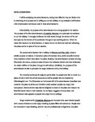
I am now going to compare this advertisement with an "Alldays Ultra Light pantyliner" advertisement. I feel that this advertisement is aimed at more of a particular age group than the "Always Ultra" sanitary towels, ranging from late teens to twenties. This is immediately evident from the sexy, seductive and even raunchy image that is presented by the background photograph of a naked young lady.
The background to this advertisement is black. This immediately
makes the advertisement stand out because black is a very strong and bold colour. The "Always Ultra" advisement also stands out a great deal, although the background is green. Both of these backgrounds have different colours but both still stand out, but for different reasons. Having a background which stands out is very effective because it grabs the reader's attention and makes them look at the advertisement.
Similar to the "Always Ultra" advertisement, the text is in a different colour to the background to emphasise the message, and to make it very visible. In the "Alldays Ultra Light" advertisement, all of the text is in white, which makes it exceptionally effective against the black background. The text must stand out otherwise the target audience will not want to read it.
The majority of the text in this advertisement, is in a very small font
and it is not as easy to read as it is for the "Always Ultra" advertisement. However, some of the text is in a larger font. The title ("Alldays Ultra Light") is in a large font, and so is "The extremely thin pantyliner." These sentences are important as they introduce the advertisement with the titles, and so it is necessary that they are in large fonts, in order to grab the reader's attention. The font is easy to read, but it is quite plain and it is not as creative as the "Always Ultra" advertisement. Also the words are very close together, and I feel that it is not as legible as the "Always Ultra" advertisement.
The language used in this advertisement is very different to the language used in the "Always Ultra" advertisement. At the top of the page, the first sentence is "Light up your femininity." The word "light" could be taken in two ways, either as an adjective, to "illuminate" or "spark-up" your femininity, or to literally lighten the weight of the pantyliner. The vocabulary used is very carefully chosen, in order to make the product sound as appealing as possible. The word "extremely" is another example of carefully chosen vocabulary, as it emphasises how "thin" these pantyliners are. Other very effective language is "touch of femininity" and "breathable pantyliners." This personification makes the words sound very alive, and feminine and light.
The Unique Selling Point for this advertisement is "femininity." This
word is repeated three times, as this is the USP and it needs to be emphasised. The brand name, "Alldays" has also been repeated four times. In addition, "Alldays" has teamed up with "Figleaves" which is the "largest Internet retailer of lingerie." This means that when you buy Alldays pantyliners you "get a free £5 voucher." This links in very well with the target audience, because woman of that age would be interested in buying sexy lingerie. The word "Figleaves" has been repeated three times.
In the top left-hand corner, there is a bright pink rectangular shape
with white writing saying "FREE £5 LINGERIE VOUCHER" in big bold letters. Having this bright colour, and large font really makes it stand out and appeals to the reader.
There are two images on this advertisement. The main one is a picture of a woman from her waist downwards. She is naked, and the potential consumer can see her curvy hips and toned legs and stomach. This image is very seductive and sexy, and it plays a main part in the advertisement. The target audience would see this woman and think that if she wore these "extremely thin" pantyliners, then she would still be sexy and attractive. The figure of the woman associates with the age group of the target audience. The Unique Selling Point is femininity and this image is very feminine and womanly. The image is very large and stands out quite a lot. It blends in with the background which might cause a few difficulties when reading the text from a distance.
The second image is an image of the product, just like on the "Always Ultra" advertisement. The colours used, being purple pink and orange , contrast drastically with the other colours in the advertisement which are black and white. Once again, having a picture of the product, brings it to life, and the reader can see what it looks like. The packaging of the product itself is also very seductive, because you can only see the woman's stomach and top of her trousers. Again, the woman has a toned stomach and curvy hips, showing her femininity.
At the bottom of the advertisement, there is some additional information, saying website addresses, and when the offer with Figleaves ends. Lastly there is a small logo at the bottom of the page, indicating the makers of this product. This is to inform the target audience of the company name.
Overall, I think that while there are certain differences in the approaches that the advertisements take, there is also much in common. Their target audiences are different ages, and they both have individual ways of using these advertisements to appeal to their target audiences. The "Alldays" advertisement is very sexy and appeals to a younger target audience, whereas the "Always Ultra" advertisement is aimed at a wider age range.
Both advertisements use attractive colours, fonts and images to grab the potential consumers attention. They used interesting language and persuasive techniques to make the product sound appealing and to persuade their target audience to buy their product, which is obviously their primary objective.
I feel that the first advertisement, the "Always Ultra" advertisement is more effective than the "Alldays" advertisement for many reasons. Firstly I think that having a very large target audience, (all women aged from early teens to late fifties) is very effective because then more women would appeal to the advertisement.
On a whole, the advertisement is really legible and clear to read. The
images are fun and eye-catching, and all of the text is neatly spaced out and with a decipherable, large font. There is not that much text, but the language used is very effective for example the use of rhetorical questions and statistics really helps make it a successful advertisement.
English Media Studies Coursework