Underneath the title is the character, Sarah Michelle Gellar, with the copy printed around, this makes her the focus of the page while making use of the space (being able to fit a lot of copy on the page.)
Black, white and red are the main colours on FHM. This colour combination is a very strong and striking combination which helps make the magazine eye catching. The fonts are simple yet masculine with different widths depending on the importance of the copy (bold for the headings and regular for the other copy featured on the cover.)
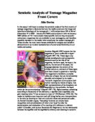
The character common to both front covers is Sarah Michelle Gellar an award-winning American actress who is probably best known as Buffy Summers in the television series Buffy the Vampire Slayer. Despite being the same actress she is presented very differently. On the cover of Cosmo we are just given a head shot showing mainly her face and hair. Being a role model for many young girls, her hair style and makeup is what will interest the audience. She is staring straight forward as if looking at the reader, by doing so this teenage audience may feel like they can connect with her.
FHM presents her in a completely different light. A full body image, bed hair, black strappy top, cleavage on show and fly undone are all components that cry out sex appeal!
With hand on hip her pose shows determination and confidence - an invitation to the male audience.
Sarah Michelle Gellar’s different poses show her progression in career. For example when she started playing Buffy she was innocent, clean cut and very much girl next door similar to her character on the front of Cosmo Girl, the earlier of the two magazines. Later on in the series of Buffy she becomes wilder and more confident just like her character on FHM.
The copy on the cover of a magazine briefly tells us what’s included in the issue. It often mentions a variety of types of articles such as: fashion tips, quizzes, life stories, celebrity gossip; etc
Although Cosmo Girl and FHM appeal to two different target audiences there are a few similarities within the copy. For example, the largest of the text on the covers, other than the title, are the words “Sarah Michelle Gellar” being a idol to many, her fans and admirers will instantly know she is the main focus of this particular issue, therefore buy the magazine. Also included on both covers are fashion and style tips “21 style tips” and “5 hair dares”. People buying the magazine may think if they follow these tips then, depending on the gender of the reader, they will be as beautiful as Sarah Michelle Gellar or end up with a stunning girl friend just like her (as if!) I believe that this is an excellent way of selling a magazine as people are very conscious of there appearance and always what to keep up keep up with the latest trend. Both magazines get you into viewing the contents by only giving a small amount of either a life story or piece of celebrity gossip, from FHM: “Smashed skull! Splintered legs! Stubbed toes! The excruciating life of Jackie Chan” this is also using alliteration and explanation marks for extra effect and for Cosmo Girl “Back Street Boys fans share there wildest stories ever.” Boys being in bold to catch attention to the word as, stereo typically, all girls care about is fashion, make up and boys!
Magazines are a very clever piece of advertising. Without the readers knowing they are tempting and usually succeeding into getting us to buy items of clothing, makeup, gifts, movies an most importantly for them the next issue.
I feel that both Cosmo Girl and FHM do this well by appealing to their target audience with features previously mentioned.