Media Assignment - Vogue Magazine.
GCSE Media Assignment- Vogue Magazine Vogue was first published in 1892 and ever since has reflected the rules of the fashion world. Vogue means 'fashion prevailing at any given time', which is why Vogue it such a good name for the magazine. It talks about the ins and outs of the fashion world and is under the arm of any chic fashion conscious chick. My first impressions of the front cover were optimistic. The cover was bright and colourful. The magazine presented itself as expensive and up-to-date. I saw that the magazine was preparing itself for the summer and that it was aimed at women who want it all, whether or not they can afford it. I could see that the editors of Vogue have tried hard to aim the magazine to suit their target reader; very wealthy, fashion conscious, celebrity watching women. However anybody can buy the magazine, the readers may be from all areas of British society. The design and layout: the front cover has (r)Vogue written at the top of the page in luminous orange large font that is easy to read, and stands out. To the left is the month and price in pounds. It is white and approximately font size 12. The editors display the price like that deliberately so that you are not put off by it and are drawn to the magazine by the articles and the pictures, not value for money. Directly diagonal to the price is the barcode, which also explains the small

Comparing Tabloids & Broadsheets.
I am going to compare two types of newspaper, a tabloid (Daily Express) and a broadsheet (The Times). They are quite different, mainly in the layout, how language is used and the content. First I compared the headline and sub-heading between the two newspapers. In the tabloid the headline is very dramatic to grab your attention so you want to read the article. An example of this is 'Wills fury over TV drama.' The tabloid has just one front page story and an offer on the front to sell itself so people get pulled in by the offer or want to carry on reading the main story. However the broadsheet also has a heading that catches you attention, but it gives more information than a tabloid heading, it doesn't need to attract people's attention because there are only a certain amount of people that read it and they know what to expect. An example of this is 'One night of Ecstasy may bring on Parkinson's.' It tells you exactly what it is about, where as the tabloid heading isn't as clear. Also the tabloid has one big heading on the front of the paper and the broadsheet front page looks the same as the inside pages, with lots of different articles on the page. The only difference between the front page and the rest of the pages is that it has 'The Times' printed on it. The sub-headings in both of the newspapers just give more information to the main headline, which also pulls you into

As part of the advertising and marketing module Im going to create two A4 size front covers for a new magazine and one contents page to accompany the front covers. I will also be producing two A4 size adverts for a new range of hair products.
As Media Brief Aisha Riaz As part of the advertising and marketing module I'm going to create two A4 size front covers for a new magazine and one contents page to accompany the front covers. I will also be producing two A4 size adverts for a new range of hair products. I will be working individually to produce the final products. I will be taking photographs and editing and manipulating them myself using Adobe Photoshop. I've decided to create a new version of a lifestyle magazine which will be called UNIVERSAL. It will be different from the usual lifestyle magazines as it will be more multi cultural in its fashion content and topics also the front cover models who are usually white/English will be replaced, to illustrate this point to the consumer, I will use a range of models from different ethnic backgrounds on the front cover to portray this image of the magazine. The name UNIVERSAL suggest that it could be universally understood and anyone can pick it up and relate not just to its contents but to the English language as well as it's universal therefore I decided that creating this new magazine will be an ideal way of reflecting on the name and focusing on different cultures apart from just the limited cultures that the current lifestyle magazines actually cater for. The target audience for this magazine will be females aged from 18-29 from different ethnic
Media Studies Practical Production - Analysis of finished product - a magazine.
Jonathan Youd Media Studies Practical Production Analysis of finished product. After completing the product, I now understand how important the appearance of the magazine is. The front cover of my completed product almost invites the audience and persuades them to buy the magazine. I have done this in many ways, for example the logo on the front I have used a variety of different lettering styles to add emphasis to a particular part of the product. The name is presented in very bold, block capitals to make it appear dramatic and eye-catching. The star shaped logo is in an orange colour to immediately catch attention. I have chosen to do this as it is a visual image that represents the company so that the public can immediately identify it whenever they see it. The background is very effective as it is an image of a busy city and almost acts as a doorway for the audience that lures them and intrigues them .On the cover I have used rhetorical questions which automatically gives the audience something to think about even before they have opened the magazine. Images of people played an extremely important role for the product and had a very powerful impact on the reader. As the audience are eyes naturally look at the picture before the text. They also set the tone for the text, for example the image of the footballer portrays him as a laid-back, down to earth character

Media Coursework - Analysis of Article in the Daily Mirror
Media Coursework The Mirror's article puts across a strong bias straight away with the headline using techniques such as assonance by repeating the 'e' sound in 'speed freak' so that the headline sticks in your head the article makes Henri Paul look like a hooligan by using words like 'freak', 'nut', 'boozer' and 'binges' also the article uses slang terminology like 'nut', 'boozer', and 'knocking back' that aswell as being recognised by the Mirror's audience (classes C2 to E) would demean him and portray him as a lout. This article also preys on some people's xenophobia against the French and shows a huge negative bias throughout, it doesn't have many facts to prove that he was a drunk. Instead it uses dubious quotes to back up it's story like: 'he looked like a well pissed Groucho Marx' and 'I've known him to drink nine whiskies in one sitting'. The pictures in the Mirror's article show a stunt motorcyclist riding away from what looks like an explosion this is a demeaning picture and portrays him as what they call a 'speed freak' and a 'bike nut'. The other picture shows the smashed up Mercedes after the '90mph tunnel smash' this picture is playing on peoples emotions and the British peoples prejudice and evokes a sense of anger and hatred for the French. The caption also evokes anger for Henri Paul and grievance for princess Di this backs up the whole article, which is

How do newspapers present the news? Compare the front page of two newspapers published on the same day.
How do newspapers present the news? Compare the front page of two newspapers published on the same day. Firstly I am going to look at The Sun. It was published on Thursday, 11th September 2003. It has a big splash headline saying BACK ON 9/11. Without a sub heading and an image this headline doesn't mean much, which makes the reader look down and start to read the article to find out what it's about. It takes up about half the page and leaves very little space for the rest of the story, which is why it is carried on later in the paper. There are only two stories on the first page; the main story is about some video footage on Osama Bin Laden praising 'brave terrorists'. The other is about J-Lo and Ben Affleck's wedding being called off. There is a cross-reference for both of these stories so that the story can be carried on inside the newspaper. There is one image per story. The image of J-Lo and Ben Affleck shows them looking happy together before they broke up. I think this image was chosen because it is a good picture for showing people how happy they were before they broke up. The image for the Osama Bin Laden story shows him at his hideout 'praising brave terrorists'. I think that both of these images are effective because when people see them, they want to find out more, and read the story. The picture of Osama Bin Laden, I think, is especially effective.
Analysis of a “Dune” film poster
Analysis of a "Dune" film poster I have chosen to analyse a poster advertising a film called "Dune". It is a remake of an earlier science-fiction film. I found it in a magazine called "Cult Times" which is a science-fiction magazine aimed at people of both genders and all races aged 20 to 40 that are sci-fi fans although it does still appeal to most sci-fi fans of a wider age group. The poster depicts a starry night in a desert like place with a large moon/planet that takes up most of the sky. Over the bottom third of the page the same desert like place is shown however the sun appears to be shining and there are lots of people with their arms in the air. This part of the picture looks as if different pictures are put together in a collage and the lines smoothed out. At the bottom and sides of this section the images fade to black. In yellow letters that stand out from the background is written, "FRANK HERBERT'S" (and in a much larger font) "DUNE". Over the background picture for the next third of a page is images of several people. The main one is in the middle of the page and is a white man with blue eyes. His image merges with the light that looks like a sun and on the right hand side with three people, who again appear to have been collaged and merged together. On his right contrasting sharply with the main face ore three other people who have been merged. All the
Producing a Magazine.
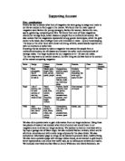
Supporting Account Pre - production Firstly we had to decide what kind of magazine we were going to design and make to do this we needed to find a gap in the market. We found that the main types of magazine were fashion for young teenagers, fashion for women, fashion for men, sports, gardening, computing and film. We found that none of these magazines catered for teenage boys, lower classes or people from a multicultural society. We also noticed that the magazines represented strong gender stereotypes, which the girls shown to be weak, less intelligent and only interested in make - up and housekeeping. The boys on the other hand were shown as strong, athletic, academically superior and with no emotions or softer side. Knowing this we decided to make a magazine that catered for people from a multicultural society, for all classes and showed the softer more emotional side of teenage males. The target audience for our magazine is 13 -18 year old males. The next step was to do market research, the first thing we did was look at the content of the nearest competing magazine: Name Design Colour Images Content Features Class Ethnic minority Bliss Short paragraphs, lots of pictures, lots to look at Mostly pink, bright, baby blue, yellow, peach, purple Competitions, problem pages, interview, advert, questionnaire, fashion, make - up, what boys think Celebrity
How the ownership of newspapers affect the news we read and the views we have?
How the ownership of newspapers affect the news we read and the views we have? Ownership of newspapers affect the news we read as it depends on whom the owner is - in this case Rupert Murdoch - the news will perhaps express a specific opinion. The ownership may change opinions into facts; they can be biased. The Sun and The Times which are both a Rupert Murdoch ownership will show that the newspapers will represent the same views both of them are owned by Rupert Murdoch. Rupert Murdoch's history: 954: He inherited his first newspaper "The News" 956: He brought his first magazine "TV Week" - which is a weekly television magazine only first published in Melbourne, Australia until recently it expanded to other areas in Australia, Canada and United States. (http://en.wikipedia.org/wiki/TV_Week) 958: He brought his first TV Station 960: He brought his first Record station 962: He brought his second TV Station 972: He was elected as the first politician 979: He brought his first airline 981: He brought his first publishing house 983: Brought his first Cable Channel Rupert Murdoch owns ? 9 satellite television networks ? 176 newspapers ? 100 cable channels ? 40 book imprints ? 40 television stations ? 1 movie studio Total number of audience of his products: 4.7 Billion People - 3/4 of the population Media is the centre of democracy. Democracy is based on
"Much Ado About Mousing"
Commentary "Much Ado About Mousing" This piece is in the format of a newspaper article in the broadsheet 'The Independent Review'. Styled as a critical review, the piece is intended to inform the reader about an episode of 'Tom and Jerry', a cartoon aimed at young children. However, I decided to imitate the verbose style of a broadsheet critic, and I also aimed to mock the overly analytical, presumptuous tone that the media often exudes, by relating every minor incident of 'violence' in the cartoon to extreme cases of brutality in society. I chose to implement the typical discourse structure of a newspaper article, with short, bold introductions and a succinctly clear headline. I chose the headline "Much Ado About Mousing" as it is wordplay on the Shakespearian play "Much Ado About Nothing", and the readership of 'The Independent Review' would most likely realise the pragmatic meaning of the pun. It also raises the question whether the satirical style of the article really is much ado about nothing, and analysing the content of 'Tom and Jerry' in too great a depth. I used complex lexis, to appeal to the more refined audience: "unashamed trivialisation", "sadistic depravity" and "ferocious contempt" are a few examples. In many cases, I used words that would not be found in typical tabloid newspapers; I would have incorporated more simple synonyms if I had written the