Evaluation
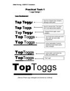
To create the logo I sampled some different fonts then chose ones which I thought were most suitable for the logo. They were then resized so they were both in a size ratio where they would compliment each other nicely. A simple thick black line was drawn beneath the ‘Top’ and a thinner one underneath the ‘Toggs’.
To create the logo I used a word processing package with drawing facilities (Microsoft Word XP) and an image editing application (Microsoft Paint 5.1). No unnecessary hardware was utilised: only the components required for a computer to function and be usable (mouse, keyboard, monitor, base unit)
Microsoft Word XP was used because although its drawing features are limited (when compared to a D.T.P. package) they are very powerful. In a matter of seconds I was able to produce the basis of my logo to work with.
Microsoft Paint 5.1 was used as one of the limitations of a word processor is that it is unable to easily save images that can be used elsewhere. Paint was used to do the task of taking the completed logo from word and saving it into a format recognised by most applications (bitmap).
The hardware used was used purely because it is necessary for the computer system to be operable without it.
The task could have been accomplished by hand by either drawing freehand or by use of rulers, compasses, stencils or other drawing tools. The logo could have either been photocopied to where it was to be used (letterheads, invoices, promotional material etc).
This may have been effective if the logo had involved complicated imagery but was not appropriate as my logo was based very much on simplicity and has a lot of clean smooth lines that would be almost impossible to produce by hand.
The disadvantage to this is that photocopiers work on an optical system and will never be able to produce the same quality replications as those produced digitally. Therefore the quality of the logo would deteriorate when it was photocopied.
Alternately the logo could have been drawn free hand then scanned into the computer and electronically added to documents to prevent any loss of quality when reproduced.
It would have been possible to use a much more powerful image manipulation/editing application but as my logo was so simple the most basic drawing tools in Microsoft Word sufficed.
If my logo had included intricate drawings that would have been best drawn freehand I would have used a scanner to scan the image into the computer where I would have used an image editing application to transfer into the logo.
When my final logo was ready to be taken from Microsoft Word and put into Microsoft Paint to be saved as a bitmap I encountered problems in that when the bitmap was enlarged the image became unclear. To overcome this difficulty I enlarged the image in Microsoft Word before transferring it to Microsoft Paint.
This system of working proved effective however Microsoft Word is primarily a word processor therefore the movement images can become difficult. A more sophisticated drawing tool could be used (for instance Corel Draw) to overcome this despite the fact it has unnecessary features.