Each of these figures were made into a percentage of the total, and the graph was laid out so that the inner zone results were in descending order at the start of each group of columns. These again were both done for ease of comparing.
Evaluation.
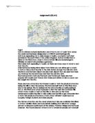
The graph and map that I have produced clearly show me that my prediction for this section was correct. It is clear to see that the inner circle has a higher percentage of retail buildings than the other circles. As we go away from the centre then this percentage tends to drop and other uses begin to dominate, such as professional or entertainment. I feel that the predominant retail building use is mainly due to the large amounts of public transport that all lead to the centre of the city and the amounts of car parks that allow private transport to have easy access. Therefore, as there are so many people travelling to the centre, then all of the large leading chain stores wish to have their stores based here. Other, smaller stores may also wish to have their stores here, but in most cases can’t afford the prices that the centre of town buildings are worth.
The table on the above page is the one that was used to produce my graph (Labelled graph 1). It shows the per cents of each of the uses in each of the circles. Using this it is simple to see how the percentage of the retail buildings especially descend as they get further away from the centre, from a high percent of 65 to a lower percent of 47. Another very clear change is that the professional and public Authority building uses increase in density as they get further from the centre. This data should help me, when added to the results of the other investigations, to accurately identify the Central Business District of the city.
Building Heights. (Refer to map 2)
Hypothesis.
For the building heights, I predict that the centre of the city will have the taller buildings. This is mainly due to the popularity of the centre from the points of view of the larger stores. As there is only a limited amount of ground area at the centre of any city, it is often common to build upwards, where it is not possible to build outwards, to gain more shopping area. This is often therefore done to allow the larger chain stores to have their shops based at the centre, most popular parts of the town or city.
Method.
The method of this section of my project was done at the same time as gathering the land use data. As well as a map for the land uses, we were issued with one for collecting the building height data. As we were viewing each building, we counted the number of storeys that it had, by looking at the number of windows. We placed the storey number into that building space on our map. It was simpler to gather this data, as it was often that large blocks of buildings were all of the same height, and so could be counted at the same time. When we returned to school, a large map was given to us, on which we coloured in each of the buildings to show its individual height. The larger buildings were given a darker colour, and so the lighter shades were given to the lower buildings. Once a key had been added, the map produced a clear way of viewing the heights of the buildings, enabling us to compare the centre of the city to the outer regions.
Evaluation.
By looking at map number … and comparing the more central buildings with the further away zones, it becomes obvious that my prediction was incorrect. I predicted that the taller buildings would be found at the centre of the city, but in fact they were not. At the centre, the tallest buildings were four storeys high, but mainly heights of three storeys were recorded. These are quite high, but when compared to some of the five storeys or over, which were more common further away from the centre, a large difference is noticed. In conclusion it is clear to see that the three storey high buildings (coloured blue on the map) dominate the central areas, and the four storeys high (green) and the five storeys high or over buildings (red) were more populated towards the edges. This would not be the case in an average city, but the city of Bath is different to many others due to its historic background. I feel that the only reason for this is that the buildings at the centre were built in Roman or Georgian periods, and so a height of three or four storeys was quite high. Also, in this period the demand for the land at the centre of any city was not so high, and so the buildings did not have to be built so tall. However, in more recent ages, the demand for the land in a city has rapidly grown, and buildings are needed to be built much taller, if possible. When these taller buildings were in demand, builders and planners were not allowed to add to the historical and protected lower buildings that already stood at the centre of Bath, and so the taller ones had to be built on the boundaries or further away from the centre of the city. In any other city, the modern centre of town buildings would be able to be added to and made taller as the land was in demand, but in Bath the architectural and historical buildings are left untouched, and so the city is built up taller further away from the original centre of the city.
Pedestrian counts. (Refer to map 3)
Hypothesis.
The hypothesis for the pedestrian count is that the vast majority of the city’s pedestrians will be recorded at the centre of the city. This means that I predict that the amount of pedestrians will decline further away from this area. I have made this prediction as the more attractive shopping areas and chain stores are generally located in this part of the city.
Method.
Throughout the day in Bath a total of three pedestrian counts were done, the first taking place at eleven o’clock, the second at twelve o’clock and the third at one o’clock. Each of the pairs of people was given a location at which they had to be at each of these times in order to do their count. My partner and I were situated in Southgate Street in the south zone of our maps, and so we had to return to this point at every count. It was important that each pair did this exercise at exactly the same time to give an even and accurate result. Before leaving for Bath, we each had constructed three sheets of paper, one for each count, which included our name, location, time, date, the present weather condition and importantly a large space for recording the pedestrians at each time of the day. Taking priority over all other exercises to ensure the accuracy, we had to be at our exact position at every count time and ready to count the number of pedestrians that passed by. Each of the counts lasted for exactly ten minutes, and a tally was used to record the results.
On returning to school, each of the figures from each count was added, and made into a percentage of the highest amount. These percents were placed next to their position on a map, which was the same as the maps issued for the land use and building height sections. Isolines were then placed onto this map, ranging from ten percent to one hundred percent in the centre. This map therefore enabled us to clearly see where the most populated areas were.
Evaluation.
From the map drawn with Isolines, it is clear to tell that the most populated areas were mainly at the centre of the city, which proved that my prediction was correct. The most densely populated regions are split into two clear parts, which may mean that the most attractive shopping area is also split. The lower of the two populated regions is situated at the Baths and Abbey area, which suggests that the pedestrians have gathered here to view the tourist attractions. This clearly means that it is not entirely shoppers attracted by the centre of town stores but equally the tourists attracted by the historical features. This exercise could have been slightly inaccurate due to the rainstorm that occurred in the middle of the one o’clock count, and so the exercise could have been improved by doing more of these exercises in finer weather. Although the rainstorm reduced pedestrian amounts, it did so all over the city, and so did not really affect the comparison between the centre further away areas. It was still clear in this count that more pedestrians were found in the central regions. However, the number of pedestrians all over the city, in each area clearly dropped in this shower, as people were sheltering. The isolines also branched out to the far west and east areas on our maps. This is due to the car parking areas and Sainsbury’s store to the west, and Pultney Bridge to the east. The isolines are clearly very accurate as they correspond well with the attractive areas of the city.
Environmental Survey. (Refer to map four and graph 2)
Hypothesis.
In this area of my project I would predict that the highest shop and street quality would be found in the centre of the C.B.D. Despite the pressure that is put on this area from the pedestrians, the large chain stores, with lots of money, urge the council of the area to keep the appearance and quality high. If the stores did not do this, then it may result in less pedestrians, and so less shoppers. As we go further away from the centre then this quality will decrease, as there are less large stores putting pressure onto the council, because they have less money.
Method.
To do this exercise were given another map of the C.B.D, which had clearly shown a transect line through the whole area shown. This line had marked regularly down it seven clear points that were to be stopped at and from there we were to view the streets and shops in the direction that it told us to. This meant that we had to walk to the start of this transect, at the top of our map and make our way down it again, stopping at each point and inspecting the shopping quality and street appearance. To give each area a mark, we used the table that is on the next page. (Table 1)
We put the mark given from this table into another table that we had produced, which is shown bellow. Using this data we produced a graph to show the results in a clear format. Below, points A to D are shopping quality, and points E to J are Street appearance.
Evaluation.
The graph that was produced showed us that my prediction in this section was correct. The rise in the middle of the graph tells us that the environmental quality at the centre of the C.B.D. was higher than at the edges of our map. There was a clear drop in the street appearance in points 6 and 7. The reason for this is likely to be McDonalds, which is relatively close to both of these points. The other street appearance drop can be found in the first location. The reason for this may simply be that it is far away from the centre, so the population of pedestrians is less. If there is less people then there is less chance of producing a mess, and also the shops nearby are not so desperate for the streets there to be cleaned. The reason for the cleaner streets and higher shopping quality in the centre points, between 2 and 5, is that the larger stores can persuade the council to clean and look after the streets, ensuring that customers continue to return to that area of the city.
Urban Land Use Classification.
Function clustering. (Refer to map 5, 6 and 7)
Aim.
The aim of this part of the project is to find out whether certain comparison functions within the CBD of Bath tend to cluster together. Whether certain functions do cluster or not should give me a clearer picture of the positioning of the CBD, as certain outlets will be expected to cluster within a CBD. I have chosen three shop types that I am going to investigate, which are Banks or Building Societies as one function, Restaurants and Cafes as the second and Chemists as the third.
Hypothesis.
We would expect to see certain comparison outlets within a CBD clustering, normally for one of to reasons. Firstly, because a certain situation suited the entrepreneurs involved. This is true for example in most bank outlets today, as until recently paper work was passed between branches on foot and so a clustered formation ensured more safety and ease of travel. For this reason banks and building societies clearly clustered if possible in the 19th century. Therefore, relating this information to the time when the majority of Bath was built up, I would expect to see the Bank or Building Societies on my map to cluster together. Secondly, some people realised that certain customers preferred clustered shops, for convenience reasons. For example, it is true that many customers prefer to look into various shop windows to compare goods before they enter a branch and purchase the item. This second reason does not affect the second function that I looked into, restaurants and cafes. For this shop type, I have predicted that it will cluster towards the expected areas of high tourist population. These means regions such as the Abbey, the Roman Baths, main shopping streets or other entertainment areas such as theatres or cinemas. Contrasting these two functions, I expect the chemist shops to be far more dispersed around the city. This is because I feel that customers do not need to compare the medicines that are bought from a chemist, but only need convenient outlets that are easily accessible. I felt that it would be interesting to investigate the distribution of these functions in Baths CBD, and to see if my prediction was correct.
Method.
To collect the data that was required to find the location of each of the outlets that I was investigating then the original land use maps were looked at. As I was collecting land use data from the South of the map area, then this region was the only one that I felt to be entirely reliable, as I did with the land use section. After each of the buildings that I was looking for had been found, for all three of the categories that I was investigating, they were placed onto a map. There are three maps, one for the Restaurants and Cafes, one for the Banks and Building Societies and one for the Chemists. When each of the outlets for each of the three categories had been placed onto its map, a line was drawn from it to the bottom and to the left hand side of the page. Both lines were measured for each point, and placed into a table. All of the y-axis and the x-axis lengths were added, to give an average. These two lengths were plotted onto the map, on for the x-axis and one for the y-axis. These two lines joined to give the mean centre of distribution. Then, the length of each of the points to the mean centre of distribution was taken. These were all added up and divided by however many that there were, to give an average distance called the standard distance. The standard distance gave us the radius of a circle that was to be drawn, with the mean centre of distribution being the centre of the circle. The circle that was drawn indicated the distribution of the outlet that was displayed on that map. The larger that the circle was then the more dispersed that that outlet was. This means that as I predicted that the chemist shops would be more dispersed, then the circle that was drawn onto the chemist map should be larger than the circles that were drawn onto the other two.
Evaluation.
From looking at the map it is clear to see that my hypothesis was correct, and that the chemists was more dispersed than the Restaurants or Cafes or the banks or Building Societies. This is made very clear by the maps due to the size of the circle, and as the chemist circle is larger than the other two then it tells us that the outlets are less densely populated. This can be noticed when simply looking at the gaps between each of the functions on the same map, and it is then made clear that the gaps between the far fewer chemists are much larger than those between the other functions, where clustering can easily be detected.
I feel that there is sure to be a level of inaccuracy in the Restaurant and Café map due to the positioning of the clusters. When the Abbey and Bath area is looked at, it is noticeable that there are no outlets present, which is sure to be wrong. This is one of the most populated areas of the CBD of this city, and so it would be expected that there was a large level of food functions nearby. The only explanation for this probable mistake is the source of my information, which was not primary. If it had been primary, then I would have collected it myself, which I did not. The data for this area of the city was collected by someone else, and was clearly not reliable. However, there is distinct clustering present on this particular map, as was expected. There is clustering around the theatre on the West of the map and clustering near the indoor market, more to the East of the map. These are both areas of high population, and so the prediction for this map was mostly correct.
The Bank and Building Society map is partly as expected as well, as clear clustering is visible in Milsom Street, in the Northern area of the map. The positioning of outlets in this street is almost certainly because of the early need for close banking due to the moving of cheques etc. However, the more dispersed areas that are present in the lower parts of the map are probably due to the fact that this fact is no longer a necessity. Nowadays, banks are able to have their sites further away from each other as postage for example is now another option of delivery of important paperwork. This means that again the prediction for this map was partly correct, but the more recently positioned outlets are able to move further away from one another.
The final chemist population map however was entirely as I predicted. There are only five chemists in the map area, all which have a large distance between them. This is because there is no competition in this shop type, but the dispersed population provides a convenient and accessible layout for customers.
There is not a large difference in the standard distances of all three of the functions, but the chemist’s is the largest, as was expected. This may be because the clusters are relatively dispersed. This would still give a large standard distance, even though clustering is present. This may mean that a more accurate way of finding how dispersed a function is would be to look at both the standard distance and the distance between each of the points on the map.
Nearest Neighbour Analysis.
A nearest neighbour analysis is a mathematical technique that is used to determine how clustered something is. In this case, I am going to be examining exactly how clustered the chemist function was using that map that I have already constructed.
Method.
As shown on the Chemist map, each of the shops concerned must be numbered in any order. The nearest shop to each number must be found, and the distance between them must be calculated. For example, if the nearest chemist to number 1 was number 4, then the distance between these two numbers must be found. The average distance must then be found, so all of the individual lengths must be added, and divided by the amount that there are. The second value that was needed to calculate the answer was the area of land in which this exercise was taking place. For this, we ruled lines on the original map, so that the majority of the built up area was shown.
Calculations.
The equation that is used to find the nearest neighbour value is:
2•d √ n
A
In this equation,•d is the average distance, n is the number of chemists and A is the area that is being looked at. The total distance value was 27.8 cm, and was divided by 5 to give an average length of 5.50 cm. This was the value of•d. Clearly the number of stores was 5, and the area was the length of the two lines that were drawn on the map multiplied together. The horizontal line was 20 cm long and the vertical line was 35 cm long, this gave an area of 700 cm2 on the map. This gave me the below equation to calculate:
2 x 5.50 √ 5
700
This was calculated as below to give the answer of 0.93408.
11.12 x √ 0.0071
= 11.12 x 0.084
= 0.93408
Interpretation of Nearest Neighbour Value.
The answer to a Nearest Neighbour equation will always have an answer between 0 and 2.15. 0 is an entirely clustered type of distribution and 2.15 is a more regular and dispersed pattern. The answer that was calculated for the chemist map was 0.93408, which is very close to 1.0, which is a completely random distribution. This shows that the chemist distribution was as expected, very random. This means that if a Nearest Neighbour Analysis were done for another of the functions in this section of the project, then a more clustered result would be expected. This would mean a value closer to 0, or much less than 0.93408.
Conclusion. (Refer to map 8)
It is clear to see that I believe that the city of Bath does have a clear Central Business District. I have shown this by drawing it onto the map that is on the previous page. It was a combination of all of the areas that I investigated that enabled me to do this and some helped more than others. The areas of study that helped me the most were the Environmental survey, the Pedestrian counts and the Land uses, however the others were also looked at and helped in different ways. There was a clear trend in each of the ones that helped me the most, and this trend was visible in the same way in all of the maps. For example, the top of the shaded area on the pedestrian map is in exactly the same place as point two on the environmental map. At point two the quality of both streets and shops clearly drops. This area is also where the retail outlets finish. This means that this area is likely to be the top end of Baths CBD, as this trend is shown in three of the maps. I looked at areas like this o the maps all the way around the perimeter of the CBD, until could see where I believed the outline to be. To do this I had to remember that a CBD generally has a high environmental quality and pedestrian amount, and more retail departments than other areas. In the case of Bath, there are also lower buildings and certain function clustering. Because I looked at each of these both individually and together I believe that I have made an accurate prediction to the situation of the CBD.
If I was going to repeat the investigation then I feel that here are two main areas that could be improved. These are the amount of pedestrian counts that were done and the photographical support for each section. I feel that if a larger range of pedestrian counts were recorded then some further work could be done to maybe find out which time of day and where the most pedestrians were found. This area of work could also be improved if the weather was the same throughout, and preferably dry. This would mean that the most number of pedestrians would be present, making the results more accurate. If a wider amount of results had been taken and the averaged then the daily average would give a far more reliable and precise map than was produced, which only showed three ten minute count results.
If more photographs had been taken then more areas of the project could have been improved and backed up. This photographical support would have been especially helpful in the pedestrian counts, environmental surveys and the building heights, where some primary evidence would have proven my results. If a series of photos had been taken down the transect line for example, then the environmental quality would have been more easily compared throughout the city. The more time allocated to the project the more enjoyable and interesting it became for me.