-
Box and Whisker Plot: A box and whisker plot shows the inter-quartile range, the median and the two extremes, it is a good way of showing how the data is spread out, and whether or not there are more results at the bottom or top end of the scale.
Hypothesis 1
There is strong positive correlation between height and arm span.
To investigate this I am going to use sampling, random and stratified, to get a selection of data to use in my investigation. I will do this because using the full set of data will not be appropriate because the resulting graph will probably be too complicated, however I will do an investigation using the full set of data, just to see what the two results are like, and check for any large differences, if I have taken a good stratified sample there should be no noticeable differences.
Once I have got my data I will put it onto a scatter graph, and add a line of best fit. If most of the points are close to the line of best fit, which will go through the average point, then that means that there is good correlation. If the line is showing that as height increases so does arm span then this shows positive correlation, if both happen then it shows strong positive correlation.
The main problem I had with my data was where and where not to take a selection from, I decided to take my stratified selection due to year groups, however I was also considering doing it for gender as well, but after thought I decided that it doesn’t matter about gender as, even if one sex isn’t as tall as the other, it should mean that it their height and arm span will still be in relation to each other. And the same will apply for different year groups, we all grow at different speeds but our height should still be in relation to our arm span whatever age we are.
I decided to take a sample of 30 people from the whole school, out of 192 in the whole school. This meant me needing to do a calculation to find out what number of pupils I will need to take from each year group. I will round my results to the nearest whole number, due to the fact that you can’t have a percentage of a person. This might mean that the final number in my sample will not be 30, however I will just carry on the investigation using whatever number is given, as this will not affect my overall results.
This is the formula I used:
Year group No. pupils in year group x the no. in sample I want.
No. pupils in whole school
Form 1 24 x 30 = 3.75 rounded up to 4
192
Form 2 35 x 30 = 5.46 rounded down to 5
192
Form 3 40 x 30 = 6.25 rounded down to 6
192
Form 4 49 x 30 = 7.65 rounded up to 8
192
Form 5 44 x 30 = 6.88 rounded up to 7
192
30
This gives me a total of thirty with which to do my
investigation, what I wanted in the first place.
Now I have the numbers I need from each year, as I have said earlier I decided that there was not any other factor that might interfere with my results, so I will do a random sample, to find exactly which pupils to use. To do this I will use a random number table.
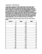
My results:
From form 1: Pupils No. 11, 8, 18, 22
From form 2: Pupils No. 26, 44, 33, 32, 31
From form 3: Pupils No. 74, 93, 81, 72, 79, 73
From form 4: Pupils No. 117, 144, 118, 101, 108, 122, 139, 137
From form 5: Pupils No. 157, 186, 183, 190, 166, 171, 168
These are my results:
I then put these results onto a scatter graph.
dThis graph shows me that there is strong positive correlation between height and arm span. This is because peoples arms should grow at the same sort of rate as the rest of their body. This is using the stratified sample of data, I will now do a graph using all the
ddata, they should look the same, if not I have not taken a very good sample.
I think that this graph shows the same results as the last one, meaning that the sample I took was a fair one and was evenly spread throughout the data set.
I think that the investigating I have done has proved to me that my hypothesis was true and that there is strong positive correlation between height and arm span.
Hypothesis 2
Birthdays are evenly spread throughout the year.
To investigate this hypothesis I am going to use frequency tables, bar charts and pie charts, as these are the best ways of showing the spread of data. I have decided to use the full data set for the first part of my investigation as this will give me a better picture of the whole school, however after that I am going to pick one year group and do the same for them, to see if one year group is ant different to the school as a whole.
Once I have gathered my data I will, put it into frequency tables and then into a bar chart, this will help me to quickly spot if there is any pattern in the results, I will expect that most of the frequencies for each month will be about the same, giving a good spread and meaning that the bars on the bar chart will be all about the same height.
I decided that when considering birthdays that there are not any other factors that I need to worry about, such as sex, height or shoe size, as these do not have any effect on the month in which you were born in.
These were my results:
I got this data by using a ‘countif’ statement on Excel, it will work out the number of people who have one thing in common, from one part of the data, e.g. birth month or hair colour. However it could have been collected using a normal tally chart, going through and ticking of when I get one in a certain month, but I decided this was more efficient.
Pie chart:
TThis chart shows me that there is quite an even spread throughout the months of the year, with a few months not having as many as others, but apart from that they are close enough to be considered an even spread.
Bar chart:
This chart also shows me an even spread of birthdays throughout the year, however it is clearer on this chart that the are some months in which the numbers of birthdays is substantially smaller than the other months, these are June and
December. I do not
know why this has
happened and have not
thought of a reason for
it, it is just how it is.
Both of these charts have shown me that birthdays are evenly distributed throughout the year, with a few exceptions but nothing major. I think that this has proved my hypothesis to be true.
Hypothesis 3
The average height of pupils increases by the same amount each year during the school.
To investigate this hypothesis I will find out the average heights of the pupils in the forms, then compare these to these to each other, also I will find out the average height for the whole school, which I would expect to be the almost the same as form 3, as this is the middle year of the school.
Firstly I will get all of the pupils from each form and find the average height. To do this I will use an ‘average’ statement in the formula bar of Excel, it will find the average of the set data that I choose.
These are the average heights I got for each year:
Form 1(Pupil number 1 to pupil number 24): 152.5 cm
Form 2 (Pupil number 25 to pupil number 59): 160.6 cm
Form 3 (Pupil number 60 to pupil number 99): 166.0 cm
Form 4 (Pupil number 100 to pupil number 148): 171.5 cm
Form 5 (Pupil number 149 to pupil number 192): 174.6 cm
Now I will put these into line graph( I will expect that if my hypothesis is true then the line will be straight and not bent):
What this graph shows me is that the amount that heights increase each year becomes less as you get older. This is because we grow more when we are younger and we start to slow down as we get older.
I will now compare the average heights of pupils in the middle year of the school, with that of the whole school to see if there is any similarity. I will again use an ‘average’ statement to find out the averages.
These are the results I got:
Average for Form 3: 166.0 cm
Average for the whole school: 166.9 cm
This has shown me that the average height of pupils in form three is basically the same as the whole school. I expected that because form 3 is the middle year in the school, and therefore should have the average heights in the school. I think this has proved that my hypothesis was not true.
Hypothesis 4
There is a bigger variation of heights than arm span in pupils.
To investigate this I am going to use a cumulative frequency graph to show me the spread of heights, and add a median and inter-quartile ranges to give me a better picture of the spread. I am also going to use standard deviation, which is a more accurate way of measuring the spread of data around the mean point. Then repeat this for arm span, and compare my results.
The calculation for standard deviation is:
However to investigate standard deviation there is a ‘standard deviation’ statement which I can use on excel, which will be easier.
Cumulative Frequency Table and Graph:
Median = 169cm
Lower Quartile = 163cm
Upper Quartile = 177cm
Inter-quartile range = 14cm
I added the inter-quartile ranges to get a better perspective on how varied the results are, this use of these are to eliminate any anomalies which may be in my results, such as a very tall person, or a very short person. This has shown me that there is not much height variation here, only a gap of 14cm between the inter-quartile ranges. To further investigate this I will use standard deviation to examine the spread of data around the mean point. I used the ‘standard deviation’ statement on excel to work it out, however I checked it myself; by redoing the calculation, I ended up with the same answer.
These are the results I got:
The Standard deviation figure that I got was = 11cm
The smaller the number the less varied the data is. What this means is that 95% of the pupils I chose came between 2 standard deviations of the mean point being – 167cm. This means that 95% of the population (all the pupils) had heights between 145 and 189.
I will now do the same for arm span and see what I find:
Median = 168cm
Lower Quartile = 160cm
Upper Quartile = 177cm
Inter-quartile range = 17cm
This has shown me that arm span has the bigger inter-quartile range, meaning that it has the bigger variation around the median, I will investigate variation around the mean by standard deviation, again I will use a ‘standard deviation’ statement on excel, this time I will not check, as my result from last time was spot on so I can trust the excel statement.
My Result: Standard Deviation = 12cm, this means that 95% of the population were within two standard deviations of the mean point (167cm again), meaning they were between 143cm and 191cm. This has shown me that there is a bigger variation in arm span than in height.
Another way of expressing spread is in a box and whisker plot, I have done this on Graph Paper 1.
What these plots show me is a greater variation in arm span than in heights, which I had already found out, however they are a good way of comparing the two sets of data.
Overall my conclusion is that there is a greater variation in arm span than in height, but not a large difference. However I believe that this has proved my hypothesis to be wrong.
Hypothesis 5
The heights of pupils in the school are symmetrically distributed.
To investigate this I am going to use mainly a histogram, in which the area of the bar means the frequency, not the height like I a normal bar chart.
I used a ‘countif’ statement on excel 2 find the data that I needed, these are my results:
I organised these results into a histogram on graph paper 2.
The histogram showed me that there was probably a slight positive skew in the data, however I will also do a line graph of the frequencies to prove this.
This graph showed me that heights are not symmetrically distributed, and that there is a slight positive skew on them, meaning that there are more tall people than short people generally. This has proved that my hypothesis was not true.
Hypothesis 6
People with fair hair are more likely to have blue eyes.
To investigate this I will organise my data into tables, and display my findings in the form of pie charts, as these will show the distribution of the data more clearly.
Again I will use a ‘countif’ statement on excel to find the data I will need, these are my results:
The pie chart for my results:
I have decided to class both blonde and ginger hair as fair hair when I investigate eye colour as well. I will now do a study on eye colour distribution within the whole school:
The bar chart for these results:
I will now investigate the percentage eye colours of people who have fair hair:
The bar chart for these results:
From these results I can see that the percentage of people with blue eyes who also have fair hair is a lot higher than in people who don’t, especially if you count green and grey as being quite similar to blue. I think that this is because, people who have fair hair, tend to have less of a substance called melanin, which causes the colours in the body to turn darker, therefore the people who have less melanin in their hair also have less in their eyes, causing them to be a light colour, such as blue or green. From this I believe that my hypothesis was true.
Evaluation
I believe that I have covered a wide range of topics in my study and have used a variety of methods to investigate them. I think that if I had had more time for this study I would have gone into more depth on each subject, and maybe with some, even compared them to the national statistics, to see if my school gives out the same sort of results. I probably would have investigated topics such as number of children in family in comparison to the whole country; however I believe that what I have done is quite a full study of the statistics given to me.