It is essential for adverts to be eye-catching and stylish because they are in competition with all the other adverts for similar products. Anything from catchy jingles, to horrific scenes are used in advertising
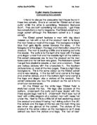
The first advert to be analysed is the Hugo Boss fragrance. The advert is for a new product called ‘WOMAN’ that they are adding to their line of fragrances.
The first thing that is noticed about this advert is the colour. It is very contrasting with the black and white, and gives a big impact to the audience. The white usually signifies innocence but with the black background it’s suggesting hidden depths, like a wild side that you could have. The model’s look is very confident, like she can get anything she wants but not in an over powering way. In a way that men want to be with her, and women want to be her. Her pose is also very relaxed, the arms crossed, rather than signifying impatience, show her to be easy-going. The smile on the models face is like the Mona Lisa smile but with more flirtatiousness behind it. Although the model isn’t wearing much make-up and her hair is just put back in a bun she still is very pretty, and she is saying that you only need to wear this perfume to look nice.
The model in this advert is wearing a suit which suggests that she is a business woman. The suit isn’t a normal one though. It is low cut and sexy, showing a different side to working women.
The phrase
‘expect everything’
is very empowering. It gives the consumer confidence, like it’s saying you can expect everything if you wear our perfume.
Most of the page is filled with the model but on the right hand side there is the Hugo Boss logo and a bottle of ‘WOMAN’ perfume. The Hugo Boss logo is in the middle of the black space at the side and is quite small but because it is written in white it stands out against the black. The capital letters suggest that they really are the boss, and are a well established company who consumers can trust.
The picture of the perfume bottle is showing that it is different from other perfumes. The bottle is a half moon shape which also suggests the use of black and white is a connotation for night and the moon. The Hugo Boss logo is embossed onto the lid of the bottle which is showing an up market product which will be worn by an up market person.
The second advert to be analysed is the Charlie Sunshine advert by Revlon. The Charlie Sunshine advert appears completely different to the Hugo Boss advert on first look, but through analysing it you can see lots of similarities.
Firstly, the use of model. The model in this advertisement is dancing and flirting. She seems to be having fun and looks confident. The model is also wearing white, as was the Hugo Boss model. In this advert it is again contrasting with the bright orange background, but it is also being used to make her tan appear darker. Her tan is very deep, like she has been sun bathing, which makes a consumer think of holidays. In the Hugo Boss advert the model is pale and also has freckles witch suggests she is defiantly a worker.
There’s a lot more writing on this advert than the Hugo Boss advert because they are appealing to different types of women. This advert is going to attract loud, bubbly, chatty girls. The slogan of Charlie Sunshine is emblazoned across the middle,
‘get up! And feel that sunshine!’
The use of exclamation marks shows that the want to shout it, and also want the consumer to shout it, whilst buying their product, whereas in the Hugo Boss advert the message from the company is a lot simpler, ‘Expect Everything’. In the top left hand corner is the word ‘new’. This will entice people who like to be trend-setters or who are looking for something fresh. The word ‘Charlie’ is written in large free flowing letters which is the signature font of the company, there-for re-assuring the consumer that they are buying from a company that they have trusted before.
Whereas Hugo Boss used black as a connotation of sophistication, Charlie Sunshine are using orange, a bright,
lively, sunny colour. The orange backs up the message about sunshine.
The picture in the bottom left hand corner is advertisements for other of their products, showing that they are versatile. The models hand is just above the picture, as if she’s going to grab the bottle. The idea of the advert is to make consumers think that by using Charlie Sunshine you will be flirty, bubbly, energetic and tanned!
At the very bottom of the advertisements is the ‘Revlon’ logo. It is a long white stripe across the bottom of the page to show that they are the makers of the perfume, and the word Revlon is in gold, to continue with the sunshine theme.