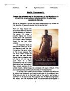
In this poster there are many points hitting you in the face wanting to see this film. For instance, the use of colour in this picture suggests that half of the balance is light and the other half dark, perhaps showing that this warrior may not only be evil, but may be good. There is a fiery background at the top, looking like a rain of fire, like clouds or like a volcanic eruption. At the bottom there is a darker image, like a Coliseum with people sitting in it. The people are very small and they are all looking at this huge warrior.
At the top of this poster you see a slogan. The slogan reads ‘What we do in life echoes in eternity’, and is split on each side of the gladiator’s head. ‘What we do in life’ is on the bright side of the poster, and ‘echoes in eternity’ is on the darker side. This suggests that the light side represents life, and the dark side represents death. This foreshadows what happens in the film, and makes the audience curious. In addition, it starts with two ‘W’s, which is something one cannot pronounce fast. It is pronounced strong and slow. ‘What we do in life’ also shows more of a meaner statement: it’s not something always good, it might be bad; it’s giving us a choice to think about ‘What we do in life’, so it might not always be good. ‘Echoes in eternity’ is saying that someone (i.e. g-d) will always know what we have done. Therefore, ‘echoes in eternity’ means something good, like “will always be heard in heaven”.
The positioning of the slogan suggests that there is one dark side and one light side of the poster, and that one part is more aggressive than the other. If the positioning on the poster is looked at, the more forceful part of the slogan is in the light side of the poster, and the less forceful part of the slogan is in the dark side of the poster.
If we look at all the images in the poster, we see a huge warrior looking tall, firm and strong. In the darker, lower part of the poster, we see people sitting in the Coliseum. If the warrior image was not as big, it would not give the same strong and tense feel to the poster.
The big title Gladiator is one of the main points in this poster. The colour is crispy, fiery, and sharp. The size of the font is big and it shows that it is a mainly action film. Russell Crowe is written in a large golden font above Gladiator, so that people who like the actor’s films would be attracted.
The target age of this film would be from ages 15 – 30. I think this because teenagers would relate to them, because they like blood, fighting and bright strong colours. Here we see a strong, big, fierce man who is looking like he has just attacked someone.
I think that this poster reached its goal. I think this because its quality and meaning is fabulous. Every time you look with depth into this poster, you find something new.