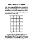
a= 0.00031t4 + 0.005t3 + 0.0325t2 – 1.33t + 9.6
Figure3
Figure 3 shows the curve of best fit. The curve of best represents the function, thus the function is: a= 0.00031t4 + 0.005t3 + 0.0325t2 – 1.33t + 9.6
The graph created compared to the graph given is subsequently steeper. This has to do with the window settings. Where the given graph is forced to confine into a smaller space, this graph is able to expand and have a larger scale, showing how it truly looks.
The second problem faced within this investigation instructs the patient to take 10 µg of the drug every 6 hours for 1 day. In this situation many assumptions and known fats have to be introduced in order to solve the problem. Foremost, 1 day is equal to 24 hours. Secondly we must consider that every time the patient takes the drug, the amount does not go to a constant. The amount will vary because we must add the amount remaining to 10 µg, giving the new total amount of drug in the patient’s bloodstream. In the first 6 hours, the equation was a= 0.00031t4 + 0.005t3 + 0.0325t2 – 1.33t + 9.6, all we have to do to figure out the x and y coordinates is to look at figure 2, because that is the same graph, but only take the first 6 hours, because at 6hours, 10 µg of the drug is added to the patients bloodstream. Thus, the pattern emerges that at every 6 hours (6, 12, 18, 24) the dose remaining will be increased by ten, and in the equation, the “b” value (y intercept), will be the first number increased by ten.
Figure 4
Figure 4 shows the amount of drug in the first 6 hours of the 24 hour day. The amount will increase every 6 hours by 10 µg.
Calculating the Amount of the drug in the bloodstream from 6-12hours requires a different procedure however. First, the amount remaining after 6 hours is 3.7 µg. At this point, the patient takes another 10 µg of the drug. So, the 9.6 in the original function is replaced with 13.7, giving us the new function of a= 0.00031t4 + 0.005t3 + 0.0325t2 – 1.33t + 13.7. We already have the “t” values, but now we must calculate the “a” values. To do this, plug the “t” value into the equation, which is the time period from 6t-12t, increasing by 0.5 each time, and the number formulated is the “a” value. The best way to organize this information is the data point table.
Figure 5
Figure 5 shows the data point table for 6 hours
To 12 hours.
To graph this, simply plug this data point table into the data point table in Graphmatica, it will give you the function from 6t-12t. The graph looks uniform except for the initial increase of 10 µg at 6t, where in the graph there is a steep drop from 6t to 6.5t. Thus shows that as the tests go on, by the second dose, the amount of the drug in the blood stream decreases significantly more rapidly than before, which can be explained in part by the human immune system to adjust to certain vaccines and medicines. The maximum in the first 6t (0t to 6t) was 9.65a and the minimum was 4.0a. In the second 6t (from 6t to 12t) the maximum is 13.7a at 6t and 4.63a at 12t. This shows the pattern that the maximum will always come at the first t in every 6t frame, and the minimum will come at the last t in every 6t frame.
Figure 6
Figure 6 shows the graph but only a specific section, from 6t to 12t. As you can clearly see, the Amount of blood stream significantly drops from 6.0t 6.5t, this is most likely due to the human immune system. The maximum here is at (6.0, 13.7) and the minimum is at (12.0, 2.63).
Third frame is from 12t-18t. In this frame, we must use a similar procedure to calculate the function and the data points. Firstly, the last point in the 2nd frame indicated 4.63a in the patient. However the patient again takes another 10 µg of the drug at this point. So in the function we have to replace 13.7 with 4.63a + 10a, which is 14.63. So the new equation becomes: a= 0.00031t4 + 0.005t3 + 0.0325t2 – 1.33t + 14.63. Again, to determine the data points, plug in the known “t” values which are the 0.5 increments from 12t to 18t, and the number produced is equal to the a value. Put the results in a Table first to show the relationship, and then show it visually on a graph.
Figure 7
Figure 7 shows the data point table for the 3rd frame In the 24 hour timeline.
What is significant in this data point table is that fro the first time we see the “a” values reaching negative integers. This means that at 17.5t although the a value is technically -0.97a, in reality we know that you can not have a negative amount of a drug, thus the Amount of Blood in the bloodstream reaches 0 officially after 17.0t; 17hours.
Figure 8
Figure 8 shows the graph of the 3rd frame in the 24 four cycle. Here we can see that the amount of drug in the bloodstream finally reaches zero. Although the “a” values are negative at 17.5t and 18t, we know that in reality that is not possible. We can clearly see that the maximum occurs at (12, 14.63) and the minimum occurs at (18, -2.16).
The fourth and final frame is from 18t to 24t. In the 3rd frame, we were left with a -2.16a. Thus to figure out the initial value for the 4rth frame, we must add 10 µg. Thus the new initial value for “a” at 18.0t is 7.84, represented in the equation as:
a= 0.00031t4 + 0.005t3 + 0.0325t2 – 1.33t + 7.84. To calculate the other values in the 4th frame, simply plug in the known t values which range from 18t to 24t, increasing by increments of 0.5t every time.
Figure 9
Figure 9 shows the data point table for the fourth frame.
We can clearly see that all the points other than the initial
Are negative integers. The maximum is located at
(18.0, 7.84) and the minimum occurs at (24, -39.09).
Again, because the numbers are negative integers, they may technically exist, but in Real life, the amount of drug in the blood stream has now come to a phase of massive loss. It shows that one hour after the additional 10 µg is taken; the entire drug in the bloodstream is gone. The body of the patient we can securely say has become immune to the drug now.
Figure 10
Figure 10 shows the graph of the forth phase in the 24 hour cycle. As you can see, the majority of the values are negative integers.
The final step in creating our 24t cycle function is to combine the 4, 6t phases of the function into one graph. The graph will show that there are specific local maximums and minimums for each phase in the graph; these have already been listed previously. The steep jumps are due to the sudden 10 µg. However, it is clear to see that as the graph progresses, especially in the last two phases, it takes a shorter time for the amount of drug in the bloodstream to decrease, showing us that clearly the patient’s body is used to the drug, and it clearly dissolving faster than ever before.
Figure 12
Figure 12 shows the entire data point table for the final Amount of Drug in a Bloodstream graph which combines all four phases to get a 24 hour cycle.
Figure 13
The maximum in the overall graph is located at (12, 14.63) and the minimum is (24, -39.09). This breaks the pattern we saw earlier where the maximum was the initial point in the phase and the minimum was the last point in each phase. If that pattern had occurred in this situation, then the maximum would have been the first point in the data point table (refer to Figure 12), (0, 9.65).
If no further doses were taken for one week, then the amount of drug in the bloodstream would remain 0. This is because at the latter stages of the graph, it is clear to see that when the drug is taken, it is completely gone from the bloodstream in approximately ½ hour (specifically referring to Phase 4, see Figure 9 and Figure 10). Thus if no doses were taken after the 24 four testing period, any trace of the drug in the bloodstream would be gone.
If doses continued to be taken every 6 hours for a week, then it would repeat the pattern we have seen. The “b” value would inevitably get smaller and smaller, but never exactly hit 0 because of the fact that a 10 µg has to be given, a horizontal asymptote for the initial values only, at the 0 mark. But the fact remains that the “b” value would continually get smaller, and the time taken for the drug to completely disassociate itself in the bloodstream would also get smaller and smaller, it is an exponential regression.
Thus at the conclusion of the investigation, it is clear to see that the drug in the patients bloodstream gradually disassociated itself at a faster rate throughout the 4 phases until it was at a point where it was gone merely 0.5t after the additional 10 µg dose of the drug. The four functions proved to be the following:
-
a= 0.00031t4 + 0.005t3 + 0.0325t2 – 1.33t + 9.6
-
a= 0.00031t4 + 0.005t3 + 0.0325t2 – 1.33t + 13.7
-
a= 0.00031t4 + 0.005t3 + 0.0325t2 – 1.33t + 14.63
-
a= 0.00031t4 + 0.005t3 + 0.0325t2 – 1.33t + 7.84
The point at which the drug initially hit 0 µg in the bloodstream was following the 17 hour mark in the 24 hour test, and it reached 0 again at 18.5 hours. In conclusion, to improve the experiment, the investigation needs essentially test a stronger drug, one which does not allow the body to gradually become immune to it.