
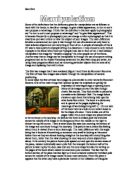
'The Royal Pavilion, Brighton, reflects fashionable tastes
'The Royal Pavilion, Brighton, reflects fashionable tastes in architecture, design, attitudes and way of life?' Do you agree with this hypothesis? The Royal Pavilion was a very fashionable building in it's day. The architecture was quite fashionable as it used the idillic style which was fashionable and the farmhouse idea was fashionable, however the Indian style the Royal Pavilion used was unfashionable. On the outside of the Pavilion the Prince also used the neo-classical style which was fashionable back then. Trompe l'oeil was a fashionable interior design which the Prince used. However the Prince did use chinoiserie which was unpopular then but was popular 50-60 years before the Prince used it. The Prince then used wall-to-wall carpets which was unfashionable but caught on. The Royal Pavilion was also fashionable because it had banquets, balls and many other social events. Also in the Pavilion it is clear to see the attitude from the rich towarde the poor, the rich thought very little of the poor and didn't like being around them. The Royal Pavilion does reflect the way of life in Brighton as all the rooms reflect how the people in Brighton liked to live. The farmhouse was a very fashionable place to live in 1786. It was so fashionable because it was linked with the Romantic Movement, the Romantic Movement was where the rich "pretended" to be like the poor and stayed
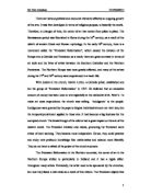
Manipulation - Some of the definitions that the dictionary gives for manipulation are as follows: to work with the hands, to handle or manage, to give a false appearance, to turn to one's own purpose or advantage.
Some of the definitions that the dictionary gives for manipulation are as follows: to work with the hands, to handle or manage, to give a false appearance, to turn to one's own purpose or advantage. I think that the definition's that best apply to photography are "to turn to one's own purpose or advantage" and "to give false appearance". This is because frequently in photography you can change or alter a photograph so that it is exactly as you want others to view the subject of your images. The main difference between a camera and our eyes is that through the use of a camera we only have to view selected objects and not everything in front of us. A simple of example of this is if I was to take a picture of people sitting in a classroom. I may choose to only include 2 people in the frame when there are 4 people I can see in front of me. I have already manipulated this image by "visually cropping" the other people out of the frame. Another way that an image can be manipulated is through the use of computer editing programs such as the Adobe Photoshop series and the Jasc Paint shop pro series , by using these programs effects such as removing particular objects from an area of an image and replacing them with others. The first two images that I have analysed (figure 1 and 2) are by Rommert Boonstra. The first of these two images was created through the manipulation of camera
There are various political and economic elements affected an ongoing growth of the arts.
There are various political and economic elements affected an ongoing growth of the arts. It was first developed in terms of religious purpose, to beautify the world. Therefore, in changes of time, the center of art has moved from place to place. The Renaissance period was flourished in Rome during the 16th century, as a result of the rebirth of ancient Greek and Roman mythology. In the early 16th century, there is a movement called the "Protestant Reformation", which caused the division of the Europe into a Catholic and Protestant, as a result; there are great contrasts in terms of art style and the lives of artists between the Southern Catholics and the Northern Protestants. The Northern Europe was most greatly affected, and many of the artists during the 17th and 18th century were experienced in a harsh life. With doubts in the church, Martin Luther, a Catholic priest, established and led the group of 'Protestant Reformation' in 1517. He believed that an excessive amount of money has been used in arts especially at the cathedral of St. Peter's. To make art costs expenditure; the church was selling 'indulgence' to the people. Indulgences were granted by the pope to forgive individual sinners not their sins, but the temporal punishment applied to those sins. It had become a big business for the corrupted church. The breakthrough of the reform had a great impact on the arts

The traditional art of Africa consists basically of masks and figures of magico-religious significance, decorative objects used for personal decoration, and symbol of rank or importance.
The traditional art of Africa consists basically of masks and figures of magico-religious significance, decorative objects used for personal decoration, and symbol of rank or importance. Most of these objects are in some way associated to ceremonial and other structured activities (such as singing, dancing, drumming, and storytelling), without which the visual arts could not work in traditional African culture. The forms and functions of traditional African art are very mixed. Sculpture is usually considered Africa's greatest triumph in art, although sculpture is found in many parts of Africa, this means of expression occurs with the highest amount in western and central Africa. Most of the sculptures are made of wood, but objects are also made of metal, stone, terra-cotta, mud, beadwork, ivory, and other materials. In southern and eastern Africa there are ancient rock paintings dedicated to the SAN (Bushman) people. The only other main rock art tradition in Africa is that of Algeria, Libya, and Chad, the work of the prehistoric people of the Sahara. Islamic influence is seen all over the west African grassland and the east African coast. Some groups like the YORUBA of Nigeria carve a great variety of objects. GENERAL CHARACTERISTICS At least three basic themes occur again and again in traditional African art: 1 the distinction between bush and village, 2 the
"Islamic Art is characterised by variety". Is this true?
ESSAY TITLE: "Islamic Art is characterised by variety". Is this true? "And of His Signs is the creation of the heavens and the earth and the diversity of your tongues and colours. In that, surely, are Signs for those who have knowledge." (Qur'an, al-Rum: 23) Islam is an entire way of life, with Islamic Art playing an integral part in this. Extending from North Africa to Southeast Asia, it links together "disparate communities through a range of common cultural values."1 A range of styles are achieved, all contributing to the vast scope of Islamic Art.; thus, creating a richly diverse, yet unified concept. This diversity, however, is contained within a somewhat, restricted framework of techniques. Here I use the term 'restricted' very loosely, as each individual technique can be applied in such a way as to achieve an almost infinite number of transformations, for any given art form. I will be discussing this in more detail during the course of this essay. Before moving on to discuss the huge variety we find in Islamic Art and the factors which unite this huge concept, I think it is important to clarify what this concept of 'Islamic Art' is. "The term Islamic generally refers to purely religious expressions, such as calligraphy."2 Is it art created by Muslims? Or alternatively, is it art created by people residing in countries where the dominant religion is Islam?
"Artists pick over culture, seeking to comment, define and reinterpret whether or not this relates to another cultural background or gender, or an interest in repositioning through juxtaposition, contrast and depiction."
? Exam Block Essay ? "Artists pick over culture, seeking to comment, define and reinterpret whether or not this relates to another cultural background or gender, or an interest in repositioning through juxtaposition, contrast and depiction." An artist looks at culture, picks something out and responds by remaking it. They look at the object, putting it side by side and reinterpreting it. By looking at culture artists are able to respond to it as a theme of 'Precious Things' as a result of their cultural background by delving into their own culture. 'Like everybody else, artists are affected and influenced by their personal and cultural backgrounds'1therefore, linking their intent to Precious Things. Through time and experimentation, artists have expressed their views of culture clearly with their art. For many centuries, artists throughout the world have aimed to capture and portray a particular theme or subject in accordance to their cultural beliefs, personal influences or moods. "An important part of visual language goes beyond the written word to the visual and performing arts, for they communicate in a less obvious and structured way the personal concerns of the artist as a member of a cultural group and therefore speak in a direct way to others, feeding the human spirit, its goals and complexities."2 Julie Rrap and Colin McCahon are two examples of artists who 'pick

The Italian Renaissance.
The Italian Renaissance The Italian Renaissance is separated into three periods of time ;the High Renaissance, Early Renaissance and Late Renaissance . During each of these periods a variety of artists had contributed to a magnificent transformation in Italian artistry . Despite The Renaissance being divided into three main times , all had occurred sometime during the 15th century . It was during the High Renaissance period that the artistry that was produced was normally associated with architecture . It was due to this , that several different artists compositions could be gathered together to produce a piece of work which had much impact upon the eye whilst sustaining a balance in colour and style . However , it was due to the fact that there were a myriad of different compositions that made it inevitable for the High Renaissance to break at an early stage since each composition on its own had steadiness in its style . Essentially, the High Renaissance had lasted from 1495-1520 and was sparked off by artists which are regarded to be genius' in the present day . These artists do include Donato Bramante and Leonardo da Vinci .Da Vinci being seen as one of those men who had set of the Italian Renaissance to its peak as it was seen that in his work he had meddled with different ideas , experimenting with his thoughts and in doing so had brought spirit into art that was so
Photography was a major shaper and creator of modernism, Discuss.
Photography was a major shaper and creator of modernism, Discuss. Art is an activity characteristic of humanity since the dawn of civilisation. In any epoch the Artist, by virtue of special gifts, expresses that which is finest in humanity...the visual artist archives this through modes of understanding and expression which are 'purely visual' - radically distinct from, for example, verbalisation. This special characteristic of art necessarily makes it an autonomous sphere of activity, completely separate from the everyday world of social and political life. The autonomous nature of visual art means that questions asked of it may only be properly put, and answered, in its own terms - all other forms of interrogation are irrelevant. In the modern world the function of art is to preserve and enhance its own special sphere of civilising human values in an increasingly dehumanising technological environment. If these beliefs sound familiar - perhaps even self-evident - it is because they long-ago became part of the received common-sense we in the West learn at our mother's knee. (Burgin 1986) The 20th Century had a good start due to the inventions and innovations of the 19th Century era. The culture was becoming more and more refined with the standardisation set out by the previous generations finally becoming long term standards and the fruition of ideas and ideals set out
How is the Reader Drawn into Achebe's Fictional World?
How is the Reader Drawn into Achebe's Fictional World? The book is written in the past tense, as though it were a story being related to someone. The opening of Chapter three maintains this tradition. The persona who narrates this story is relatively objective in his/her account of the occurrences in Umofia and they seem to have access to the characters' innermost thoughts. In this style of narration, the persona is often referred to as the 'voice of God'. By choosing to write the story this way, Achebe enables the reader to sympathize with the characters in a way that would not be possible had it been written otherwise. Customs unique to Igbo culture are interwoven with features that are personal to the characters. Aspects of Igbo lifestyle that would seem strange to those unacquainted with their culture are written with nonchalance (that is, the persona is not awed when recounting parts of their daily life), which is part of the book's allure. In my opinion, this (at the time it was published) unconventional approach is partly why this book was so successful, as it lends a sense of the exotic to the book. There are facets of the book that are universal in their appeal because certain problems are common regardless of ethnicity. These make it easier for the reader to relate to the story. An example of this is at the end of chapter 3, when the reader learns of the

A Discussion of Rembrandt’s Self-Portrait at the Age of 63, 1669, National Gallery
A Discussion of Rembrandt's Self-Portrait at the Age of 63, 1669, National Gallery The art repertoire of Rembrandt van Rijn, the great seventeenth-century Dutch painter, contains nearly ninety self-portraits, creating a forty-year autobiography of self-exploration. His innate propensity to study his own image was reinforced by the social and cultural atmosphere of his time, and his efforts to distinguish himself from his contemporaries. Upon looking into the face of a Rembrandt self-portrait, one can perceive his extraordinary aspirations, his attainment of power and status, and the misery that he found in his last years. In examining Rembrandt's Self-Portrait at the Age of 63, 1669, and comparing it to an early work done at age thirty-four, his purpose in creating these paintings can be ascertained, as can the effect of his position in life when they were done. During the seventeenth century, there was a rise in individualism or the concept of the human being as autonomous and self-governing. Under this idea, "man (as opposed to God) makes and shapes the world in which he is primary" (Chapman, 4). The value of the individual and his own uniqueness is derived from Renaissance Italy and the Reformation, which created a fundamental shift toward a man-centered view. The growth of individualism "marked a radical reordering of society that prompted many to turn inward and