I will investigate whether or not there is a relationship between heights and weights of boys and girls at Mayfield High School. The population of this investigation are the pupils at the Mayfield High School.
Mayfield School Statistic Coursework
Introduction
In this investigation, I will investigate whether or not there is a relationship between heights and weights of boys and girls at Mayfield High School. The population of this investigation are the pupils at the Mayfield High School.
Line of Enquiry: Relationship between heights and weights this is because from my own knowledge, I know there is a relationship which I would like to unravel. Also, there is a possibility of it producing some surprising results.
Collecting Data
I will be taking a random sample of sixty pupils. I am choosing sixty pupils because it will be adequate enough for good graphs/charts and also because it divides into three hundred and sixty exactly which can be useful for some calculations and it has twelve different factors which can make it easier for certain calculations. I will be using a sample because it will be easier to handle.
I will sample by assigning a random number to each row/person which can be done by pressing RAN# on the calculator or by typing =RAND() in Microsoft Excel. From these random numbers assigned to each pupil, I can sort this numerically and if I want sixty random samples, I select the top sixty. I will not take too little results so that the results are not reliable and I will not take too many so there are all the points on a graph. Therefore I will take a sample of sixty. This ensures that there is no bias which is useful because it ensures that the data will be accurate. I am taking a sample because it will be easier to handle and makes it a representative sample which means it represents the whole population. I want a representative population so the results represent the whole population, not just the sample, so any conclusions made will relate to the whole population, not the sample in general.
The data in question is secondary data so it may not be entirely accurate. Also, when the data was collected originally, many mischievous pupils may/will have given false details which cause anomalies, even though most people give accurate results. However, due to this being the only set of data, it will be the set used in this investigation. I will detect an outlier (if needed to detect an outlier) by calculating if the point in question is above Upper Quartile + 2 x inter-quartile range or it is under lower quartile - 2 x inter-quartile range. This sets the boundaries for outliers because it is a fixed range for the sample. I will firstly use the data of height and weight and then I will develop it later.
Due to this being the only set of data usable, I cannot personally take my own results personally. However, this can be suggested as an improvement which will be stated later. Also, if there is a set of data with some parts missing, I will discount the whole person because some of the information maybe useful later and may convey something towards the conclusion.
Plan 1
From using the random sampling of sixty people for reasons stated above, I will try to prove the following hypothesis correct: "As the height increases, the weight increases." I can add to this further and predict that the height is directly proportional to the weight.
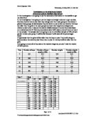
I will firstly start by a scatter graph of heights and weights of sixty pupils which is shown below. Below is a prediction which relates to the hypothesis. I am using a scatter graph as it shows the relationship between two different variables. I will add a line of best fit because it summarises the relationship in one line which is easier to identify. Here is a prediction of what the graph will look like from my prediction.
(Prediction Graph)
Here is the actual graph the sample of sixty produced:
This graph suggests that on average, as the height increases, the weight increases which proves my original hypothesis correct. The correlation is moderately strong, which suggests that there can be better results achieved to result in a stronger correlation. This shows that my earlier prediction is partly correct but it is not correct for all the pieces of data. I will be splitting up the years to try to achieve stronger correlations in this piece. Another reason for splitting up the years is because ...
This is a preview of the whole essay
(Prediction Graph)
Here is the actual graph the sample of sixty produced:
This graph suggests that on average, as the height increases, the weight increases which proves my original hypothesis correct. The correlation is moderately strong, which suggests that there can be better results achieved to result in a stronger correlation. This shows that my earlier prediction is partly correct but it is not correct for all the pieces of data. I will be splitting up the years to try to achieve stronger correlations in this piece. Another reason for splitting up the years is because the mean increases as the year increases (see below).
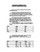
Mean
Including Anonomolies
Height
Weight
Year 7
.55
46.26
Year 8
.60
49.93
Year 9
2.22
51.32
Year 10
.68
55.69
Year 11
.67
54.66
As you can see the mean for the years increase as the year increase, by the increment that they increase by is not uniform. This may be due to anomalies which will be discussed later. The idea of it being non-uniform suggests that the line of best fit will be different for each year therefore the conclusion will be different. Also, from my own knowledge and experience, I know that people grow at different rates as they grow older, thus I will split up the years.
Plan 2
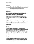
Year 7
From doing the random sampling method (see above for method and reasons for doing it), I selected sixty random pupils and put their heights and weights on a scatter graph to compare the two variables. I started with year seven:
This graph shows moderate positive correlation between the heights and weights, which suggests that the taller a year seven is, the heavier he is. I have stated the gradient of the line of best fit because I can use it to predict values from it. This equation suggests that on average, every time a year seven pupil is a metre taller, they will be 34.5kg heavier. This can be simplified into every time a year 7 pupil is 10cm taller, s/he will be approximately 3.5kg heavier. Also from this equation I can predict the weight of a pupil by knowing his/her height. I predict that a year seven who is 1.5m tall will weigh (1.5 x 34.542=) 52kg. My prediction is proved correct by a year seven pupil called "Jan Marton" who is 1.5m tall and weighs 52kg. Next I will continue the plan by comparing year eights.
Year 8
I will not include a graph for the year eight pupils because it is the same method as the year seven, except the results will be different. Microsoft Excel calculated that the gradient of the line of best fit for the year eight is y = 40.239x - 15.513.
This can be translated into every time a year eight pupil is 10cm taller; s/he will be approximately 4.0kg heavier - (0.5kg heavier than the year seven conclusion). Also from this equation I can predict the weight of a pupil by knowing his/her height. I predict that a year seven who is 1.7m tall will weigh (1.7 x 40.239=) 53kg. My prediction is proved correct by a year seven pupil called "Caren Jason" who is 1.7m tall and weighs 53kg. Next I will continue the plan by comparing year nines.
Year 9
For the same reason as above, I will not include a graph for the year nines. However, the gradient is y = 43.953x - 20.668.
This can be translated into every time a year eight pupil is 10cm taller; s/he will be approximately 4.4kg heavier - (0.4kg heavier than the year seven conclusion). Also from this equation I can predict the weight of a pupil by knowing his/her height. I predict that a year seven who is 1.4m tall will weigh (1.4 x 43.953=) 41kg. My prediction is proved correct by a year seven pupil called "Elizabeth Taylor" who is 1.4m tall and weighs 41kg. Next I will continue the plan by comparing year tens.
Year 10
I have drawn a graph because it contains an unexpected result:
As you can see, there maybe an anomaly - you can see the pattern in the data (between 1.35m and 1.85m) the anomoly is the exception of the trend of the relationship. Due to this anomaly, the equation for the line of best fit is negative, which means that as people get taller, their weight decreases. I will take the anomaly out because the results will change and become more accurate and represent the selected year group instead of the sample. Also, to my knowledge, I know that 4.65m is an impossible height as the Gunniess world record for the tallest person is 2.72m tall. (I could also use the method stated on page one to prove that this is an anomaly/outlier.) This anomaly could be due to a typo or a mistake of legibility or it could be a mischievous pupil. So I excluded the result to get (PTO):
(Fact about world's tallest man taken from: http://www.guinnessworldrecords.com/gwr5/content_pages/record.asp?recordid=48409)
As you can see, the graph as dramatically changed. The gradient is now 48.282
Year 11
From Microsoft Excel, I have found out that the equation of the line of best fit for the year elevens is y = 51.73x - 32.093. (I have not drawn a graph as the only needed information is the gradient (which is used below)).
If I synthesise all the gradients together in a list below so I can analyse them further easier, I get the following table:
Year
Gradient
7
34.542
8
40.239
9
43.953
0
48.282
1
51.730
As you can see, the gradients which approximately increase uniformly. I have put these onto a graph to see the relationship between them:
As you can see on the graph above, the graph gives an extremely strong positive correlation and the line of best fit has a gradient of 4.2419. This means that every year a pupil becomes older, the weight that they increase by when they get 10cm taller increases by 4.24kg every year. However, this approximation/conclusion cannot be true for every single person. From my own knowledge and experience, people grow at different rates and at some point in there lives, they discontinue growing and even shrink. I do not have a sufficient amount of data to go further into this as my population is only pupils at a school which the highest age is sixteen.
However, the year group is discreet data. This means that I cannot have 81/2 years, so I cannot draw too many detailed conclusions from this graph. I will continue this later (see below)
However, one of the main reasons I split up the year groups was to see whether or not I found a stronger correlation between the heights and weights. I will achieve this by using the next method: Vertical Dispersions.
Plan 3
I will be measuring the vertical dispersions of each of the selected random sample from the line of best fit. I will do this by taking each height and substituting it for the x in the equation in the equation for the line of best fit. From this, I will take the positive different of the substituted weight and the actual weight and add up the total for that year. This will be repeated for each year (+ the overall school) so I can see if the correlation is stronger if the years are split up.
Year 7 - Sixty Random Sample
The vertical dispersion total for the sampled year sevens is 544, which makes the mean vertical dispersion per piece of data 9.1.
Year 8 - Sixty Random Sample
The vertical dispersion total for the sampled year eights is 399, which makes the mean vertical dispersion per piece of data 6.7.
Year 9 - Sixty Random Sample
The vertical dispersion total for the sampled year nines is 409, which makes the mean vertical dispersion per piece of data 6.8.
Year 10 - Sixty Random Sample
The vertical dispersion total for the sampled year tens is 549, which makes the mean vertical dispersion per piece of data 9.2.
Year 11 - Sixty Random Sample
The vertical dispersion total for the sampled year elevens is 529, which makes the mean vertical dispersion per piece of data 8.8.
The whole school put together (sample) - Sixty Random Sample
The vertical dispersion total for the sampled whole school is 395, which makes the mean vertical dispersion per piece of data 6.6.
To conclude this plan, the idea of splitting up the years did not produce a stronger correlation as I thought it would have. This maybe because the actual sample(s) taken may just have all coincidently been less strongly correlated, but this seems unlikely as the vertical dispersion for all the years was higher. However though, it produced interesting facts which I am going to lead onto next. For example, the mean vertical dispersion for the whole is lower than all the other years' mean vertical dispersion. This could be because the particular samples in question do not have a better correlation.
As stated on page five, the graph which I have contains the gradient and year group. However, the year group is discreet data which means that I cannot make too many detailed conclusions from it. To be able to make better conclusions, I will compare age and weight. This is because the age will not be discreet data, and the weight is part of the aims. Then I will continue and compare height and age, as height is part of the line of enquiry so I can make valid conclusions from these two pieces to produce a valid conclusion which relates to the line of enquiry.
Plan 4
Part 1
As stated above I will compare age and weight. I will firstly use the age in years which will the added to the number of months aged divided by twelve so I can get the number of months into a decimal number system which will be easier to handle. I will take a sample of sixty (for reasons mentioned earlier), age plot a scatter graph of age vs. weight so I can measure the relationship between the two variables. Below is a graph of what I predict the graph will look like:
Below is what the actual graph looks like:
As you can see, as the age increases, the weight increases. However, the correlation seems pretty strong and positive, but the correlation towards the line of best fit can be increased if I use a curve of best fit. I will use vertical dispersion to prove (or disprove) that the curve has a stronger correlation towards the line of best fit. To use vertical dispersion, I need to know the gradients: the equation of the above line of best fit is y= 10.937x - 89.46 which states that the gradient is 10.937. Below is the graph of the curve of best fit:
The mean of the vertical dispersion is 6.36 for the first graph. The mean of the vertical dispersion is 5.71 for the second graph. This shows that the curve of best fit is a better representation of the data of the whole school, even though there are still a few pieces of data that are not near the curve of best fit.
From this graph, I can conclude that as the pupils get older, their weight also increases. In addition to this, the older pupils get, the amount that they increase by per year also increases. This can be related to the recent headlines about obesity and unhealthiness (there has recently been a lot about this in the news). There is nothing to suggest that the weight cannot stop increasing.
Part 2
During the first part of Plan 4, I compared age and weight. Now I will compare age and height. I will, again have a sample of sixty, on a scatter graph with a curve of best fit (for reasons mentioned previously). My prediction for this graph is the same as the one for the height. Below is the actual graph:
As you can see above, as the age increases, the height increases. However, the amount that the height increases for every year increasing begins to decrease. This concludes that during the early teens, the pupils are growing reasonable rapidly, but as they progress through their teens, the growth rate slowly begins to decrease. This can be supported by my own knowledge and experience.
Conclusion
To conclude, I concluded from plan one that simply, as height increases, weight increases. This lead onto separating out the years which concluded that the amount that the pupils grew per school year increased as the year increased. Due to a school year being discreet data, I compared age (which is not discreet data) to heights and weights. From this is concluded that as the age increased, height increased, but simultaneously, the growth rate began to decrease. As well as this, I conclude that when the age increased, the weight increased, but the amount that that weight increased by became amplified. This can be related to real-life situations such at the recent obesity crisis. However, as weight can continue to increase after a pupil's teenage years, and from real life experience and my own knowledge, the height cannot be controlled - it usually always stops and sometimes reverses. The weight can be controlled by a pupil consuming more or less which can suggest that there cannot be a fully justifiable conclusion made that can relate to everybody in the population as one of the variables can be directly controlled by a human being and the other variable cannot. However, apart from this, I can conclude that the majority of the population prove that my hypothesis is correct: as the height increases, the weight increases - it is directly proportional.
The techniques that I have used in this investigation have been pretty reliable. They have been complimented by the results/the sample of results which have produced accurate data which has been fairly easy to extract detailed, valid conclusions from.
I could improve/continue this by extending the problem and separating the data by gender - from my own knowledge, I think that the two different genders grow at different rates. I could have a box and whisker diagram showing how the different heights and weights were distributed throughout the population. However, the conclusions made in this piece of work only directly apply to the Mayfield High School data - the conclusions are limited to the Mayfield High School; however it may coincidently apply to real life as the secondary data is based on a real life school. Also, I took a sample of sixty random pupils each time. This can represent the whole populations, however sometimes it cannot. The majority of the sixty pupils in the sample may all coincidently follow the hypothesis that was being investigated at that particular time.
Mathematics Coursework Mr. England
Page 1 of 10