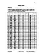
Therefore, Median = 10 ≤ x < 12
Lower Quartile, Upper Quartile and Inter Quartile Range – Ford
To make my estimations accurate I will find out the lower quartile, upper quartile and inter quartile range.
Median = n + 1 ÷ 2
Median = 16 + 1 ÷ 2
Median = 8.5
I now looked at 8.5 on the y-axis (cumulative frequency) of the graph on the next page and dropped a perpendicular line until it touched the plotted line. Therefore Median is the value that is obtained on the x-axis. This has been shown on the next page.
Hence, Median is equal to £10.5k
To find the lower quartile (LQ) I will use the following formula:
¼ (n + 1)
Where ‘n’ again is known as the highest cumulative frequency.
¼ (n + 1)
¼ (16 + 1)
¼ (17)
17 ÷ 4 = 4.25
I now looked at 4.25 on the y-axis (cumulative frequency) of the graph on the next page and dropped a perpendicular line until it touched the plotted line. Therefore LQ is the value that is obtained on the x-axis. This has been shown on the next page
It is now known that the lower quartile is equal to £8.4k. This is the value of one-quarter way into the division.
The same steps are to be considered while finding out the upper quartile, but this time the following formula was used:
Upper Quartile = ¾ (n + 1)
¾ (16 + 1)
¾ (17)
17 х 3 ÷ 4
51 ÷ 4
12.75
The same steps were taken into deliberation. This is the part of three quarters of the way into the division. The value that I obtained on the x-axis is £15k.
UQ = £14.5k
Now with the known upper and lower quartile I can determine calculating the inter-quartile range. The following formula shows how to calculate the inter-quartile range:
Inter- quartile range (IQR) = Upper quartile – Lower quartile
IQR = 14.5 – 8.4
I.Q.R = £6.1k
Mean, mode, median and range – Vauxhall
I now have shown the mean, mode, median and range of a specific make of car. I have taken Vauxhall into consideration. The mean, mode and median will be found by using the prices of Vauxhall cars when new. From the following table the mean, mode, median and range can be found:
I shall firstly find out the mode that is also known as the modal. The mode is the highest frequency. By looking at the table above, in the frequency column, it can be seen that 3 is the highest frequency because there are two numbers that are 3. This is known as a bi-modal. This basically means that there are two highest frequencies in the Vauxhall model. Therefore mode is equal to £12k ≤ x < £14k and £18k ≤ x < £20k. This shows me that this is the most frequent price. It is the central tendency from all the Vauxhall cars.
Secondly I shall calculate the range. The range can be calculated as the following:
Range = Highest Price – Lowest Price
Range = 20 –4 = £16k
The mean can be found by dividing the number of cars by means of the number of makes. This can be written as the following:
Mean = ∑ Frequency × Mid-interval
∑ Frequency
Mean = 5 + 14 + 18 + 11 + 39 + 15 + 0 + 57 ÷ 19
Mean = £8.37k
The median represents the middle value out of collection of numbers. Finding the median is very straightforward. The frequency column that was shown above can find the median. The frequency should always arrange from smallest to largest. If there were a large amount of data that is present in the frequency column it would be very time consuming to put the column in ascending order. Therefore an easier step can be taken into deliberation. This has been shown below with the formula that is used at all times to calculate the median:
Median = n + 1 ÷ 2
Where n is equal to highest cumulative frequency
Median = n + 1 ÷ 2
Median = 13 + 1 ÷ 2
Median = 14 ÷ 2
Median = 7
Now when this median is found this number is taken and the cumulative frequency column is looked at. It can be noticed that 7 lies between 6 and 18. It can now be said that the median is equal to 12 ≤ x < 14.
Therefore, Median = £12k ≤ x < £14k
Lower Quartile, Upper Quartile and Inter Quartile Range – Vauxhall
To make my estimations accurate I will find out the lower quartile, upper quartile and inter quartile range.
Median = n + 1 ÷ 2
Median = 13 + 1 ÷ 2
Median = 7
I now looked at 7 on the y-axis (cumulative frequency) of the graph on the next page and dropped a perpendicular line until it touched the plotted line. Therefore Median is the value that is obtained on the x-axis. This has been shown on the next page.
Hence, Median is equal to £13k
To find the lower quartile (LQ) I will use the following formula:
¼ (n + 1)
Where ‘n’ again is known as the highest cumulative frequency.
¼ (n + 1)
¼ (13 + 1)
¼ (14)
14 ÷ 4 = 3.5
I now looked at 3.5 on the y-axis (cumulative frequency) of the graph on the next page and dropped a perpendicular line until it touched the plotted line. Therefore LQ is the value that is obtained on the x-axis. This has been shown on the next page
It is now known that the lower quartile is equal to £8.5k. This is the value of one-quarter way into the division.
The same steps are to be considered while finding out the upper quartile, but this time the following formula was used:
Upper Quartile = ¾ (n + 1)
¾ (13 + 1)
¾ (14)
14 х 3 ÷ 4
42 ÷ 4
10.5
The same steps were taken into deliberation. This is the part of three quarters of the way into the division. The value that I obtained on the x-axis is £18.5k.
UQ = £18.5k
Now with the known upper and lower quartile I can determine calculating the inter-quartile range. The following formula shows how to calculate the inter-quartile range:
Inter- quartile range (IQR) = Upper quartile – Lower quartile
IQR = 18.5 – 8.5
I.Q.R = £10k
Mean, mode, median and range – Fiat
The third make of car I shall investigate is Fiat. I have shown a table below, with all the necessary details that I will be using during the calculations of discovering the mean, mode, median and range.
I shall firstly find out the mode that is also known as the modal. The mode is the highest frequency. By looking at the table above, in the frequency column, it can be seen that 4 is the highest frequency because there are two numbers that are 3. This is known as a bi-modal. This basically means that there are two highest frequencies in the Fiat model. Therefore mode is equal to £6k ≤ x < £8k and £10k ≤ x < £12k. This shows me that this is the most frequent price. It is the central tendency from all the Fiat cars.
Secondly I shall calculate the range. This will show me the price between the lowest and the highest price of this car make. The range can be calculated as the following:
Range = Highest Price – Lowest Price
Range = 12 – 4 = £8k
The mean can be found by dividing the number of cars by means of the number of makes.
This can be written as the following:
Mean = ∑ Frequency × Mid-interval
∑ Frequency
Mean = 0 + 28 + 18 + 44 ÷ 10
Mean = £9k
The median represents the middle value out of collection of numbers. Finding the median is very straightforward. The frequency column that was shown above can find the median. The frequency should always arrange from smallest to largest. If there were a large amount of data that is present in the frequency column it would be very time consuming to put the column in ascending order. Therefore an easier step can be taken into deliberation. This has been shown below with the formula that is used at all times to calculate the median:
Median = n + 1 ÷ 2
Where n is equal to highest cumulative frequency. The added one is done so that the figure can be rounded off to give a most accurate result that could be obtained.
Median = n + 1 ÷ 2
Median = 10 + 1 ÷ 2
Median = 11 ÷ 2
Median = 5.5
Now when this median is found this number is taken and the cumulative frequency column is looked at. It can be noticed that 5.5 lies between 4 and 6. It can now be said that the median is equal to 8 ≤ x < 10.
Therefore, Median = 8 ≤ x < 10
Lower Quartile, Upper Quartile and Inter Quartile Range – Fiat
To make my estimations accurate I will find out the lower quartile, upper quartile and inter quartile range.
Median = n + 1 ÷ 2
Median = 10 + 1 ÷ 2
Median = 5.5
I now looked at 5.5 on the y-axis (cumulative frequency) of the graph on the next page and dropped a perpendicular line until it touched the plotted line. Therefore Median is the value that is obtained on the x-axis. This has been shown on the next page.
Hence, Median is equal to £8.4k
To find the lower quartile (LQ) I will use the following formula:
¼ (n + 1)
Where ‘n’ again is known as the highest cumulative frequency.
¼ (n + 1)
¼ (10 + 1)
¼ (11)
17 ÷ 4 = 2.75
I now looked at 2.75 on the y-axis (cumulative frequency) of the graph on the next page and dropped a perpendicular line until it touched the plotted line. Therefore LQ is the value that is obtained on the x-axis. This has been shown on the next page. It is now known that the lower quartile is equal to £7.4k. This is the value of one-quarter way into the division.
The same steps are to be considered while finding out the upper quartile, but this time the following formula was used:
Upper Quartile = ¾ (n + 1)
¾ (10 + 1)
¾ (11)
11 х 3 ÷ 4
33 ÷ 4
8.25
The same steps were taken into deliberation. This is the part of three quarters of the way into the division. The value that I obtained on the x-axis is £11.4k.
UQ = £11.4k
Now with the known upper and lower quartile I can determine calculating the inter-quartile range. The following formula shows how to calculate the inter-quartile range:
Inter- quartile range (IQR) = Upper quartile – Lower quartile
IQR = 11.4 – 7.4
I.Q.R = £4k
Box whisker diagrams
In this part pf my coursework I shall produce box whisker diagrams for each of these makes that I have calculated the mean, mode, median, range, upper quartile, lower quartile and inter quartile range. After making the box whisker diagrams I shall compare each of the diagrams produced. This will also tell me how much tendency there is from the central point. The box whisker diagram shall look like the diagram below:
I will be producing all the box whisker diagrams on the same scale this will allow me to compare them easily. I have shown the box whisker diagrams for three makes below:
Conclusion on box whisker diagrams
By looking at the previous page, which shows the three box whisker diagrams for Ford, Vauxhall and Fiat, it can be seen that the Vauxhall is the widest drawn diagram and Fiat is the smallest.
Once again the median shows the middle price of the make of car. By visual observation id can be seen that Vauxhall once again has the largest median and the Fiat has the smallest median. This tells me that the central tendency of Vauxhall is higher than any of the other two makes. If the middle price of the Vauxhall make of cars is taken into consideration that would be more expensive than the other makes, this will not be suitable for a normal working class person. I would prefer buying the Fiat make of cars, which has a not so expensive central tendency. The Ford is the average car between these two makes.
It can also be seen that Vauxhall has cars that are of a higher range than the other two makes that I have been investigating. This is a good feature, as the person that will buy the vat will obviously buy a car, which is reliable to his/her pocket, and this may vary to very rich and not so rich. There I mean to say that there is a wide choice of choosing a very expensive car or which will be reasonable and affordable, by working class people.
I have also notices that comparison between the medians to the upper quartile also varies. Vauxhall again has the more dispersion. This is due to the contributing factors that raise the price of the second hand car. There can be many contributing factors that raise the used car price. Some of them have been mentioned below:
- The engine size: the more the engine sizes then more the cost of the car.
- The number of doors: the more the doors can also raise the price.
- The style: this is defining a contributing factor because sport cars tend to have a more expensive price than the hatch or estate cars.
- Central locking: this can hoist the price, as it is expensive to have in a car.
- Number of seats: this can raise the price.
- Gearbox: this tends to have an effect on the price as well, as the automatic cars verge to have a highest price tan the manual cars.
- Air conditions.
I would prefer a sales man that has to travel up and down different states most probably drives the Vauxhall make of. A normal working class person that travels to and from work every weekday would most probably drive the Fiat. And the Ford is a mixture of both.
Second hand price and new price
I know shall begin the second part of the coursework. In this part of the coursework I will be comparing the current price (second hand price) and the original cost (price when new) of the each make of car. I am investigating this, as I will be able to judge which make of car decrease in value the most and which preserves most value. I will be scrutinizing five make of cars. The following are the make of cars that I shall be investigating:
- Peugeot
- Fiat
- Rover
- Ford
- Vauxhall
Peugeot
I shall begin with Peugeots; the data for this make of car has been shown on the table below:
The above data has been represented on the following bar chart. This bar chart has especially been created as it clearly shows the comparisons between the cost of each car when new and the second hand price for a certain years of age.
By looking at the bar chart it is obviously known that the price when new is higher than the second hand price. It clearly represents a comparison between them both. The age is a contributing factor to the depreciation of the price. Many other things can also act as a contributing factor such as door number and engine size.
Fiat
The next make of car that I will be investigating will be Fiat. The same steps will be taken into consideration as for the Peugeot.
The data for this make of car has been shown on the table below:
Many factors can also be a contributing factor here that shows more depreciation in the second hand price. These can be for instance the age of the car as the more older the car is the more depreciation will be caused or the larger the engine size the more the price will be when new and then it would reduce in price much more faster as the person that would buy it would not buy a car with a rather large engine as this will cost him/her more money on fuel, therefore the owner would have to bring the price down so that it could be sold. Therefore depreciation can be caused by many contributing factors.
The following bar chart shows that the cost of buying a car brand new is always more than the current price of the car:
Rover
The data for this make of car has been shown on the table below:
The above data has been epitomized in the bar graph below:
Looking at the graph it is easily noticed that the decrease in the original cost of the car has reduces rapidly. For example Car number 7 has decreased from its original price to a very low second hand price. I have also noticed that car number 4 is an anomaly, this is because its second hand price is more than car number 2 which is 7 years old whereas car number 4 is 8 years old. Ignoring car number 4 that has been taken as an anomaly, I have noticed that the more the age of the car the more the car depreciates.
Ford
The same steps are taken into deliberation. The data for this make of car has been shown on the table below:
The above data has been epitomized in the x-y graph below:
By looking at the graph above it can easily be seen that the second hand price is much lower than the price when new. I have calculated the depreciations of this make of car above in a tabulated form. There can be many contributing factors that make the second hand price much lower than the price when new. For example the age is a very important contributing factor. I have shown a scatter diagram below, which shows how much depreciation, is caused after a period of time.
Vauxhall
The final car to be used in the comparison of the original cost and the current price is Vauxhall. The data for this comparison has been displayed on the table below:
The data is represented on the bar chart on the next page:
Conclusion
Now by visual observation I am able to perceive which car preserves most value and which decreases more in value. This is not an accurate conclusion as a proper comparison to calculate the depreciation of each car will be done and this shall provide a precise result. The conclusion that I am making in the research I have done so far is not accurate and simply provides an insight of what the depreciation of each make may be like.
By having an overall view from all the graphs made so far I have taken as a whole that Peugeot retains most value and depreciates the slightest from all other makes of cars.
I have also noticed that Rover depreciates the most and retains its original value the least.
Age and Used price (Negative correlation)
In this part of the assignment I shall investigate the depreciation of each car. I thought about whether there would be any correlation between the second hand price and the age. I predict there to be a negative correlation, showing that as the age of the car increases the price of the car shall decrease. Rather than doing all 100 cars together I have decided by just doing five makes of the car. I shall compute the depreciation by the use of scatter graphs, with the line of best fit. By using the line of best fit I shall be able to calculate the depreciation of each car, this will be done by calculating the gradient. I believe that age has a major influence on the price of a second hand car, there I feel it is significant to correspond to the data regarding the age of the following five makes.
The following make of cars shall be investigated during this segment of the coursework:
- Peugeot
- Fiat
- Rover
- Ford
- Vauxhall
Peugeot
First I shall make a start with Peugeot. The data that will be requires to plot he scatter diagram has been shown below on the table:
In order to make it easier to plot of the scatter diagram I have put the above data into ascending order. The table below was used to plot the scatter graph:
Now this data from the table above produced the scatter diagram below. In the scatter graphs that I have produced the y-axis indicated the used price, which is indicated as value (£).
By looking at the graph above it can easily be noticed that it is a negative correlation, which means that Peugeots price depreciates, as it gets older.
The gradient can now be found. The gradient provides the depreciation of Peugeots each year. I shall find the gradient by converting the line of best fit into a right hand triangle and dividing the vertical by the horizontal.
Gradient = Vertical height ÷ Horizontal
Gradient = 2515 ÷ 3.8
Gradient = 661.84
As we know we are finding the depreciation, it always must be negative
Hence, Gradient = - 661.84
This has clearly been shown on the hand made graph on the next page.
It is now known that Peugeots depreciate by £ 661.84 every year. The regression equation can now be calculated using the formula below:
Y = (Gradient × χ) + y-intercept
Y = m χ + c
Y = -661.84 χ + 8000
The price when new is the value on the y-axis when the age is zero. The gradient, which is 661.84, shows the depreciation per year. With the calculations and the produced scatter diagram it can be seen that price of a new Peugeot car will be £8000. By looking at the scatter diagram it can be seen that if the line of best fit is extended through the y-axis it will go through £8000, this shows the price when new. This can also be proven by the calculations that I have made above and the ‘c’ is 8000, which also means that the price when a brand new Peugeot car is going to be £8000.
I have also calculated the equation of the line of best fit on the graph, this was calculated by the computer and shows me the accurate gradient as well as the interception. The calculations are more precise, although my calculations are not wrong but are not so accurate. Therefore, I shall now be calculating all the line of best-fit equations by computer, to give me a more exact result.
Index numbers
An index number shows how a quantity changes over a period of time. Index number is also known as price relative. In this case I am going to find out how the price of Peugeot make of cars changes over a period of time. The table shows how the price of this make of cars has changed over the 8 years of age:
In this index year corresponding to age 1 (years) is the base year (the age in which the price changes are based) and is written as 1=100. The index for 3 years of age of the car (77.3) indicates that on average car prices have decreased by 77.3%. It is (77.3 – 100) = -22.7%. This tells me that the price of the used car, when it was 1 years old, has fallen by 22.7% when it was 3 years old.
When the percentage calculated was negative it clearly told me that it would be a negative correlation.
Fiat
The next make of car to be used in this part of the investigation is Fiat. I shall now produce a scatter diagram, which will display the age of Fiats against the current price of Fiats.
I shall be discovering the gradient with the help from the line of best fit and this is telling me exactly the depreciation of Fiats. The data that is required to produce the scatter diagram is given below:
The data is on the table above has been used to create a scatter graph, shown below:
By looking at the graph it can effortlessly be said that it is a negative correlation, this means that the value of the Fiat depreciates as they become older.
The regression equation has been shown on the graph above as well as below:
Y = (Gradient × χ) + y-intercept
Y= -779.74 χ + 6970.2
This tells us that Fiats decrease in value by £779.74 every year.
The interception shows the new price, £6970.2, whereas the gradient here, which is 779.74, is the depreciation per year of this model/make.
Rover
The next car make I shall be investigation is Rover. I intend to do exactly the same procedure I took into consideration before. I shall now produce a scatter diagram, which will display the age of Rovers against the current price of Rovers.
I shall be discovering the gradient with the help from the line of best fit and this is telling me exactly the depreciation of Rovers. The data that is required to produce the scatter diagram is given below:
The data is on the table above has been used to create a scatter graph, shown below:
By looking at the graph it can effortlessly be said that it is a negative correlation, this means that the value of the Rover depreciates as they become older.
Converting the line of best fit into a right hand triangle and dividing the vertical by the horizontal can find the gradient. This is will tell me how much depreciation of Rovers have each year. I will not need to find the gradient as the computer provides me accurate and efficient equations quickly. The equation of the line of best fit in the graph has been shown below:
Y = (Gradient × χ) + y-intercept
Y = m χ + c
Y = -1987.6x χ + 15179
This tells me that Rovers decrease in value by £1987.6 every year. The y interception shows the price of Rover cars when it is brand new.
Ford
The next car make that shall be investigated is Fords. The data that will be required to plot the scatter graph for Rover is represented below:
This data on the table above has been used to cerate the scatter graph below:
By looking at the graph it can effortlessly be said that it is a negative correlation, this means that the value of the Fords depreciates as they become older.
The equation of the line of best fit that has been shown above has been calculated below. This has been done with the help of a computer. I have calculated the equation by using a computer because it gives me fast and accurate results.
Y = (Gradient × χ) + y-intercept
Y = m χ + c
Y = -813.25χ + 8664.9
This tells us that Ford decrease in value by £813.25 every year. Here the price of a brand new Ford is £8664.9.
Vauxhall
My final make of car that has to be investigated is Vauxhall. The table below is the data that is needed for plotted the scatter graph:
The data on the table above has been expressed upon the scatter graph on the next page. As you can once again see there is a negative correlation present, which means Vauxhalls depreciate as they get older.
By looking at the graph it can easily be said that it is a negative association, this means that the value of Vauxhalls depreciates as they become older.
Y = (Gradient × χ) + y-intercept
Y = m χ + c
Y = -773.01 χ + 8871.5
This tells us that Vauxhalls decrease in value by £773.01every year. the interception on the y-axis is 8871.5, this shows the price when new.
Conclusion
I now shall display the depreciation per annum of each make of car on a table in order to conclude which car decreases in value the most per year and which retains most value.
It can also be seen that if the line of best fit in the graphs that I have shown in this part of my coursework are extended beyond the ‘y’ axis, it will give the price of the car when it is zero years old, this is known as the new price. For instance if the ford car make graph is looked at again it can be imagined by visual observation that the new price of the car lies on the extension on the line of best fit. This has been shown below:
I have used the same graph for Ford cars as before but this time I have extended the line of best fit. This shows the price of the car when it was brand new. We can clearly see that it was above the price of £8,000. This method can also be used for finding out more information on the other graphs I have created.
The most depreciation for price is the one with the highest gradient. This is mainly because the car that will be used more will have the highest gradient. This car should belong to a sales man for example; this is because a sales person drives many miles everyday. This gives the car a higher depreciation as it has been used more and is less new and older.
I have now created a table to represent the depreciation of each car below:
The data that has been shown above has been represented on the bar chart below:
By looking at the above graph it can be noticed that Rover, depreciates the most out of all the makes. It can also be seen that Peugeots depreciate the least and retain the most value out of all the makes.
While producing this segment of my coursework I have discovered that I can also use another worksheet function, which is called Pearson’s product moment correlation coefficient, which is an index that ranges from –1.0 to 1.0 comprehensive and reflects the extent of a linear relationship between two data sets. This would have been incredibly functional, as it would have told me whether I have a positive or negative correlation between my results. I have shown the equation below:
r = ∑(xy) / √∑x2∑y2
Here ∑(xy) is equal to the sum of product of the deviation from the mean that has been previously been calculated for each make.
x = deviation from mean of one variable.
y = deviation from mean of the other variable
Age and mileage (Positive correlation)
In the second part of this coursework I shall be investigating the comparisons between the ages and mileages of the five different makes of cars. I will be looking at the relationship between the ages and the mileages. The information that will be gathered shall be displayed upon line graphs/scatter diagrams.
Peugeot
First I will begin with the comparison with the first make, which is Peugeot. The information that is required to produce a scatter diagram is represented below in a tabular form:
The data that has been shown above has been represented on the scatter graph below:
By looking at the above graph is can be easily said that it is a positive correlation, which means that as the mileage of a car increases the age also increases.
The age is zero and there is no mileage therefore graph should pass through the origin which has, as shown above.
The gradient shall now be found; this will endow me with the mileage done per annum for Peugeots. The gradient of a graph is found by converting the line of best fit into a right angled triangle and dividing the change in y axis form the change in x axis. I have done this automatically with the help from ICT. I have shown the full equation of the line on the graph above, which has also been described below:
Y = (Gradient × χ) + y-intercept
Y = m χ + c
Y = 10707 χ
This tells us that Peugeots increase in mileage by 10707 miles every year. It is obviously known that the y-interception is 1. This tells us that as the age is 0 the mileage will also be 0.
Fiat
My second car make that has to be investigated is Fiat. The data that has been represented below in a tabular form shall be needed to plot a scatter graph, this shall correspond to the relationship between the age of a car and the mileage it has done:
The data that has been shown above has now been used to produce a scatter graph. This is shown below:
The graph on the previous page shows a positive correlation, this means that as the age increases the mileage of Fiats would also increase.
The gradient shall now be found; this will endow me with the mileage done per annum for Fiats. The gradient of a graph is found by converting the line of best fit into a right angled triangle and dividing the change in y axis form the change in x axis. This again I have done with the use of the computer, which provides me more accurate and fast calculations.
Y = (Gradient × χ) + y-intercept
Y = m χ + c
Y = 7218.8 χ
This tells us that Fiats increase in mileage by 7218.8 miles every year.
Rover
The next car that shall be investigated is Vauxhall. This will be investigated to discover the age and mileage. The data that will be required during this part of the coursework has been shown below:
The data has been presented on the scatter graph on the next page:
By looking at the above graph is can be easily said that it is a positive correlation, which means that as the mileage of a car increases the age also increases.
This has clearly been shown on the hand made graph on the next page.
The gradient shall now be found; this will endow me with the mileage done per annum for Rovers. The gradient of a graph is found by converting the line of best fit into a right angled triangle and dividing the change in y axis form the change in x axis.
Y = (Gradient × χ) + y-intercept
Y = m χ + c
Y = 9530.6 χ
This tells us that Rovers increase in mileage by 9530.6 miles every year. The line of best fit again passes through the origin which tells me that as the age of the car is 0, which the car is brand new, the car will have 0 mileage.
Ford
My second last cars to investigate are Fords. I shall now take the same steps I took into consideration before. The data that has been represented below will be needed to stratagem a scatter diagram:
The data that has been displayed on the next page, on the table has been used to create a scatter graph, which can be seen below:
By looking at the above graph is can be easily said that it is a positive correlation, which means that as the mileage of a car increases the age also increases.
The gradient shall now be found; this will endow me with the mileage done per annum for Fords. The gradient of a graph is found by converting the line of best fit into a right angled triangle and dividing the change in y axis form the change in x axis.
Y = (Gradient × χ) + y-intercept
Y = m χ + c
Y = 7759.5 χ + 0
Y = 7759.5 χ
This tells us that Fords increase in mileage by 7759.5 miles every year.
Vauxhall
The final car to be investigated is the Vauxhall. The data that shall be required during this part of my investigation has been shown on a table below on the next page:
The data that has been shown above has been represented on the scatter graph below:
By looking at the above graph is can be easily said that it is a positive correlation, which means that as the mileage of a car increases the age also increases.
The gradient shall now be found; this will endow me with the mileage done per annum for Vauxhalls. The gradient of a graph is found by converting the line of best fit into a right angled triangle and dividing the change in y axis form the change in x axis. I have done this by using the computer, which gave me fast and accurate results.
Y = (Gradient × χ) + y-intercept
Y = m χ + c
Y = 8276.6 χ + 0
Y = 8276.6 χ
This tells us that Vauxhalls increase in mileage by 8276.6 miles every year.
This formula that has been created above can now be used to find out any to discover the dependant variable, in which this case is the mileage.
Conclusion
Whilst conducting this part of the investigation I have noticed that all the graphs that have been created, the line of best fit always passes through the origin, in other words the line of best fit always passes through the y-x axis that is always 0. By this notification I can discover that when the age of the car is 0 the mileage is always 0. This is obvious and can be proven by looking at the line of best fit in all the graphs. The one, which has the highest gradient, is the most miles done every year. I have shown the gradient that was calculated during this part of my investigation below in a tabulated form:
I have shown the data in ascending order. It can now be seen that Fiat depreciates the least and Peugeot depreciates the most. I have created a graph to illustrate the data above:
New price and engine size
In this part of the coursework I shall be investigating the relationship between the costs of buying a new car with the engine size. I shall be plotting scatter graphs to show clearly the relationship between the both.
Fiat
I shall begin this investigation with the make Fiat. The data that is required to produce a scatter graph has been shown below in a tabular form:
The data that has been shown above has been used to represent the scatter graph below:
By looking at the scatter graph above it can easily be seen that it is a positive correlation, this means that as the cost increases, the engine size also increases. Hence this means that Fiats, which have larger engines, will cost a greater price. The line of best fit is again passing through the origin which shows that is the engine size is 0 then the price when new will obviously also be 0.
Rover
I shall now investigate Rover by the same method as I have done before. The following table shows the data that will be required to plot the scatter diagram:
The data on the table above has been used to make the scatter diagram below:
There is also a positive correlation here, which also shows that as the engine size increases the cost of the car also increases.
Ford
My final car that shall be investigated for the relationship between the engine size and the cost is the make Ford. The following is the data that shall be used to plot a scatter graph:
The data on the table above has been used to create a scatter graph; this can be seen on the next page:
Conclusion
During this segment of my coursework I have come to conclusion that the more the engine size of any car the more the cost shall be. I have also noticed that the line of best fit always passes through the origin, this obviously means that as the engine size is 0 the cost of the car shall also be £0.
The correlation between the ‘Second hand price’ and ‘the mileage’- Ford
In this part of my coursework I shall be finding the correlation between the ‘second hand price’ and ‘the mileage’. I have shown a scatter graph below that represents all the data from the car Ford:
I have shown the data is ranking order, in which the lowest second hand price has been shown first and it follows to the largest second hand price.
Conclusion
By looking at how the points are distributed in this correlation graphs between the ‘used price’ and the ‘mileage’, I have discovered that as the mileage increase, the price decreases; hence, this suggests that there is an inversely proportional relationship between these variables. This also indicated that there is a weak negative correlation between the dependant variable ‘second hand price’ and the independent variable ‘mileage’. In this case, the points appear to lie roughly on a line, which stops down to the right and passes through the origin.
I have also managed to present a line of best fit for these graphs, this, we can use these graphs to estimate data that has not been given. For instance, I was provided with the ‘second hand price’ of a car and I hoped to find the mileage or if I was provided with the ‘mileage; and I wished to find the ‘second hand price; of the car, I could use the line of best fit to find this data. For example if the price of a ford car were £4,000, using the line of best fit, the mileage would have been estimated to be 50,000 miles. (Please refer to graph on the previous page). However, if the provided price of the car were £5,000, the mileage would be estimated to be roughly 59600 miles. Comparing this estimated data to reality, as we look carefully at the cars also with the mileage of 59600 miles there is one car priced below this and another priced above this value. This estimate does not reach any actual prices in reality; however, these priced were evenly distributed form the second hand value. Therefore, this suggests how using the line of best fit could provide a balanced rough value. It also shows the price of the car when it is brand new, this is when the mileage is zero and the value of the second hand car, which is new at that time, is between £9k and £10k.
Overall, this has outcome distinctly as I expected, that as the mileage increases, the second hand price decrease, creating a negative correlation, thus, an inversely proportional relationship.
Price Vs Colour (No correlation)
I shall now be investigating in scatter diagrams that have no correlation. I will only be looking at two make of cars Ford and Vauxhall. I have chosen to investigate if the colour affects the colour of the car. I think that the colour has no affect on the second hand or even the new price of the car, but I shall be investigating only with the second hand price of the car as the question has asked me to. I have given codes to each of the colours so that it can be easier to plot the scatter diagrams by computer.
I have shown the table from both of the makes below:
Ford
The data above has been shown on a scatter diagram below:
As it can be seen there is no correlation that can be seen. In other words it cannot be said that it is a positive or negative correlation, therefore it is a no correlation graph.
Vauxhall
The data above has been shown on a scatter diagram below:
The same can be seen from this scatter diagram, as it has no correlation. This shows that the colour does not affect the second hand price of the car. There my advice to anyone buying a second hand price car is that colour does not raise the amount you will have to pay, therefore colour is not a contributing factor. I have also noticed that red is the most colour of a car that is present. This could mean that red is the most popular colour among the people that buy the cars or it might not be a popular colour at all, as the more the red coloured cars available in the warehouse or wherever the cars are kept, means that no one buys them. There can be these possibilities. I would have investigated more into this matter if I had time, but unfortunately I was short of time.
Data interpretation – Finding the formula for a line of best fit graph
During this investigation, I have also discovered that a formula could be found from these straight-line graphs for finding the values for the ‘price’ using the independent variables such as the ‘age’ of the car. I believe that this will support me understand more easily how the independent variables affect the price of all the cars (the dependant variable).
From previous and past learning, and reading of various textbook, I have discovered that an equation, which describes a straight-line graph is often expressed in the form ‘Y = m χ + c’.
In this case, ‘y’ is obviously the value from the ‘y’-axis, hence, this would be the dependant variable, the ‘second hand price. The ‘m’ value is found to give the gradient. This is the measure of how steep the line is. In this case, the gradient measures the depreciation of price per year or mile (depending on the independent variable measured). The ‘c’ value gives you the point of interception on the y-axis, which in the case of observing the age of a car, it would represent the price of a brand new car (where it is not old by any age at all!). The gradient of the line is given by the change in ‘y’ divided by the change in ‘x’. In the case of observing the mileage of a car, the ‘c’ value would provide you with the price of a car that has not been driven a distance! This is due to where the line intercepts ‘y’ which is at ‘0’ of ‘x’ on a graph. Not that ‘x’ is the value for the x-axis; thus, this would be the independent variable such as the mileage and age.
Therefore, this would determine the way I hope to find the formula for each graph. For instance, if the line has a gradient of 2 and cuts the y-axis at the point (0,3), its equation is Y = 2 χ + 3.
Standard Deviation
In the final part of my coursework I shall calculate the standard deviation of each make of car, in other words this means calculating the average price of each make of car. I shall be doing this using a method known as standard deviation.
The following steps shown below show how standard deviation should be prepared. I shall carefully consider each step during this part of the coursework:
- Firstly the data should be plotted in a tabular form
- This data shall be used to calculate the mean. The mean is simply calculated by the sum of the data divided by the data entries.
- The mean shall be subtracted from each of the data that has been entered.
- Now the figures that will be present shall be squared. This shall only be done if the figures that are obtained are small numbers. This is done to convert them into more larger and manageable figures.
- Now these numbers that have been squared shall be added together and found as in a total.
- Now the variance shall be found. This is the simplest stage; it basically is dividing the total of the squared numbers by the total numbers entered.
- If the numbers previously were square rooted then the figure that will be obtained by calculating the variance shall also be square rooted.
The standard deviation shows the dispersion of values around the arithmetic mean. The greater the dispersion the larger the standard deviation. The dispersion or deviation of items around the arithmetic mean. It is ‘standard’ both because it is standardized for all values of n and because it is very useful both practically and mathematically.
I shall now follow every step that has been shown above and begin the search.
Peugeot
I shall firstly begin the investigation started with Peugeots. The data that will be needed during this part of the investigation has been represented below:
I shall now find the average; adding all the prices and dividing the sum by the number of entitles will do this:
Average = Sum of Second hand prices ÷ Number of entitles (xn)
Average = 27287 ÷ 5
Average = 5457.4
The total of squared deviation is equal to £19360985.2. I shall now use this figure to calculate the variance. The variance formula has been shown below:
Variance = Total of squared deviation ÷ Number of entitles (xn)
Variance = £19360985.2 ÷ 5
Variance = £3872197.04
The variance must be square rooted. This will give the following figure £1967.79.
Therefore, the standard deviation of Peugeots is equal to £1967.79.
Fiat
The second make of car that shall be investigated is Fiat. The following data will be needed during the calculation of standard deviation:
I shall now find the average; adding all the prices and dividing the sum by the number of entitles will do this:
Average = Sum of Second hand prices ÷ Number of entitles (xn)
Average = 33834 ÷ 10
Average = 3383.4
The total of squared deviation is equal to £29420580.4. I shall now use this figure to calculate the variance. The variance formula has been shown below:
Variance = Total of squared deviation ÷ Number of entitles (xn).
Variance = £29420580.4÷ 10
Variance = £2942058.04
The variance must be square rooted. This will give the following figure £1715.24.
Therefore, the standard deviation of Fiats is equal to £1715.24.
Rover
The next make I shall be investigating is Rover. The data that will be needed during the process of calculating the standard deviation has been represented below:
I shall now find the average; adding all the prices and dividing the sum by the number of entitles will do this:
Average = Sum of Second hand prices ÷ Number of entitles (xn)
Average = 54712 ÷ 12
Average = 4559.33
The total of squared deviation is equal to £194755863.8. I shall now use this figure to calculate the variance. The variance formula has been shown below:
Variance = Total of squared deviation ÷ Number of entitles (xn).
Variance = £194755863.8 ÷ 12
Variance = £16229655.32
The variance must be square rooted. This will give the following figure £4028.60.
Therefore, the standard deviation of Rovers is equal to £4028.60.
Ford
I will now investigate Ford; this will be investigated in the same procedures as before. The following data that has been represented on the table below will be used to calculate the standard deviation:
I shall now find the average; adding all the prices and dividing the sum by the number of entitles will do this:
Average = Sum of Second hand prices ÷ Number of entitles (xn)
Average = 65423÷ 16
Average = 4088.94
The total of squared deviation is equal to £107937489.7. I shall now use this figure to calculate the variance. The variance formula has been shown below:
Variance = Total of squared deviation ÷ Number of entitles (xn).
Variance = £107937489.7÷ 16
Variance = £6746093.106
The variance must be square rooted. This will give the following figure £2597.32.
Therefore, the standard deviation of Fords is equal to £2597.32.
The standard form of writing the equation for finding out the standard deviation is as follows:
Standard deviation (s.d.) = √∑ (x - x) 2 / n
Where ∑ means ‘the sum of’
x represents an item of data
And n is the number of items of data.
The symbol x is the mean where x = ∑x / n
Vauxhall
The final car that I shall be investigating is Vauxhall. The data once again has been represented in a tabular form below:
I shall now find the average; adding all the prices and dividing the sum by the number of entitles will do this:
Average = Sum of Second hand prices ÷ Number of entitles (xn)
Average = 61992÷ 13
Average = 4768.62
The total of squared deviation is equal to £66,484,545.06. I shall now use this figure to calculate the variance. The variance formula has been shown below:
Variance = Total of squared deviation ÷ Number of entitles (xn).
Variance = £66,484,545.06 ÷ 13
Variance = £5114195.774
The variance must be square rooted. This will give the following figure £2261.46.
Therefore, the standard deviation of Vauxhalls is equal to £2261.46.
I now intend to discover which make of car is the most expensive to purchase and which make is the cheapest to acquire.
The average price (standard deviation) of each make of car has been demonstrated on the table below:
The data that has been shown above has been used to make the line graph below:
It can be seen that Rover is the most expensive car to purchase, whereas Fiats are the cheapest cars to purchase.
Conclusion
I have accomplished this coursework and I have come to some conclusions. These conclusions were regarding the relationships of all the investigations I have taken into consideration.
Firstly in the price and cost investigation the original cost of all the cars was always more that the second hand price. This is obvious as first hand price is always more than the second hand price. This can is seen clearly by looking at the bar charts. By looking at the graphs it can be noticed that Peugeot retains most value and depreciates the slightest from all other makes of cars. It can also be noticed that Rover depreciates the most and retains its original value the least.
The investigation that was concentrating on the age and price of all the five makes I took into consideration were all negative correlations. This shows that as the age will increase the price value would decrease. This can also be noticed by looking at the gradient that was calculated for all the make of cars. It can be noticed that Rover, depreciates the most out of all the makes. It can also be seen that Peugeots depreciate the least and retain the most value out of all the makes.
The positive correlations were the ‘age and mileage’ and the ‘cost and engine size’. This means that as the age of the car increases the mileage increases alongside it and as the engine size of the car increases the cost of the car also increases.
Lastly by calculating the standard deviation I was able to become aware of the average price of all the five makes I had taken into consideration. This told me when car was the most expensive and which was the least expensive. By taking standard deviation into consideration I have found out that Rover is the most expensive car to purchase, whereas Fiats are the cheapest cars to purchase.