(This is one of many Geiger counters available.)
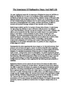
The first graph drawn was the actual results of the dice experiment. On the graph the half-lifes have been measured by lines drawn horizontally across from the y-axis. They have been calculated at going across the y-axis at 50, 25 and 12.5. The reason for this is because the top number on the y-axis is 100. It has been multiplied by ½, ¼ and . To get the half-lifes you have to draw the line along horizontally until it touches the curve. Next you draw a line vertically down from the point of intersect. You take the measurement from the labelled x-axis along the bottom. The first half-life is 4.1, the second is 3.7 and the third is 4.2. The last half-life stops at 12 so therefore all of them should total to 12. If the results were more accurate then they would all averagely be 4. = Average half-life.
The second graph is the probability graph containing the theoretical curve. On the graph I have followed the same rules used for the first. I have drawn the lines horizontally across the same numbers on the y-axis. This is because the top number is still the same, 100. The first half-life is 3.7, the second is 3.8 and the third is 4.5. These half-lifes also add up to 12. If they were more accurate be 4 as shown in the paragraph above.
Radioactive decay is the splitting up of a radioactive nucleus. It shoots out different parts of itself including alpha and beta particles; these are usually followed by gamma rays. When a nucleus ejects such a particle, it undergoes nuclear disintegrations. Energy is released in this process and a different, stable nucleus is formed. Activity is the number of nuclei decaying per second. The time if decaying in any individual nucleus is unpredictable. This is because the lifetime of a radioactive substance is never effected in any way by any physical or chemical to whatever environment or situation it may be subjected to. The timing is unpredictable because no pattern of decaying will repeat in the same way all the time. Each atom of a radioactive element is the same, so each has an equal probability of decaying.
Evaluation
I have drawn two graphs. The first one is a graph of average points from the dice rolling experiment. The second is a probability graph showing the theoretical curve of radioactive decay. The graph below is a typical example of what a radioactive decay curve graph should look like.
To draw my probability graph I had to follow the theoretical rules to get the curve. The theory is that of atoms are assumed to decay each time they split. On the graph I have drawn y-axis numbered 0 – 100. This is because of dice are assumed to land on a specific colour/ number. This is the reason dice have been used in this experiment as an example of radioactive decay. To get the curve I had to make my own calculations. Instead of using the original start number of 600 I chose to use 100 to keep it simple. I worked out that of 600 = 100.
of 100 = 16.7(1d.p). I subtracted 16.7 from 100 to find the next number (83.3). I had to do this for all the numbers, find a of them and subtract that. I repeated this until I got to the 15th term.
The probability curve is used to model decay because, drawn with accurate calculations it gives a clear picture of what a proper radioactive decay graph should look like. Even if it takes centuries for an element to decay, the shape will always be a curve. An example of this is Radium (Ra); it takes 1620 years to decay. Therefore I have come to the decision that the main reason is what has been explained in the conclusion. It shows that every time an atom splits or a dice lands on a particular number, that it goes down a 1/6(in theory/) each time. The message that is trying to be put across by the graph is that no matter what the atom or dice are decayed by, the probability of the next will not be affected by the previous. This is because each atom in an element is the same so they all have an equal chance of decaying. This is the reason why dice were used in this experiment because they too have the same numbers on them and have an equal probability of landing on a specific number. The dice do not effect each others outcome as the atoms of a substance do not do this either.
The curves on the probability and radioactive graphs are similar in some ways and differ in others. There are no major differences between the graphs, the only differences are:
- The gradients of both curves are slightly different, this is because the decaying on the probability graph is going down by exactly 1/6 each time. The actual results one is not known how much it decays by each time because the points are only averages. The probability graph has the steepest curve because it decays a lot more quickly that the results graph. This is shown by comparing the values in each table.
- Both sets of half-lifes are slightly different but there is not really much difference between there values. Both sets have the same average of 4.
-
On the probability graph I have gone to the 15th, while on the other it only goes up to the 14th.
Things similar between them are:
- The shape, they are both a curved shape because of the increasing reaction rate.
- They both go along the y-axis at 50, 25 and 12.5. This is because the top y-axis number is 100.
Overall there weren’t many points that I could find different about the graphs. They are both based around the same shape and have similar half-lifes. They follow the same theory. The probability graph was a little more reliable because the curve went through all the points plotted, so the half-lifes were more accurate to read. The actual results graph was not as reliable because the curve line doesn’t go through all the points exactly, so the half-lifes may not be as accurate.