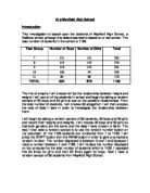
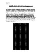
Histogram
As height and weight are continuous I can record them on a histogram. Histograms are a good, clear way to record data and they can also help me to find the modal interval and the mode.
Weight
Since my class intervals are the same and that they are 10, I do not need to find the frequency density as if I multiply it by 10 I will get the same value as my frequency.
- From the histogram for boys’ weight I can see that the modal interval is 40-50. The mode weight for boys is 46 kg. From the histogram for girls’ weight the modal interval is 40-60. The mode weight for girls is 50 kg. I can see from this that girls have a higher weight than boys.
Height
From the histogram for boys’ height I can see that the modal interval is 160-170 and the mode height is 164 cm. From the girls’ histogram I can see the modal interval is 150-170 and the mode height is 160 cm. I can see that boys have a slightly higher height than girls.
Frequency polygons
Frequency polygons are a good way to compare my two sets of continuous data. By using frequency polygons I can compare boys and girls height and weight.
Height
This frequency polygon shows us that boys have a higher height than girls.
Weight
This frequency polygon shows us that girls have a slightly higher weight than boys but they are both close.
- As I said earlier, in weight all three measures of average showed that girls have a slightly higher estimate mean, mode, and median. The results are very close together and the range is also greater so this shows that the girls sample is more spread than the boys and this could be a reason for my results. Evidence from the sample also suggests that 23 out of 30 boys, or 77% will have a weight between 40 and 70 and those 25 out of 30 girls, or 83% will have a weight between 30 and 60. The frequency polygons show that there are fewer boys with smaller weight and they also show that most boys and girls have the same weight.
- In height boys were generally taller with the measures of average being higher than girls. Also, evidence from the sample shows that 20 out of 30 boys, or 67% had heights higher than 160 cm whilst 16 out of 30, or 53% girls had a height higher than 160 cm. The frequency polygon also shows more boys have higher heights than girls.
- These conclusions are based on a sample of only 30 boys and 30 girls. If I was to increase the sample or repeat the whole exercise again I could confirm my results.
I will now test the following hypothesis:
- In general the taller a person is, the more they will weigh.
To test this hypothesis I will take a new random sample of 30 students.
Scatter diagram
I will now draw a scatter diagram for this data to compare height and weight.
- My line of best fit must have passed through the point (160, 50). I worked this out by finding the mean of the X and Y axis and then saw were they crossed. There is a positive correlation between height and weight. This suggests the taller the person the more they will weigh.
- The line of best fit suggests that somebody with a weight of 55 kg will have a height of 170 cm.
- Height and weight are also affected by gender. Earlier in this investigation, I found out that boys tend to be taller. I will now see what the correlation will be if boys and girls were to be considered separately using my original sample.
- There is a stronger correlation between height and weight if boys and girls were to be considered separately. The lines of best fit on my diagrams predict that a girl with a weight of 60 kg would have a height of 1.76 m, whereas a boy with the same weight would have a height of 1.85 m. This tells me that boys have smaller weights than girls. Although, a girl with the weight of 40 kg would have a height of 1.42 m, a boy would have the height of 137 cm. This tells me that girls with smaller weights are taller than boys. There is also a stronger correlation on the scatter diagram for girls.
I can also use the formula for the line of best fit to predict student’s weights or heights:
Boys only: y = 39.23x - 12.652
Girls only: y = 59.706x – 44.838
Mixed sample: y = 50.967x – 31.297
For example, to predict the weight of a girl with the height of 1.50 m:
y = 59.706x – 44.838
So y = (59.706 X 1.50) – 44.838
= 44.721
Using the equation of my line of best fit for girls, I can predict that a girl with the height of 1.50 m will have a weight of 44.72 kg.
Predict the height of a boy with the weight of 60 kg.
y = 39.23 – 12.652
So x = y + 12.652
39.23
If y = 60 then
x = 60 + 12.652 = 1.85 (2 d.p)
39.23
Using the equation of my line of best fit for boys, I can predict that a boy with the weight of 60 kg will be 1.85 m tall. If I look on my scatter diagrams I can see that these two predictions are correct.
- The line of best fit is a best estimation of relationship between height and weight. There are exceptional values in my data, such as the boy with a weight of 45 kg who is 1.92 m tall, which fall outside the general trend. The line of best fit is a continuous relationship. These values could be a result of puberty, which takes place around year 9 and year 10, were some students might gain height, weight or both.
Cumulative frequency
Firstly, I will draw a cumulative frequency curve for weight, then for height.
Cumulative frequency table for weight.
Cumulative frequency table for height.
- A reason for drawing cumulative frequency curves for continuous variables like height and weight is that I can easily read off the median, upper quartile, lower quartile and the interquartile range. I will put them into a table for both height and weight.
- My data implies that if we select a boy from random from the school, the probability that he will have a height between 150 and 170 will be 0.63. I can estimate that 63% of boys in the school will be between 150 cm and 170 cm. If I was to select a girl from random, the probability that she will also have a height between 150 cm and 170 cm will be 0.53.
I will now draw box and whisker diagrams to show the median, upper quartile, lower quartile and the minimum and maximum values.
- The box and whisker diagrams show that the interquartile range for boys is only 0.4 cm greater than girls. This suggests that the boys’ heights and girls’ heights are closely spread out; there is not a big difference between them. There is not much of a difference if they are considered mixed either.
- The box and whisker diagram for weight shows us the same difference between boys and girls (both are spread out in roughly the same way). Although when considered mixed the data is more spread out.
- Whilst in general boys are taller than girls, the evidence suggests that 7 out of 30 or 23% of girls have a higher height than the upper quartile height of boys. Also, in general girls’ weigh more than boys there is evidence that suggests that 23% of boys have a higher weight than girls above 60 kg.
Standard deviation
Standard deviation will help me find out how my data is spread out around the mean. Firstly I will calculate the standard deviation of boys’ height.
µ = mean
n = number of values (30)
I will be using this formula to find the standard deviation:
Standard deviation = √∑x² - µ²
n
Standard deviation = √83663 – 51.56667²
30
Standard deviation = 11.386 (3 d.p)
From this evidence I can see that the mean for boys’ weight is not a realistic way of interpreting the data and the mean is unreliable.
Standard deviation = √808165 – 163.7²
30
Standard deviation = 11.88 (2 d.p)
I can see that my mean for boys’ height isn’t a good way to judge my data. It is unreliable as the standard deviation is quite high.
Standard deviation = √83689 – 51.56667²
30
Standard deviation = 10.963 (3 d.p)
From the outcome of the standard deviation for girls’ weight, I can see that the mean for the girls’ weight isn’t a good way to interpret the data. The mean is unreliable.
Standard deviation = √788268 - 161.4667²
30
Standard deviation = 14.287 (3 d.p)
The standard deviation for girls’ height is high and therefore I can not use the mean to judge my data. The mean is unreliable.
- From the results I have got for standard deviation I can see that the mean for girls and boy’s weights and heights isn’t a reliable way to interpret the data I have collected.
Product-moment correlation coefficient r (PMCC)
The product moment correlation coefficient is good for seeing how strong the correlations are on my scatter graphs. I can predict that the correlation for girls will be stronger than that for boys.
Formula: r = Sxy
√ (SxxSyy)
Sxy = ∑xy - ∑x∑y
n
Sxx = ∑x² - (∑x) ²
n
Syy = ∑y² - (∑y) ²
n
r = (2549.05) - (49.11X1547)
30 .
√ (80.8165) – (49.11)² X (83663) – (1547) ²
- 30
r = 16.611
40.58170188
r = 0.409332
- I can see from calculating the PMCC, that my strength for the correlation between the two variables, height and weight, for boys is weak.
r = (2534.45) - (48.44X1547)
30 .
√ (78.8268) – (48.44)² X (83689) – (1547) ²
30 30
r = 36.56066667
48.96490299
r = 0.74667
- I can see from the answer that my prediction was right. The correlation for girls’ height and weight is definitely stronger than that for boys. This tells me that there is a better relationship between height and weight for girls more than boys.
Conclusion from random sampling
- There is a positive correlation between height and weight. In general tall people will weigh more than smaller people.
- The points on the scatter diagram for the girls are less dispersed about the line of best fit than those for boys. This suggests that the correlation is better for girls than for boys.
- The points on the scatter diagrams for boys and girls are less dispersed than the points on the scatter diagram for mixed sample of boys and girls. This suggests that the correlation between height and weight is better when girls and boys are considered separately.
- I can use the scatter diagrams to give reasonable estimates of height and weight. This can be done either by reading from the graph or using the equations for the line of best fit.
- The cumulative frequency curves confirm that boys and girls have quite a close height and weight, with girls being slightly higher in weight and boys slightly higher in height.
- The median for boys is higher in height and the median for girls is higher in weight.
- From the box and whisker diagrams I can conclude that, in general boys are taller than girls, but not exclusively so. The cumulative frequency curves can be used to estimate that 23% of girls have a higher height than 172 cm, the upper quartile height of boys.
- Also from the box and whisker diagrams I can conclude that in general girls weigh more than boys but not exclusively so. The cumulative frequency curves can be used to estimate that 23% of boys have a higher weight than girls above 60 kg. This could also be a result of my sampling which has more students from year 7 and 8 then 9, 10 or 11. This could mean more lighter people than heavier people
- I could have had a greater confidence in these results if we had taken larger samples. Also, my predictions are based on general trends observed in the data. In both samples there were exceptional individuals whose results fell outside the general trend.
- When age is taken to consideration, the correlation between height and weight will be better than when age is not considered.
This was based upon 60 students sampled at random. To ensure that the students from different age groups are represented equally I will now take a stratified sample.
Stratified Sample
I will use this information to find the Stratified sample of 30 boys and 30 girls, so a total of 60 pupils. I will use 60 pupils again as it will provide more accurate results. I will divide the amount of boys and girls in each year by the total amount of pupils (1183) and then multiply that number by the amount of random sampled pupils I will take (60).
By taking a stratified sample I can be sure as possible that my sample is representative of the whole school. As far as possible, my sample is free from bias caused by gender or age divisions.
I will now use the SHIFT RAN# button on my calculator to pick the right amount of boys and girls in each year to give the following results.
Now that I have my data I will put them into frequency/tally tables to make it easier to read and it is a better way to represent the data.
Now I will repeat what I did for normal random sampling but this time for stratified sampling and I will then compare the results.
Mean, mode, median and range
I will now use estimate mean, mode, median and range to give me a more information and more clear evidence about weight and height. Firstly I will consider weight.
Mean weight
Mean = 1630/30
Mean = 54.33
The mean weight for boys is 54.33 kg.
Mean = 1550/30
Mean = 51.667
The mean weight for girls is 51.667 kg.
Modal weight
Modal weight for boys = 40≤w<50
Modal weight for girls = 50≤w<60
Median weight
I can also read the median weight from my stem and leaf diagrams, it between the 15th and 16th values.
Median weight for boys = 52 kg
Median weight for girls = 50 kg
Range of weight
This shows me how spread my data for height is for girls and boys I will take away the lowest value from the highest.
Range of weight for boys = 75-35 = 40 kg
Range of weight for girls = 74-33 = 41 kg
I will now summarise my results into a clear table. The table shows the estimate mean, mode, median and range of boys and girls and I can easily see the differences.
- This shows some differences from the random sample. The mean and median is higher for boys although the mode is higher for girls. The range is almost the same so it doesn’t really affect the results. This tells me boys’ weight would be higher.
Now I will find the mean, mode, median for height.
Mean height
Mean = 4940/30
Mean = 164.66
The mean height for boys = 164.66 cm
Mean = 4850/30
Mean = 161.66
The mean height for girls = 161.66 cm
Modal height
Modal height for boys = 160≤h<170
Modal weight for girls = 150≤h<160, 160≤h<170
Median height
I can also read the median height from my stem and leaf diagrams, it between the 15th and 16th values.
Median height for boys = 156 cm
Median height for girls = 161 cm
Range of height
Range of height for boys = 183-145 = 38 cm
Range of height for girls = 180-139 = 41 cm
I will now summarise my results into a clear table. The table shows the estimate mean, mode, median and range of boys and girls and I can easily see the differences.
- The mean for height is higher for boys than girls and this tells me that boys’ height is higher than girls in general. The mode for both girls and boys are close together although the girls’ median height is higher. The mode was also close with the girls having the same amount of pupils in both 150≤h<160, 160≤h<170 intervals. Once again the results for boys and girls are quite close but more boys have a higher height than girls.
- So far from the evidence I found out, I can see that in my sample boys tend to have a slightly higher weight and height than girls. Also I can see that in my sample the data is more spread for girls than boys.
Histogram
As height and weight are continuous I can record them on a histogram. Histograms are a good, clear way to record data and they can also help me to find the modal interval and the mode. As my class widths are the same the frequency density will be the same as the frequency.
Height
Since my class intervals are the same and that they are 10, I do not need to find the frequency density as if I multiply it by 10 I will get the same value as my frequency.
- From the histogram for boys’ weight I can see that the modal interval is 40-50. The mode weight for boys is 49 kg. From the histogram for girls’ weight the modal interval is 50-60. The mode weight for girls is 53 kg. I can see from this that more girls have a lower weight than boys.
Weight
From the histogram for boys’ height I can see that the modal interval is 160-170 and the mode height is 164.5 cm. From the girls’ histogram I can see the modal interval is 150-170 and the mode height is 160 cm. I can see that boys have a higher height than girls.
Frequency polygon
Frequency polygons are a good way to compare my two sets of continuous data. By using frequency polygons I can compare boys and girls height and weight.
Height
The frequency polygon for height shows us that boys’ height is more evenly spread out and that boys are taller.
Weight
The frequency polygon for weight shows us that, once again boys’ weight is more evenly spread and more girls have a weight between 50 and 60. It also tells us that boys tend to weigh more than girls.
- In weight, two measures of average showed that boys have a slightly higher estimate mean and median. The mode for weight is greater for girls, which tells me more girls have lower weights than higher weights. The results are very close together and the range is also close so this shows that both samples are evenly spread. More girls will have lower weights than boys and therefore boys will weigh more. Evidence from the sample suggests that 27 out of 30 girls or 90% will have a weight lower than 60 kg whilst 21 out of 30 boys or 70% will have a weight lower than 60 kg. The frequency polygons show that there are fewer boys with smaller weight and they also show that most boys and girls have the same weight.
- In height boys were generally taller with the measures of average being higher than girls in mean and mode. This tells me boys are taller than girls. Also, evidence from the sample shows that 20 out of 30 boys or 67% had heights higher than 160 cm whilst 16 out of 30, or 53% girls had a height higher than 160 cm. This tells me that more boys are taller than girls. The frequency polygon also shows more boys have higher heights than girls.
- These conclusions are based on a sample of only 30 boys and 30 girls. If I was to increase the sample or repeat the whole exercise again I could confirm my results.
Once again, I will now test the following hypothesis:
- In general the taller a person is, the more they will weigh.
Scatter diagram
To test this hypothesis I will draw scatter diagrams to give a clear representation of the relationship between height and weight.
- My line of best fit must have passed through the point (160, 50) for mixed population. I worked this out by finding the mean of the X and Y axis and then saw were they crossed. There is a positive correlation between height and weight. This suggests the taller the person the more they will weigh.
- There is a stronger correlation between height and weight if boys and girls were to be considered separately. The lines of best fit on my diagrams predict that a girl with a weight of 60 kg would have a height of 1.78 m, whereas a boy with the same weight would have a height of 1.81 m. This tells me that boys are taller than girls. Although, a girl with the weight of 40 kg would have a height of 1.42 m whilst a boy would have the height of 1.38 m. This tells me that girls with smaller weights are taller than boys. There is also a stronger correlation on the scatter diagram for girls.
I can also use the formula for the line of best fit to predict student’s weights or heights:
Boys only: y = 43.481x – 18.687
Girls only: y = 55.633x – 39.088
Mixed sample: y = 50.335x – 30.243
For example, to predict the weight of a girl with the height of 1.50 m:
y = 55.633x – 39.088
So y = (55.633 X 1.50) – 39.088
= 44.441
Using the equation of my line of best fit for girls, I can predict that a girl with the height of 1.50 m will have a weight of 44.441 kg.
Predict the height of a boy with the weight of 60 kg.
y = 43.481x – 18.687
So x = y + 18.687
43.481
If y = 60 then
x = 60 + 18.687 = 1.81 (2 d.p)
43.481
Using the equation of my line of best fit for boys, I can predict that a boy with the weight of 60 kg will be 1.85 m tall. If I look on my scatter diagrams I can see that these two predictions are correct.
- The line of best fit is a best estimation of relationship between height and weight. There are exceptional values in my data, such as the boy with a weight of 45 kg who is 1.75 m tall, which fall outside the general trend. The line of best fit is a continuous relationship. These values could be a result of puberty, which takes place around year 9 and year 10, were some students might gain height, weight or both.
Cumulative frequency
Firstly, I will draw a cumulative frequency curve for weight, then for height. It makes comparing the data much easier.
Cumulative frequency table for weight.
Cumulative frequency table for height.
- A reason for drawing cumulative frequency curves for continuous variables like height and weight is that I can easily read off the median, upper quartile, lower quartile and the interquartile range. I will put them into a table for both height and weight.
- My data implies that if we select a boy from random from the school, the probability that he will have a height between 160 and 180 will be 0.56. I can estimate that 56% of boys in the school will be between 150 cm and 170 cm. If I was to select a girl from random, the probability that she will also have a height between 160 cm and 180 cm will be 0.43.
- My data implies that if we select a boy from random from the school, the probability that he will have a weight between 60 and 90 will be 0.3. I can estimate that 30% of boys in the school will be between 60 kg and 90 kg. If I was to select a girl from random, the probability that she will also have a height between 60 kg and 90 kg will be 0.1. I can estimate that 10% of girls in the school will weigh between 60 kg and 90 kg.
I will now draw box and whisker diagrams to show the median, upper quartile, lower quartile and the minimum and maximum values.
- The box and whisker diagrams show that the interquartile range for boys is greater than girls. This suggests that the boys’ height is more spread out than girls’ heights and boys are generally taller than girls. There is not much of a difference if they are considered mixed either.
- The box and whisker diagram for weight shows us the same difference between boys and girls (boys generally weigh more). Also, the data is clearer if age is considered separately.
- Whilst in general boys are taller than girls, the evidence suggests that out of 30 or 20% of girls have a higher height than the upper quartile height of boys. Also, in general boys weigh more than girls there is evidence that suggests that 10% of girls have a higher weight than boys above 60 kg.
Standard deviation
Standard deviation will help me find out how my data is spread out around the mean. Firstly I will calculate the standard deviation of boys’ height.
µ = mean
n = number of values (30)
I will be using this formula to find the standard deviation:
Standard deviation = √∑x² - µ²
n
Standard deviation = √85411 – 52.43333²
30
Standard deviation = 9.888 (3 d.p)
From this evidence I can see that the mean for boys’ weight is not a realistic way of interpreting the data and the mean is unreliable.
Standard deviation = √805813 – 163.5667²
30
Standard deviation = 10.313 (3 d.p)
I can see that my mean for boys’ height isn’t a good way to judge my data. It is unreliable as the standard deviation is quite high.
Standard deviation = √77899 – 50.16667²
30
Standard deviation = 8.941 (3 d.p)
From the outcome of the standard deviation for girls’ weight, I can see that the mean for the girls’ weight isn’t a good way to interpret the data. The mean is unreliable.
Standard deviation = √775683 – 160.4333²
30
Standard deviation = 10.828 (3 d.p)
The standard deviation for girls’ height is high and therefore I can not use the mean to judge my data. The mean is unreliable.
- From the results I have got for standard deviation I can see that the mean for girls and boy’s weights and heights isn’t a reliable way to interpret the data I have collected. Although, the standard deviation results I have got are better than the ones I got from random sampling.
Product-moment correlation coefficient r (PMCC)
The product moment correlation coefficient is good for seeing how strong the correlations are on my scatter graphs. I can predict that the correlation for girls will be stronger than that for boys.
Formula: r = Sxy
√ (SxxSyy)
Sxy = ∑xy - ∑x∑y
n
Sxx = ∑x² - (∑x) ²
n
Syy = ∑y² - (∑y) ²
n
r = (2586.78) - (49.07 X 1573)
30 .
√ (80.5813) – (49.07)² X (85411) – (1573) ²
30 30
r = 13.87633333
30.59648441
r = 0.45352705
- I can see from calculating the PMCC, that my strength for the correlation between the two variables, height and weight, for boys is quite weak.
r = (2434.09) - (48.13 X 1505)
30 .
√ (77.5683) – (48.13)² X (77899) – (1505) ²
30 30
r = 19.56833333
29.04346997
r = 0.673760172
- I can see from the answer that my prediction was right. The correlation for girls’ height and weight is definitely stronger than that for boys. This tells me that there is a better relationship between height and weight for girls more than boys.
This scatter diagram for boys has a weak correlation.
This scatter diagram for girls has a strong correlation.
Conclusion from stratified sampling
- The results from doing histograms, frequency polygons etc. proved that the results were more accurate and made more sense than that from the random sampling.
- There is a positive correlation between height and weight. In general tall people will weigh more than smaller people.
- Also, in general boys tend to weigh more and be taller then girls.
- By doing stratified sampling, there were a fewer exceptional values caused by different year groups and therefore ages. This made by results more accurate so I will use these results to make final conclusions.
- The cumulative frequency curves confirm that boys have a more spread out range in weight, with more girls having smaller weights. In height, boys tend to be taller.
- The box and whisker diagrams show that the interquartile range for boys is greater than girls. This suggests that the boys’ height is more spread out than girls’ heights and boys are generally taller than girls. There is not much of a difference if they are considered mixed either.
- The standard deviation showed me that the mean isn’t a reliable way of interpreting my data.
- The product-moment correlation coefficient shows that the correlation between height and weight is stronger for girls than for boys.
Final conclusion
- In general the taller a person is, the more they will weigh.
- There is a positive correlation between height and weight. In general tall people will weigh more than smaller people.
- The points on the scatter diagram for the girls are less dispersed about the line of best fit than those for boys. This suggests that the correlation is better for girls than for boys. Also, the points on the scatter diagrams for boys and girls are less dispersed than the points on the scatter diagram for mixed sample of boys and girls. This suggests that the correlation between height and weight is better when girls and boys are considered separately.
- There therefore is a positive correlation between height and weight across the school as a whole. This correlation seems to be stronger when separate genders are considered
- I can use the scatter diagrams to give reasonable estimates of height and weight. This can be done either by reading from the graph or using the equations for the line of best fit.
- There is a better relationship between height and weight when people in the school are taken into proportion in each year.
- I could have had a greater confidence in these results if we had taken larger samples. Also, my predictions are based on general trends observed in the data. In both samples there were exceptional individuals whose results fell outside the general trend.
This coursework was both interesting and enjoyable to do although it was hard work. I have learnt a few things from this coursework such as standard deviation and product-moment correlation coefficient, both of which I had previously not known about.