GCSE Statistics Coursework
Introduction:
Mayfield High School is a fictional secondary school where all the students are surveyed about their body, habits, likes and dislikes. My task will be to test my hypotheses using a variety of statistical techniques and analysing my findings.
The data I have been provided with is secondary data. This is data previously gathered by someone else and has been made and accessible or has been published so that it can be used by someone else. This therefore means, it is not primary data- which is data collected by the researcher (me) specifically for this project.
Hypotheses:
To work out a person's BMI, we take their weight in kilograms and divide it by the square of their height in metres.
I travel 3km to get to school. My height is 1.65m and my weight is 65kg. Therefore, my BMI (Body Mass Index) is 24. My friend, who travels 0.5km to get to school, has a BMI of 28. This has given my hypotheses:
i) Students who have to travel further to get to school will have a higher BMI compared to those who don't have to travel as far
The probability of a longer journey home compared to those who live closer to school is very high. During a bus or car journey, it is likely that the student will eat snacks. When they get home, the chances are that they will watch TV, eat dinner, do homework and play on the computer. It is highly unlikely that they will get round to exercise.
ii) Students who travel further to get to school would be taller than those who live closer would would.
I expect those closer to the school to have a lower BMI. Ultimately, I expect them to be taller or lighter to reduce their BMI.
iii) Students who live closer to the school are lighter than those who live further away are.
Same as previous.
Pre-test:
To ensure that I am working with suitable data, and not a set of random numbers, I will carry out a pre-test. This involves testing an obvious hypothesis. In this case, the hypothesis being tested will be "as height increases, weight increases."
I think that the hypothesis above is true because the vast majority of people's weight correlate with their height. Taller people tend to be heavier and shorter people tend to be lighter.
The sample being used will be a systematic sample because it is a simpler and quicker method to obtain a sample. I want to obtain a sample of size 30 from a population of 1183. I have chosen to use a sample size of 30 because it will have enough data to show any trend in the data but will be small enough to manipulate and analyse.
183 / 30 ˜ 39
Starting at a random point, I will collect every 39th piece of data. I will avoid bias in my sampling by using Microsoft Excel to randomise the order of the data before a sample is taken. To study the strength of the relationship of the data, I will use Spearman's Rank Correlation Coefficient. According to Spearman Rank's Correlation Coefficient, the coefficient will have a value of 1 when there is perfect agreement between the two rankings. The coefficient will have a value of -1 where there is perfect disagreement between the two rankings. When there is no agreement between the ranks, the coefficient will have a value of 0.
Sample: See next page
Scatter Diagram: See page 8
The sum of all of the differences squared is 2176.5. To find out spearman's rank coefficient, we must use the formula below:
Calculations:
6 x 2176.5 = 13059
30 x (302 -1) = 26970
3059 / 26970 = 0.484
- 0.484 = 0.516
Analysis of Pre-test:
The spearman's rank correlation coefficient is 0.516. I can conclude that there is agreement between the ranks. In this case, there are 30 pairs of data . The critical value for rs at 1% significance is 0.4251. The value, 0.516, exceeds 0.4251.
The critical value is the value that must be equal or exceeded for the sample to be accepted as reliable.
Therefore, it can be said that there is statistically positive correlation between the two variables. This supports my view from the scatter diagram that there is a reasonable relationship showing that the weight increases as the height increases.
I now accept that the data I will be working with is reliable enough to allow me to continue with my investigation.
In the sample that I have taken, there are no outliers that require discussion, exclusion or inclusion.
Systematic Sample
Height (m)
Rank (H)
Weight (kg)
Rank (W)
Difference
Difference 2
.94
80
0
0
.74
3
70
2
.55
9.5
67
3
6.5
272.25
.8
2
66
4
2
4
.55
9.5
64
5
4.5
210.25
.68
8.5
59
6.5
2
4
.65
0.5
59
6.5
4
6
.7
6
55
8
2
4
.72
4
54
9.5
5.5
30.25
.52
23
54
9.5
3.5
82.25
.68
8.5
52
1
2.5
6.25
.56
7
50
2.5
4.5
20.25
.41
28
50
2.5
5.5
240.25
.62
3
49
4
.7
6
48
6
0
00
.55
9.5
48
6
3.5
2.25
.54
22
48
6
6
36
.47
25
47
8
7
49
.65
0.5
45
20
9.5
90.25
.61
5
45
20
5
25
.46
26
45
20
6
36
.6
6
43
22
6
36
.7
6
42
23
7
289
.43
27
41
24
3
9
.62
3
40
25.5
2.5
56.25
.4
29
40
25.5
3.5
2.25
.62
3
38
27.5
4.5
210.25
.51
24
38
27.5
3.5
2.25
.32
30
35
29
.55
9.5
32
30
0.5
10.25
On my scatter graph, I have drawn a line of best fit to try and estimate the relationship between people's heights and weights.
To help me identify any positive or negative correlation, I will split the graph into four and see where the points lie.
Most of my data lies in the top right hand quarter of my graph. This suggests that there is moderate positive correlation.
The graph cuts the y-axis at approximately -25, that is the y-intercept.
The mean point is (1.225, 35.5).
M = y - 35.5 / x - 1.225
M = 8 / 0.21 = 38.1
Therefore:
38.1 = y - 35.5 / x - 1.225
Therefore,
38.1x - 46.7 (3SF) = y - 35.5
38.1x = y + 11.2
The equation of my line of best fit is:
38.1x = y + 11.2
Quality of Data
Within my systematic sample, I have used an appropriate method to try to identify outliers. Outliers are observations far away from the rest of the data usually produced by recording or entry errors. The method to identify outliers is described below.
- The lower quartile (Q1) is found using the formula: (n + 1) x 0.25
- The upper quartile (Q3) is found using the formula: (n + 1) x 0.75
- The interquartile range is found by subtracting the lower quartile from the upper quartile.
- The value for the interquartile range (IQR) is multiplied by 1.5.
- The value calculated is subtracted from the lower quartile to find values that seem too low in value.
- The value of IQR x 1.5 is added to the upper quartile to find ...
This is a preview of the whole essay
- The lower quartile (Q1) is found using the formula: (n + 1) x 0.25
- The upper quartile (Q3) is found using the formula: (n + 1) x 0.75
- The interquartile range is found by subtracting the lower quartile from the upper quartile.
- The value for the interquartile range (IQR) is multiplied by 1.5.
- The value calculated is subtracted from the lower quartile to find values that seem too low in value.
- The value of IQR x 1.5 is added to the upper quartile to find values that are too high of value.
If there are outliers, they can cause bias or distort estimates or skewness. As well as that, they can lead to weak conclusions. To find any outliers, I must apply the method above.
Calculations:
Heights-
(n+1) x 0.25 = 31 x 0.25 = 7.75th value
7.75 is three-quarters of the way in between the 7th value (1.51m) and the 8th value (1.52m). To find the 7.75th value, I shall first obtain the difference.
.52m - 1.51m = 0.01m
Then, I shall multiply that value by 0.75. This is because 7.75 - 7 = 0.75.
0.01m x 0.75 = 0.0075m
Then, it shall be added to the 7th value.
.51m + 0.0075m = 1.5175m
This is the lower quartile (Q1). I must now find the upper quartile (Q3).
(n + 1) x 0.75 = 23.25th value
The 23.25th value is a quarter of the way between the 23rd value (1.68m) and the 24th value (1.70m). As before, I shall obtain the difference of the 2 values to allow me to proceed.
.70m - 1.68m = 0.02m
I shall then multiply 0.02m by 0.25 because 23.25 - 23 = 0.25.
0.02m x 0.25m = 0.005m
Then, it shall be added to the 23rd value.
.68m + 0.005m = 1.685m
I must now find the IQR. To that I shall subtract 1.5175m from 1.685m.
.685m - 1.5175m = 0.1675m
The IQR, after being multiplied by 1.5, must now be added or subtracted from the appropriate quartiles to identify outliers.
0.1675 x 1.5 = 0.25125
.5175 - 0.25125m = 1.26625m
.685+ 0.25125m = 1.93625 m
In my systematic sample, there are no values below 1.27m.
I shall show the inexistence of outliers using a box and whisker plot.
Now that I have checked the heights column for outliers, I must now check the weights column for outliers. The method used shall be the same as that used for detection of outliers in height. I have already found the position of the lower and upper quartile. There some calculations, explanations and processes are not repeated.
The lower quartile is 7.75. The 7.75th data value is three-quarters of the way between the 7th value (41kg) and the 8th value (42kg). The difference is 1 kg.
kg x 0.25 = 0.25 kg
0.75kg + 41kg = 41.75kg
Therefore, the lower quartile (Q1) is 41.75kg.
The upper quartile is 23.25. The 23.25th data value is a quarter of the way between the 23rd value (55kg) and the 24th value (59kg). The difference is 4kg.
4kg x 0.25 = 1kg
kg + 55kg = 56 kg
Therefore, the upper quartile (Q3) is 56kg.
To find the IQR, I must perform the appropriate calculation.
56kg - 41.75kg = 12.25kg
The product of the IQR and 1.5 should now be added or subtracted from the appropriate quartile to aid in identifying outliers.
.5 x 12.25kg = 18.375kg
56kg + 18.4kg = 74.4kg
41.75kg - 18.4kg = 23.35kg
In my systematic sample of weights, like with the heights, no one is light enough to qualify as an outlier. However, two people are heavy enough to qualify as outliers.
That person weighs 80kg.
I feel this weighs, although being out of line with other data, ais perfectly reasonable and therefore should be included. It shall be identified as outliers in a box and whisker plot.
To plot a box and whisker diagram, I must also find the median values of height and weight. To find the median, I must use the formula (n + 1) x 0.5.
n = 30
n + 1 = 31
31 x 0.5 = 15.5
The working shows that the median value is the 15.5th value.
In the heights data, the 15th value is 1.6m and the 16th value is 1.61m. The value at the 15.5th position can be worked out.
.61m - 1.6m = 0.01m
0.01m x 0.5 = 0.005m
0.005m + 1.6m = 1.605m
The median value of the heights is 1.605m
In the weights data, the 15th value is 48kg and so is the 16th. Without workings, I know that the median value for weights is 48kg.
Analysis of Box Plots
The first box plot shows that the distribution is nearly symmetrical and very slightly negatively skewed.
The second box plot shows that the distribution is mildly positively skewed.
Data Discussion
Although there are outliers in my systematic sample, I feel that my data is of a good quality and the outliers, although being outliers, are perfectly reasonable. Although the student is 80kg, they are 1.94m tall. Their BMI is 20.82 - which is of a healthy range. Therefore, the result is realistic and I can accept the data to be reliable.
The Next Stage
To work accurate unbiased data, I must use a census. However, I am not going to use a census for the following reasons:
- It is expensive
- It is time consuming
- It is difficult to ensure that I collected data from the whole population
Therefore, I will use sampling because it takes up a lot less time and reduces the amount of data that has to be presented and analysed. However, I will have to accept that the data may be biased and may not be totally representative.
Bias can arise from:
- Non-responses
- Ambiguity of questions
- Nature of questions - the question may influence the answer.
- Recording errors
- Unrepresentative sampling
- Population misidentification
- The element of truth in the answering
For the next stages, I have chosen to quota sample. To obtain a quota sample, the following steps must be carried out.
- The population is divided into mutually exclusive sub-groups
- A judgement will be made as to how many pieces of data will be obtained from each of these subgroups.
In this case, I have divided the population into five mutually exclusive sub-groups by their year group. Then, I have obtained 10 pieces of data. To avoid bias as much as possible, I got Microsoft Excel to choose the 10 pieces of data using the 'RAND' function.
Quota Sample
Year Group
Height (m)
Weight (kg)
Body Mass Index
Distance Between
Home and School
7
.61
43
6.6
Kilometre
7
.55
50
20.8
Kilometre
7
.62
65
24.8
.5 Kilometres
7
.52
37
6.0
2 Kilometres
7
.54
38
6.0
2 Kilometres
7
.72
53
7.9
2 Kilometres
7
.58
50
20.0
3 Kilometres
7
.6
45
7.6
4 Kilometres
7
.52
54
23.4
7 Kilometres
7
.65
66
24.2
9 Kilometres
8
.61
48
8.5
- 2 Kilometres
8
.73
47
5.7
.5 Kilometres
8
.74
61
20.1
.5 Kilometres
8
.43
40
9.6
2 Kilometres
8
.42
50
24.8
2 Kilometres
8
.6
43
6.8
3 Kilometres
8
.67
52
8.6
4 Kilometres
8
.57
52
21.1
5 Kilometres
8
.6
46
8.0
6 Kilometres
8
.32
48
27.5
6 Kilometres
9
.6
40
5.6
0.5 Kilometre
9
.49
40
8.0
Kilometre
9
.48
40
8.3
.5 Kilometres
9
.6
55
21.5
.5 Kilometres
9
.73
52
7.4
2 Kilometres
9
.54
50
21.1
2 Kilometres
9
.7
48
6.6
3 Kilometres
9
.59
46
8.2
3 Kilometres
9
.5
65
28.9
4 Kilometres
9
.62
48
8.3
5 Kilometres
0
.54
57
24.0
Kilometre
0
.55
65
27.1
Kilometre
0
.77
57
8.2
.75 Kilometres
0
.72
51
7.2
2 Kilometres
0
.6
50
9.5
2 Kilometres
0
.56
56
23.0
2 Kilometres
0
.73
58
9.4
3 Kilometres
0
.62
54
20.6
3 Kilometres
0
.8
77
23.8
4 Kilometres
0
.63
40
5.1
5 Kilometres
1
.78
67
21.1
Kilometre
1
.6
38
4.8
2 Kilometres
1
.63
45
6.9
2 Kilometres
1
.7
50
7.3
2 Kilometres
1
.61
47
8.1
2 Kilometres
1
.75
56
8.3
2 Kilometres
1
.82
66
9.9
2 Kilometres
1
.55
54
22.5
6 Kilometres
1
.72
63
21.3
8 Kilometres
1
.65
66
24.2
9 Kilometres
Data Presentation and Analysis
Bar chart:
I have chosen to represent the pre-test data using a bar chart because it is simple. This means interpreting data will be very easy. It is also used because I summarising ordinal data. When drawing the bar chart, I shall ensure that:
i) An appropriate scale is used
A bar chart with an inappropriate scale can be very misleading. It can suggest unreal failures, successes or correlations.
ii) All the bars are of the same width
If bars are not of the same width, then the graph can also be very misleading. It can suggest opinions and therefore be biased.
iii) All the axes are labelled
If the axes were left unlabelled, the reader will not know what the bar chart is representing.
iv) Both axes start on zero
False zeros are used to present correct but misleading data. As I do not wish to lead the reader into any conclusions, my axes will start at zero.
Bar Chart Calculations
I will plot the mean of each group, rather than the median. Using the mean will allow me to work with all of the data in each group and the mean is probably the most accurate average. Therefore, I will not be excluding any results and therefore not causing any sort of bias. However, I accept that the mean itself may not be a true value and that it may be distorted by any extreme values.
Students that live with 2.9 kilometres of the school:
5.6 + 18.5 + 16.6 + 20.8 + 18.0 + 24.0 + 27.1 + 24.8 + 15.7 + 20.1 + 18.3 + 21.5 + 18.2 + 16.0 + 16.0 + 17.9 + 19.6 + 24.8 + 17.4 + 24.8 + 17.4 + 21.1 + 17.2 + 19.5 + 23.0 + 14.8 + 16.9 + 17.3 + 18.1 + 18.3 + 19.9 = 578.3
578.3 / 30 = 19.3
Students that live between 3.0 miles and 4.9 miles of the school:
20.0 + 16.8 + 16.6 + 18.2 + 19.4 + 20.6 + 17.6 + 18.6 + 28.9 + 23.8 = 200.5
200.5 / 10 = 20.1 (3SF)
Students that live between 5.0 miles and 6.9 miles of the school:
8.0 + 27.5 + 22.5 = 68.0
68.0 / 3 = 22.7 (3SF)
Students that live between 7.0 and 8.9 miles of the school:
23.4 + 21.3 = 44.7
44.7 / 2 = 22.4 (3SF)
Students that lives outside 9 miles of the school:
24.2 + 24.2 = 48.4
48.4 / 2 = 24.2
In the calculations above, I have added up all the data values and divided by the number of data values to obtain a mean value.
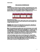
Analysis of the bar chart
In regards to the first hypothesis, the bar chart is of full support. It clearly shows that those who live further away from Mayfield High School are, in cruder terms, fatter. They have a higher BMI than those who live closer to the school. It clearly shows that those who live outside 8 kilometres of the school have a significantly higher BMI of those who live within 3 kilometres or so of the school.
However, it does not provide sufficient evidence to back up or disagree with my second hypothesis.
It also does not provide sufficient evidence to support my third theory, nor does it contradict the theory.
To find evidence to back up my second and third theory, I must use other methods of data presentation.
Where now from here?
For my main data representation and analysis, I will be using data from a stratified sample. It is appropriate because I want to avoid bias and avoid using data that is not proportional. Stratified sampling, or stratification, ensures that a fair proportion of responses from each mutually exclusive group. It is better than simple sampling or systematic sampling because the responses will be more representative.
To obtain a stratified sample, I must:
i) Divide the population into sub-groups
ii) Take a sample proportional to the size of the sub-group
Stratified sample
First, I must establish the size of each sub-group in order to take a stratified sample.
Year Group
Total
5% of Total (0 D.P.)
7
282
4
8
270
4
9
261
3
0
200
0
1
70
9
I will take a sample of 5% from each year group. The random 5% shall be chosen by Microsoft Excel using the RAND function to avoid any sort of bias as much as possible.
Year Group
Height (m)
Weight (kg)
Distance
BMI
7
.43
41
2 Kilometres
20.0
7
.74
70
2 Kilometres
23.1
7
.60
43
6 Kilometres
6.8
7
.47
47
3 Kilometres
21.8
7
.62
40
5 Kilometres
5.2
7
.32
35
2 Kilometres
20.1
7
.48
37
3 Kilometres
6.9
7
.60
38
4 Kilometres
4.8
7
.41
45
Kilometre
22.6
7
.49
40
2 Kilometres
8.0
7
.55
53
4 Kilometres
22.1
7
.62
47
Kilometre
7.9
7
.55
50
Kilometre
20.8
7
.48
44
2.5 Kilometres
20.1
8
.59
65
.5 Kilometres
25.7
8
.57
45
4 Kilometres
8.3
8
.72
51
4 Kilometres
7.2
8
.50
50
Kilometre
22.2
8
.59
38
3 Kilometres
5.0
8
.45
81
8 Kilometres
38.5
8
.50
57
2 - 3 Kilometres
25.3
8
.63
56
4 Kilometres
21.1
8
.59
64
3 Kilometres
25.3
8
.52
43
Kilometre
8.6
8
.50
39
8.75 Kilometres
7.3
8
.38
35
Kilometre
8.4
8
.66
72
4 Kilometres
26.1
8
.50
52
2.5 Kilometres
23.1
9
.57
52
5 Kilometres
21.1
9
.5
65
4 Kilometres
28.9
9
.44
49
4 Kilometres
23.6
9
.56
60
6 Kilometres
24.7
9
.50
45
3 Kilometres
20.0
9
.71
60
2 Kilometres
20.5
9
.6
42
2 Kilometres
6.4
9
.52
55
3 Kilometres
23.8
9
.6
46
3 Kilometres
8.0
9
.53
40
Kilometre
7.1
9
2.03
60
0 Kilometres
4.6
9
.65
49
Kilometre
8.0
9
.78
59
3 Kilometres
8.6
0
.53
65
2.5 Kilometres
27.8
0
.52
70
Kilometre
30.3
0
.54
57
Kilometre
24.0
0
.75
59
5 Kilometres
9.3
0
.63
56
Kilometre
21.1
0
.47
45
2 Kilometres
20.8
0
.80
72
3 Kilometres
22.2
0
.79
52
Kilometre
6.2
0
.61
59
3 Kilometres
22.8
0
.63
48
3 Kilometres
8.1
1
.86
80
3 Kilometres
23.1
1
.52
48
.5 Kilometres
20.8
1
.92
45
Kilometre
2.2
1
.62
48
8 Kilometres
8.3
1
.67
60
2 Kilometres
21.5
1
.63
52
5 Kilometres
9.6
1
.52
60
3 Kilometres
26.0
1
.80
42
2 Kilometres
3.0
1
.74
39
3 Kilometres
2.9
Finding any outliers using standard deviation
The stratified sample may still cause bias with its outliers. I will look to identify them using standard deviation. This can be worked out using the formula below.
Standard deviation is a measure of spread of its values. I will be looking for BMI outliers. To make my data handling easier, I will construct a stem and leaf diagram.
Stem and Leaf Diagram: page 18
To find out the standard deviation, I must:
i) Find the sum of the squares of the data
26759.9
ii) Find how many pieces of data I am working with
60
iii) Find the mean of all the BMI's
237.7 / 60 = 20.6 (1 D.P.)
iv) Find the square of the mean
20.6 x 20.6 = 424.4
I can now find the standard deviation using the above formula.
(26759.9 / 60) - 424.4 = 21.6
V21.6 = 4.6
The standard deviation for my stratified sample is 4.6.
To see if the distribution is normal, Chebyshev's inequality can be used.
Chebyshev's inequality states that:
- At least 50% of the data is within 1.4 standard deviations from the mean.
- At least 75% of the data is within 2 standard deviations from the mean.
- At least 89% of the data is within 3 standard deviations from the mean.
- At least 94% of the data is within 4 standard deviations from the mean.
- At leats 96% of the data is within 5 standard deviations from the mean.
- At least 97% of the data is within 6 standard deviations from the mean.
- At least 98% of the data is within 7 standard deviations from the mean.
I will assume that any data outside 2 standard deviations of the mean is an outlier.
2 x 4.6 = 9.2
20.6 - 9.2 = 11.4
20.6 + 9.2 = 29.8
There is no one with a BMI under 11.6, therefore there are no outliers that are too low in value. However, there are two pieces of data which exceed 29.8. Therefore, they are classed as outliers.
On this occasion, I will include both of these outliers because, even though their BMI's are quite high, they are not unheard of and I know people that exceed 38.5 for BMI.
Of the 60 pieces of data, 58 are within 2 standard deviations of the mean. 58 out of 60 is more than 75%. Therefore, according to Chebyshev's inequality, I can accept the distribution of my data to be normal.
Now, I will use a composite bar chart to compare the heights of those whose distance from home to school is below the median and the heights of those whose distance from home to school is above the median.
To do so, I must first find the median.
I will find the median using the formula (n + 1) / 2.
There are 60 pieces of data. Therefore, the 30.5th piece of data will be the median.
I shall class the first 30 pieces of data to be below the median and the last 30 pieces to be above the median.
Mean average of first 30 pieces of data: 1.59m
Mean average of last 30 pieces of data: 1.60m
Composite bar chart to compare students' heights
This composite bar chart shows that the average height of the two groups are extremely similar.
Therefore, this shows that the distance you have to travel to get to school does not affect your height at all.
This proves my second hypothesis to wrong.
This chart also shows no relationship to my first and third hypotheses - I will use other data
representation methods to help prove those hypotheses.
I will now construct a population pyramid to compare the weights of the two groups of students. However, I shall use a histogram instead of using bar charts.
I will use a histogram with equal intervals because the vertical axis can be used to count the frequency in each group. Therefore, the data is presented clearer than if I used a histogram with unequal intervals.
To ensure that the histograms do not mislead the reader, I will ensure that they do not have false zeros, i.e. both axes start at zero.
The data presented will be from my stratified sample. To make the job of constructing the histogram easier, I will rearrange my data into a table.
Weight ranges from
Weight ranges upto and including
Frequency (Closest 30 students to school)
Frequency (Furthest 30 students from school)
0
9
0
0
0
9
0
0
20
29
0
0
30
39
4
3
40
49
3
9
50
59
7
9
60
69
5
4
70
79
3
80
89
0
2
To construct a histogram (with equal intervals) correctly, I must ensure that my x-axis is linear and that there are no gaps between the bars.
Population pyramid: See page 21
What does my population pyramid show?
The population pyramid to the left of the y-axis is of the students who live closer. It is clear that their weights have a positive distribution, i.e. there are more students below the median bar than there are above.
However, the pyramid to the right of the y-axis shows a near-symmetrical distribution. This means that there are fewer students below the median bar than there are in the top pyramid.
My observations show that, in general, the students who live closer to the school weigh less.
This backs up my third hypothesis of:
Students who live closer to the school are lighter than those who live further away are
So far,I have proved my second hypothesis to be false; living far away from your school doesn't affect your height.
I have also proved my third hypothesis to be true. It seems that living closer to the school makes thinner than those who live further away.
What will I do next?
I intend to verify my first hypothesis of 'Students travelling to further to get school will have a higher BMI' by using a population pyramid with histograms and my stratified sample, rather than my systematic sample. The histogram will have unequal intervals to show distribution of students' BMI's.
Like with the histogram with equal intervals, I must ensure that there are no gaps between the bars (this is not a bar chart) and that the x-axis is linear.
Also, to make the data representation more accurate, I will not use false zeros.
I think that a population pyramid will work well because it will allow me to compare both data sets.
BMI
Class width
Frequency
Frequency Density
0 - 12.2
6.1
0
0.0
2.2 - 16.4
2.1
6
2.9
6.4 - 18.0
0.8
6
7.5
8.0 - 20.8
2.4
6
2.5
20.8 - 22.6
0.9
6
6.7
22.6 - 27.8
2.6
6
2.3
BMI
Class width
Frequency
Frequency Density
0 - 14.8
7.4
0
0.0
4.8 - 18.0
.6
6
3.8
8.0 - 19.6
0.8
6
7.5
9.6 - 22.1
.3
6
4.6
22.1 - 24.7
.3
6
4.6
24.7 - 38.5
6.9
6
0.9
What does the histograms show?
The histograms on the population pyramid show that the student with lowest BMI in the 'further away' half of my sample has a higher BMI than the student with the lowest BMI in the 'closer to' half of my sample.This backs up my first hypothesis.
As well, the histograms also show that the student with the highest BMI in the 'closer to' half of the sample has a lower BMI than the student with the highest BMI in the 'further from' half of the sample. This also backs up my first hypothesis.
Along with my bar chart on page 14, I can confidently say that this population pyramid backs up my first hypothesis.
CONCLUSION
Quality of data:
In general, I feel that the quality of the data that I have been working with has been of a very high standard. Although I found outliers using standard deviation and IQR, those outliers were not physically impossible and were probably not caused by mis-entry of data.
I feel that the quality of the data could have been higher if it was primary data, i.e. I went out and collected it myself. This is because I feel that I will not make any entering errors and I would almost certainly verify my data whilst inputting it.
I feel that my data contained a few limitations. Against all odds, it did not contain any near impossible values such as people over 4 metres tall or people with their intelligence quotient in the teen's. Those values may have been caused by typing errors or illegible handwriting. The original data itself may not be accurate. One could question the way in which people's IQ was measured; there are many different ways of measuring someone's intelligence quotient. To obtain someone's IQ, you could give them a test based on pictures or give them a written test. We are not told that every single person in the Mayfield database had their IQ tested in the same manner. Also, distances to and from school could be estimates rather than precise measurements. There is no doubt that my conclusions could be incorrect.
Sample sizes:
Overall, I feel that the sample sizes I have used for each part of my project are very sensible. I have not had to spend ages manipulating the data and plotting graphs. This shows that I have not taken a sample which is too large. However, my graphs and calculations were not done very quickly either, although they did not take hours, they still took some time. I feel that my sample sizes were not too small.
My hypotheses:
Overall, I feel that I have satisfied my goals on the first page. I have used a range of statistical skills, techniques and data representation methods to try and prove or disprove my hypotheses.
In general, I feel that my work could have been improved if I had taken a sample double the size of all of the ones that I have done. I feel that would have made outliers more obvious and therefore given me a clearer statement on the quality of the data.
I am happy that my conclusions are reliable because they were blatantly obvious. For example, it was obvious from the composite bar chart that the distance travelled to get to school had no impact on your height.
My findings:
As a result of my sampling, calculations, and data representations, I can state the following:
- Those who live closer to Mayfield High School have a lower BMI
- Those who live further to Mayfield High School weigh more.
- Those who live closer to Mayfield High School are just as tall as those
who live further away from the school.
AQA GCSE Statistics Coursework
Vinson Yeung 10W
King Edward VI Camp Hill Boys