I will find these averages, as they are quick to do and will help me to find out what the typical student is like. Eventually, I will put the data into stem and leaf diagrams - this will aid me to find the mode, median, and range values in an easy way, and also so I will be able to understand it more clearly. Another aim is to draw a scatter diagram because it is a good way of comparing two variables to see if there is any correlation (pattern) between them. When I have these values, I will write a conclusion to say whether my hypothesis was correct or incorrect.
This is the original amount of students (1183)
Random Sampling Method
Due to the fact that there is too much data to analyse, we were asked to take about 5% of the data, a reasonable amount so that the results are meaningful and represent the whole population. If the sample is too small, it may be biased. Simple random sampling is used so that everyone has a chance of being selected to be part of the 5%. Steps to extract 5% on the spreadsheet out of 31941 datum points from KS3 and KS4 combined in the Mayfield Data.
- Insert a new column, assign a random number between 0 and 1 to each record using the random number function =rand(). This number will change every time the spreadsheet is updated. Label this new column as Rand1.
- Copy the random number to a new column and right click, paste special. You will get a fixed random number. Label this second column as Rand2.
- In a third column, multiply the random number in Rand2 by 20 to get a number between 0 and 20. Label this third column as Rand3.
- Sort the records using the sort function, according to the random number value in Rand3.
- Pick and highlight the records whose random number value is less than 1. This should be about 5% of the whole data.
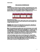
Collecting and presenting data
I have collected my data and have written it in the table below I will then use the data to create a cumulative frequency table, and then a graph.
I have created the cumulative frequency chart and graph for the height of yr 7 females from the chart below.
From this I was able to construct a cumulative frequency graph to help me to look at the range of different heights over this particular year group.
Looking at the graph above, we can see that the shortest female in year 7 is 1.4 Metres and the tallest is 1.75 Metres. And the most common height for year 7 females is 1.5 Metres. The range between the heights is 0.35 Metres. The median height is 1.5 to 1.55.
Now to look at the chart for the males from yr 7 we will use both graphs to compare the males and females heights and come to a conclusion of who’s taller and how we can interpret this.
This graph shows that she shortest male in year 7 is 1.4 Metres and the tallest is 1.7. The jump in the frequency graph between 1.55 and 1.6 Metres is the modal height for the year 7 males. The median height is 1.57 (m).
The lower quartile is 1.5 and the upper quartile is 1.62 Metres.
The inter quartile range is (Upper quartile-lower quartile) 1.62-1.5=0.12
Upper quartile is the 75th percent value and the lower quartile is 25th percent value of the cumulative frequency.
The graphs below represent, respectively, the cumulative frequency for the height of girls and boys. I could use the cumulative frequency graphs to estimate values and also to estimate the UQ, LQ and the interquatile range to compare with the actual values that I have already calculated.
Pupil height graph evaluation
This graph doesn’t show any major diffrances between the heights of girls and boys. This is probably because the pupils are of a young age and have a similar growth rate I think in year 11 the males will be considerably taller than the females as by that time they will almost be fully developed adults and men are usually taller than women. I will now look at the weights of the pupils in year 7 but I will add them to a cumulative frequency graph instead of doing two separate graphs then one comparison. I will use a box plot to show the similarities and differences.
Prediction
I predict that the males and females will have a similar weight in yr 7 as they are still young and grow at the same rate as each other.
The graphs below represent, respectively, the cumulative frequency for the weight of girls and boys. I could use the cumulative frequency graphs to estimate values and also to estimate the UQ, LQ and the interquatile range to compare with the actual values that I have already calculated.
This graph shows that the males in yr 7 are heavier than the females. But again it’s still very close to each other, as they are still young. I will now be comparing them with yr 11 to find out if there are any differences between the heights and weights of the pupils.
Conclusion:
I have come to a conclusion that my results point in the right way to my predictions. The tables show that males seem to weight more than females this is also shown on my graphs.
Also my results prove that if a person is above their average height of their class and gender then they will most likely be lighter than others.
My final prediction is that if a person is below their average height in the class and gender then they will most likely weigh more. My results show a lot of the smaller people seem to be of average or slightly lower or higher weight.
Finally my prediction has been proved correct that the older the student gets the taller they will get.
Evaluation:
If I were to redo this experiment then I would most likely change the following things:
I would go over and check more precisely the random numbers I have been given and make sure the info I take from the numbers of the people given are correct.
I would also try and make more graphs to make more sense to what I am trying to explain and use practice graphs to help explain.
Also I would try and use more information so I can get more predictions i.e. choose different variables to compare.
If possible if I did try and re-do the experiment I would try and use a higher amount of samples so I could try and get a more accurate result so instead of using 60 samples I would use 100 which could prove to me more efficient.
I would also try and put more information about each person randomly chosen.